Introduction to MATLAB Scatter Plots
Scatter plots are a fundamental tool in data visualization, essential for representing individual data points in a two-dimensional Cartesian coordinate system. The main purpose of a scatter plot is to enable visual assessment of relationships between two variables, allowing one to observe potential correlations, trends, and distributions within the data. Each point on a MATLAB scatter plot corresponds to an observation, with its position determined by the values of the two variables being analyzed.
In the context of MATLAB, the function matlab scatter is frequently utilized to create these plots efficiently. By plotting observations on a two-dimensional plane, users can gain insights into the underlying structures of their datasets. For instance, if the plotted points tend to cluster together or form a specific shape, this could indicate a strong correlation between the two variables, while a random distribution might suggest no significant relationship.
Moreover, scatter plots serve not only as a graphical representation of data but also as a preliminary analysis tool. They help identify outliers or unusual observations, which can influence the overall findings of a study or research project. Additionally, with tools such as matlab scatter3, users can extend their analysis into three dimensions, providing a more nuanced view of the relationships among three variables.
Understanding the significance of scatter plots and their functionalities in MATLAB is crucial for effective data analysis. By leveraging these visualizations, researchers and analysts can make informed decisions and derive meaningful conclusions from complex datasets. As we continue our exploration of scatter plots, we will delve deeper into their construction, applications, and advanced features in MATLAB to enhance your analytical capabilities.
Need Help in Programming?
I provide freelance expertise in data analysis, machine learning, deep learning, LLMs, regression models, NLP, and numerical methods using Python, R Studio, MATLAB, SQL, Tableau, or Power BI. Feel free to contact me for collaboration or assistance!
Follow on Social

Why Use MATLAB for Scatter Plots?
MATLAB stands out as a premier tool for creating scatter plots due to its powerful computational capabilities and extensive graphical functions. One of the significant advantages of using MATLAB scatter plots is its ability to handle large datasets efficiently. MATLAB’s robust algorithms allow users to manipulate complex data with ease, enabling the generation of insightful visualizations. This capability is essential in academic research, engineering applications, and data analysis where the relationships between variables must be explored comprehensively.
The user-friendly interface of MATLAB further enhances its appeal, allowing both experienced programmers and newcomers to effortlessly navigate its features. With an extensive range of built-in functions, users can quickly generate a scatter plot tailored to their specific requirements. Furthermore, MATLAB provides ample customization options, allowing users to adjust markers, colors, and axes to suit their desired presentation style. This flexibility is particularly beneficial when comparing multiple datasets or overlaying additional information to enhance data interpretation.
Real-world applications of MATLAB scatter plots can be found across various fields. For example, in biomedical research, MATLAB scatter3 can be utilized to visualize relationships between multiple variables, such as patient characteristics and treatment outcomes. In the realm of engineering, use of MATLAB and scatter plots can clarify the relationship between design parameters, aiding in the optimization of processes. Furthermore, financial analysts leverage MATLAB scatter plots to depict the correlations between economic indicators, thus facilitating informed decision-making.
The seamless integration of computational and graphical capabilities distinguishes MATLAB as an invaluable resource for producing high-quality scatter plot visualizations. Whether for academic purposes or industry applications, MATLAB scatter plots offer substantial advantages that enhance data storytelling and decision-making processes.
Basic Syntax for Creating Scatter Plots in MATLAB
Creating scatter plots in MATLAB is straightforward, utilizing the scatter function. This function requires a minimum of two parameters: the X coordinates and the Y coordinates of the data points that you intend to visualize. The basic syntax for creating a simple MATLAB scatter plot is as follows:
scatter(X, Y)In this code snippet, X is a vector of X-coordinates and Y is a vector of corresponding Y-coordinates. Each element in these vectors represents a specific point on the scatter plot. To enhance your scatter plots, you can specify additional parameters such as marker type and size, which allow for better representation of data points.
The syntax can be expanded to include these additional parameters, like so:
scatter(X, Y, 'Marker', 'Size')Here, 'Marker' defines the shape of the plotted points (e.g., circles, squares), while 'Size' determines the size of these markers. For example, using scatter(X, Y, 50, 'filled') would produce filled markers of size 50.
In more complex visualizations, you might want to use a three-dimensional scatter plot. For this, MATLAB provides the scatter3 function, which extends the scatter plot into three dimensions. The syntax for a 3D scatter plot is similar:
scatter3(X, Y, Z, 'Marker', 'Size')In this case, Z represents the third dimension, giving you more control over how the data is visualized. Rest assured, with the proper understanding of these basic syntax elements and their parameters, using matlab scatter functions to create effective visualizations will become a more manageable task.
% Step 1: Generate sample data
% Create two vectors x and y to represent the data points.
x = rand(1, 50); % 50 random points for x-axis
y = rand(1, 50); % 50 random points for y-axis

% Step 2: Create a basic scatter plot
figure; % Create a new figure
scatter(x, y, 'filled'); % Create scatter plot with filled markers
title('Basic 2D Scatter Plot'); % Title of the plot
xlabel('X-axis'); % Label for x-axis
ylabel('Y-axis'); % Label for y-axis

Customizing Scatter Plots: Markers and Colors
In MATLAB, enhancing the visual representation of data through scatter plots is essential for effective communication of results. Customizing markers, colors, and sizes allows users to highlight specific data trends or differentiate data groups within a scatter plot, thus improving clarity and visual appeal.
To modify markers in a MATLAB scatter plot, utilize the ‘Marker’ property within the scatter function. Different shapes can be used, such as circles, squares, and diamonds, by specifying identifiers like ‘o’, ‘s’, and ‘d’, respectively. For example, the command scatter(x, y, 'Marker', 'o') creates circular markers. Customization of marker size can further enhance the plot’s visual aspect by adjusting the third input parameter in the scatter function, which represents marker sizes. For instance, scatter(x, y, 50) creates larger markers, enhancing visibility.
Color is another vital aspect that contributes to the aesthetic and informative quality of scatter plots. MATLAB allows users to define colors through RGB triplets, hexadecimal color codes, or predefined color names. When creating a scatter plot, one can set the color of data points, for instance, scatter(x, y, 50, [0, 0.5, 0]) sets the color to a variant of green. Furthermore, employing a colormap enables the application of varying colors based on data values, enhancing the plot’s functionality and insight.
Additionally, the matlab scatter3 command offers three-dimensional scatter plots, where marker customization can similarly be applied. This feature increases the dimensionality of the representation, aiding in the visualization of complex datasets. By integrating diverse markers and colors, users can create compelling MATLAB scatter plots that are not only informative but also visually captivating.
% Step 3: Customization (optional)
scatter(x, y, 100, 'r', 'filled'); % Change marker size and color to red
legend('Data points'); % Add a legend
grid on; % Display grid

Adding Labels and Legends for Clarity
Clear communication of data visualizations is paramount, especially when using tools like MATLAB for creating scatter plots. One of the most effective ways to enhance the readability and interpretability of a MATLAB scatter plot is through the addition of labels and legends. These elements provide context, ensuring that viewers can understand the information presented within the plot.
To start, it is essential to include a title for your MATLAB scatter plot. A well-crafted title provides the viewer with an immediate understanding of the data’s focus. You can set the plot title using the title function in MATLAB, allowing you to give a concise overview of what the scatter plot represents. For example, using title('Sales vs. Advertising Spend') instantly informs viewers about the relationship depicted in the scatter plot.
Next, axis labels are crucial as they describe what each axis represents. This ensures that viewers can relate the data points on the scatter plot to real-world measurements. MATLAB provides the xlabel and ylabel functions for this purpose. For instance, labeling the x-axis as “Advertising Spend ($)” and the y-axis as “Sales ($)” would give potential insight into the relationship between these two variables.
Finally, including a legend is critical when dealing with multiple datasets within a single MATLAB scatter plot. The legend function allows you to differentiate between various data series, making it easier for viewers to interpret the results. When using multiple colors or symbols for the data points, a corresponding legend adds clarity and structure to your visualization. By effectively adding labels and legends, your scatter plots will be more informative and easier to analyze.
Handling Large Datasets and Overplotting
When working with large datasets in MATLAB, one common challenge is overplotting, where multiple data points overlap in a scatter plot, obscuring critical information. This issue can lead to misleading interpretations and hinder data analysis. To effectively visualize large datasets using the MATLAB scatter function, several strategies can be implemented to mitigate the problems associated with overplotting.
One effective approach to tackling overplotting is by adjusting marker transparency. By modifying the alpha channel of the markers in a MATLAB scatter plot, you can make overlapping points more visible. A lower transparency value allows background points to be seen, revealing clusters and trends that may not be noticeable with fully opaque markers. This technique aids in highlighting density patterns throughout the dataset.
Another strategy is to use clustering techniques. By applying algorithms such as k-means clustering, you can group similar points together and then visualize these clusters rather than each individual data point in your MATLAB scatter visualization. This not only reduces clutter but also allows for a clearer understanding of the data’s structure. In such cases, it may be beneficial to utilize a MATLAB scatter3 function for three-dimensional datasets, where clusters can be visualized in a more insightful manner.
Finally, considering alternative visualization methods like binned scatter plots can further enhance data representation. This involves dividing the data into bins or segments and plotting the averaged points within each bin. This summarized approach provides a clearer picture of the overall trends within large datasets while minimizing the confusion caused by individual data point overlap. In conclusion, successfully handling large datasets in MATLAB requires thoughtful techniques to manage overplotting and effectively communicate insights from the data.
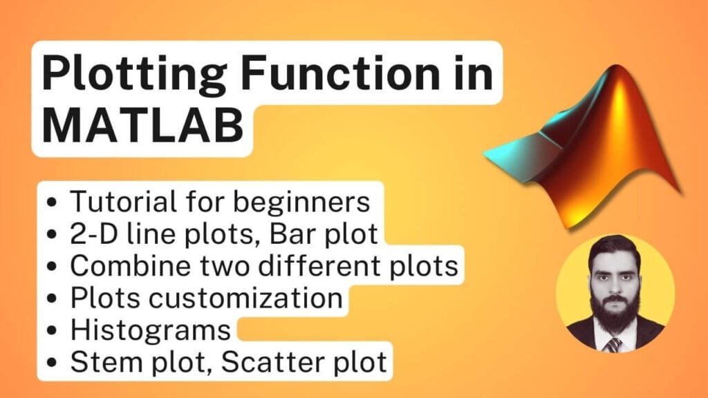
How to Plot Graph in MATLAB | Plotting Function Tutorials in MATLAB
Want to master plotting in MATLAB? In this video, we dive into the different types of MATLAB plots and how to create them, covering everything from basic line plots to more advanced visualizations. Whether you’re new to MATLAB or looking to sharpen your plotting skills, this tutorial will guide you through the essential techniques for data visualization.
This step-by-step tutorial not only teaches you the basics of MATLAB plotting, but also introduces advanced techniques to help you create professional-looking graphs that enhance your data analysis projects. Perfect for students, data scientists, and engineers alike! What you’ll learn:
- How to create 2-D line plots for simple data visualization
- How to use bar plots to visualize categorical data
- Explore polar plots for displaying data in a circular format
- Learn about stem plots to highlight data points in a visually appealing way
- Create scatter plots for representing relationships between variables
- Plot multiple lines on the same graph for comparison
- Customize line plots with markers for more informative visuals
- Combine two plots to create complex visualizations
- How to effectively plot histograms to analyze data distributions
3D Scatter Plots in MATLAB
3D scatter plots are an essential tool in data visualization, allowing users to represent three-dimensional data comprehensively. In MATLAB, the function scatter3 is utilized to create these plots, offering a visual representation that can convey complex relationships among data points in three-dimensional space. This is particularly useful when dealing with datasets involving multiple variables, as it aids in identifying patterns and correlations that may not be visible in two-dimensional plots.
When deciding whether to utilize a 3D scatter plot, consider the nature of your data. If your dataset consists of three distinct variables that interact dynamically, a 3D representation may provide greater insight. For instance, in fields such as engineering, economics, or natural sciences, displaying multidimensional data can facilitate superior comprehension of the underlying phenomena. The scatter3 function effectively plots individual points in three dimensions, enhancing the interpretability of complex data relationships.
The basic syntax for creating a 3D scatter plot in MATLAB is as follows:
scatter3(X, Y, Z, 'filled')
Here, X, Y, and Z are vectors representing the coordinates of the data points in three-dimensional space. The option ‘filled’ can be used to fill the markers for better visibility. For example:
X = rand(1, 100);
Y = rand(1, 100);
Z = rand(1, 100);
scatter3(X, Y, Z, 'filled')
This code snippet generates random data points in a 3D space, demonstrating the visual capabilities of a MATLAB scatter plot. You may further customize your scatter plot by adjusting properties such as marker size, color, and transparency, allowing for a tailored representation of your data to suit specific analytical needs.
3D scatter plots provide a robust framework within MATLAB for examining complex data structures, making them invaluable in modern data analysis practices. The ability to visualize three-dimensional relationships through the scatter3 function enhances understanding and supports informed decision-making based on data insights.
% Generate random data for X, Y, and Z axes
rng(42); % Set seed for reproducibility
x = randn(100,1); % 100 random numbers from normal distribution
y = randn(100,1);
z = randn(100,1);

% Generate random colors and sizes for the scatter points
colors = rand(100,1); % Random color values
sizes = 100 * rand(100,1); % Random marker sizes

% Create a 3D scatter plot
scatter3(x, y, z, sizes, colors, 'filled');

% Adding labels and title
xlabel('X Axis');
ylabel('Y Axis');
zlabel('Z Axis');
title('3D Scatter Plot in MATLAB');

% Adding colorbar
cb = colorbar;
cb.Label.String = 'Color Scale';

% Set view angle for better visualization
view(45,30); % Azimuth 45°, Elevation 30°

% Apply grid and set figure aesthetics
grid on;
colormap(jet);
Learn MATLAB with Free Online Tutorials
Explore our MATLAB Online Tutorial, your ultimate guide to mastering MATLAB! his guide caters to both beginners and advanced users, covering everything from fundamental MATLAB concepts to more advanced topics.

Examples of Real-world Applications of Scatter Plots
Scatter plots are an essential tool in numerous fields, providing visual insights into complex datasets by depicting relationships between variables. In finance, for example, analysts often utilize MATLAB scatter plots to examine the correlation between a company’s stock prices and market indices. By plotting these data points, they can identify trends and predict potential future performance, thus informing investment decisions.
In the realm of biology, scatter plots serve a crucial role in analyzing experimental results. Researchers may use a MATLAB scatter plot to represent the relationship between a specific treatment dose and the observed response in subjects. By visualizing the data this way, scientists can detect patterns that may indicate a dose-response relationship, aiding in drug development and medical research.
Another prominent application of MATLAB scatter plots is found in engineering, where they are used extensively for quality control processes. For instance, engineers may apply MATLAB scatter3, an extension of scatter plots in three dimensions, to analyze variations in product measurements. By plotting dimensions against tolerance limits, they can easily identify outliers and address issues in production consistency, thereby enhancing product quality.
Additionally, scatter plots are also widely used in environmental science to visualize the correlation between different factors such as pollution levels and respiratory diseases within populations. By employing a MATLAB scatter plot, researchers can effectively communicate their findings to policymakers, aiding in the formulation of regulations aimed at improving public health.
These examples highlight the versatility of scatter plots across various disciplines. By leveraging this powerful analytical tool, professionals can glean actionable insights from their datasets, illustrating the valuable role of MATLAB scatter in interpreting complex relationships.
MATLAB Assignment Help
If you’re looking for MATLAB assignment help, you’re in the right place! I offer expert assistance with MATLAB homework help, covering everything from basic coding to complex simulations. Whether you need help with a MATLAB assignment, debugging code, or tackling advanced MATLAB assignments, I’ve got you covered.
Why Trust Me?
- Proven Track Record: Thousands of satisfied students have trusted me with their MATLAB projects.
- Experienced Tutor: Taught MATLAB programming to over 1,000 university students worldwide, spanning bachelor’s, master’s, and PhD levels through personalized sessions and academic support
- 100% Confidentiality: Your information is safe with us.
- Money-Back Guarantee: If you’re not satisfied, we offer a full refund
Troubleshooting Common Issues with MATLAB Scatter Plots
When utilizing MATLAB scatter plots, users may occasionally encounter a variety of common issues that can hinder their data visualization efforts. One frequent problem arises from data formatting. The scatter function in MATLAB requires that the input data be structured correctly, meaning the dimensions of the x and y data arrays must align. For instance, if attempting to create a MATLAB scatter plot using mismatched vector sizes, users will receive an error message. To resolve this, ensure that the x and y vectors are of equal length. If your data source is a matrix, consider extracting the relevant columns to match the dimensionality before plotting.
Another typical issue involves the visualization of data points. Users may encounter scenarios where their MATLAB scatter plot fails to display correctly or yields a nonsensical view due to scaling issues or overplotting. This can be particularly prominent in datasets containing many overlapping points. To address this, adjusting the marker size may help. Using MATLAB commands such as ‘MarkerSize’ provides greater clarity. Furthermore, utilizing transparency settings for markers can enhance visibility, allowing underlying points to remain discernible.
In some cases, users may find that specific markers or color schemes do not properly represent their data, leading to confusion in interpretation. To rectify this, it is crucial to select appropriate colors and marker styles that are distinct and informative. MATLAB’s extensive color maps can be leveraged here to provide additional contrast between plotted datasets. Additionally, for 3D data, employing MATLAB scatter3 can lead to an improved understanding of data relationships by incorporating a third variable with depth and perspective.
Ultimately, identifying and troubleshooting these common issues is key to creating effective and informative MATLAB scatter plots. By adhering to proper data formatting and using visualization strategies thoughtfully, users can significantly enhance their data presentations.