Understanding Violin Plot
Violin plot are a sophisticated data visualization technique that combines the features of box plots and density plots to present data distributions in a more informative manner. Unlike traditional box plots, which provide summary statistics such as the median and quartiles, violin plots display the density of the data at different values, thereby revealing the underlying distribution across several categories.
The structure of a violin plot consists of a mirrored density plot on both sides of a central axis, flanked by a traditional box plot representation. This dual visualization allows for a comprehensive comparison between distributions. The width of the violin indicates the density of the data points in that region; broader sections represent higher probabilities of data occurrence, while narrower areas indicate lower probabilities. This makes the violin plot particularly valuable for exploring multimodal distributions, which conventional box plots may overlook.
One of the significant advantages of violin plots is their ability to provide insights at a glance while facilitating comparisons among different groups. For instance, researchers in biology can utilize violin plots to compare gene expression levels across various conditions, while social scientists might apply them to analyze survey responses segmented by demographic factors. In data science, tools such as Seaborn and ggplot2 in R offer straightforward implementations for creating visually appealing violin plots, enhancing the exploration of complex datasets.
Overall, violin plots present a unique way to visualize data distributions more thoroughly than traditional box plots can. Their versatility across disciplines showcases their significance in data analysis, making them a staple for professionals looking to communicate intricate data findings effectively. Examples of violin plots span a wide range of applications, giving users a robust method to discern patterns and insights in categorical data comparisons.
Use Cases for Violin Plot
Violin plots have gained popularity as a robust visualization tool, particularly when it comes to displaying complex distributions across multiple sub-groups. Their ability to effectively convey both the density of the data and its statistical information makes them suitable for a variety of scenarios. One prominent application of violin plots can be found in the field of genomics, where researchers often need to analyze the distribution of gene expression levels across distinct biological conditions or treatment groups. The seaborn violin plot in Python enables straightforward visual comparisons, allowing for an enhanced understanding of the variability and trends within the data.
In the finance sector, violin plots are useful for portraying the distribution of stock returns or other financial metrics across different time periods or asset classes. The detailed visualization provided by a ggplot violin plot allows analysts to discern underlying patterns that may not be apparent with traditional box plots. By visualizing the entire distribution, financial analysts are better positioned to identify skewness and multi-modal distributions, thus aiding in more informed decision-making.
Moreover, customer data analysis can benefit from the clarity offered by violin plots. For example, e-commerce companies can utilize violin plots to visualize customer behavior, such as purchasing patterns segmented by demographic groups. The violin plot matplotlib library in Python supports this analysis, allowing organizations to understand how different segments interact with their products, enhancing targeted marketing strategies.
Overall, violin plot examples from various disciplines illustrate their unique capacity to articulate the nuances of complex datasets can be used in Python Data Visualization Assignments or Homework. By offering a visual representation that combines elements of both summary statistics and distribution density, violin plots emerge as an indispensable tool for data visualization in a variety of research contexts.
Creating Violin Plot in Python Using Seaborn
Creating violin plots in Python can be accomplished efficiently using the Seaborn library, which is built on top of Matplotlib. Seaborn enhances the functionality of matplotlib, facilitating the creation of visually appealing statistical graphics, including violin plots. To get started, ensure that you have installed Seaborn along with the necessary libraries, namely Matplotlib and Pandas. You can install these libraries using pip as follows:
pip install seaborn matplotlib pandasOnce you have installed the necessary libraries, it is beneficial to source a sample dataset to utilize throughout this tutorial. The Iris dataset, which is commonly used for demonstrating data visualizations, can be easily loaded using the following code snippet:
import seaborn as sns
import pandas as pd
# Load the iris dataset
iris = sns.load_dataset('iris')
To create a basic violin plot using Seaborn, you can utilize the violinplot() function. This function allows you to visualize the distribution of the data across different categories efficiently. Below is a simple example that generates a violin plot of the petal length for each species in the Iris dataset:
sns.violinplot(x='species', y='petal_length', data=iris)This code will create a straightforward violin plot. However, Seaborn offers several customization options to enhance the visual presentation of the plot. For instance, you can adjust the color palettes using the palette parameter:
sns.violinplot(x='species', y='petal_length', data=iris, palette='muted')Additionally, you may wish to add annotations or adjust other aesthetic elements of the plot, such as bandwidth and scale. This flexibility allows you to create professional-looking visuals that convey the desired insights from your data succinctly. Through practical violin plot examples, you can tailor your analysis to meet specific presentation needs while utilizing Python’s capabilities.
import seaborn as sns
import matplotlib.pyplot as plt

# Load example dataset
tips = sns.load_dataset("tips")

# Create basic violin plot
plt.figure(figsize=(8, 6))
sns.violinplot(x="day", y="total_bill", data=tips)
plt.title("Basic Violin Plot with Seaborn")
plt.show()
Customized Violin Plot
plt.figure(figsize=(10, 6))
sns.violinplot(
    x="day",
    y="total_bill",
    data=tips,
    palette="Set2",
    inner="quartile",  # Show quartiles inside
    scale="width",     # All violins have same width
    cut=0             # Don't trim the tails
)
plt.title("Customized Violin Plot")
plt.xlabel("Day of Week")
plt.ylabel("Total Bill ($)")
plt.show()
Grouped Violin Plot
plt.figure(figsize=(12, 6))
sns.violinplot(
    x="day",
    y="total_bill",
    hue="sex",
    data=tips,
    split=True,  # For side-by-side comparison
    palette="coolwarm"
)
plt.title("Grouped Violin Plot by Gender")
plt.show()
Violin Plot with Matplotlib
import numpy as np

# Generate sample data
np.random.seed(42)
data = [np.random.normal(0, std, 100) for std in range(1, 4)]

# Create violin plot with matplotlib
plt.figure(figsize=(8, 6))
plt.violinplot(data, showmeans=True, showmedians=True)
plt.xticks([1, 2, 3], ['Group 1', 'Group 2', 'Group 3'])
plt.title("Violin Plot with Matplotlib")
plt.ylabel("Value")
plt.show()
Need Help in Programming?
I provide freelance expertise in data analysis, machine learning, deep learning, LLMs, regression models, NLP, and numerical methods using Python, R Studio, MATLAB, SQL, Tableau, or Power BI. Feel free to contact me for collaboration or assistance!
Follow on Social

Example: Python Violin Plot with Real-World Dataset
To demonstrate the utility of the violin plot in data analysis, we will utilize the popular Iris dataset, which contains measurements of different iris flower species. This dataset is frequently used for showcasing various data visualization techniques. Our goal is to illustrate how to create a violin plot using Python libraries such as Seaborn and Matplotlib.
First, we need to load the necessary libraries and the dataset. We will use the Pandas library to manage the data, Matplotlib for basic plotting functions, and Seaborn to create the violin plot. The following code snippet will accomplish this:
import pandas as pd
import seaborn as sns
import matplotlib.pyplot as plt
# Load the Iris dataset
iris = sns.load_dataset("iris")
With the data loaded, we can now create a violin plot to visualize the distribution of petal lengths across the various species of the iris flower. In this example, we will plot the petal_length against the species:
# Create a violin plot
plt.figure(figsize=(10, 6))
sns.violinplot(x='species', y='petal_length', data=iris)
plt.title('Violin Plot of Petal Length by Iris Species')
plt.show()
This will generate a violin plot displaying the density of petal lengths for each species. The width of the violin indicates the distribution; areas with greater width correspond to a higher density of data points. Notably, this visualization method reveals that the setosa species typically has shorter petal lengths compared to versicolor and virginica. By examining the plot, one can easily discern overlaps in petal lengths between different species, an essential insight in distinguishing them.
Data preprocessing, while minimal in this case, is crucial when dealing with other datasets. It may involve handling missing values or normalizing data, depending on the dataset’s complexity. In conclusion, the use of a violin plot allows for effective visual data representation and facilitates the interpretation of complex datasets.
Creating Violin Plot in R Using ggplot2
To construct a violin plot in R, one commonly utilizes the ggplot2 package, renowned for its versatility and ease of use. Before creating a violin plot, it is essential to ensure that the required packages are installed. You can install ggplot2 by executing the command install.packages("ggplot2") in the R console. After installation, load the package using library(ggplot2). This package adheres to the grammar of graphics, allowing for comprehensive and visually appealing data visualizations.
In the ggplot2 framework, various components contribute to the creation of a plot. For a violin plot, you will typically start with a dataset that includes a categorical variable (for grouping) and a continuous variable (for measurement). An example dataset that can be used is the mtcars dataset, which is present in R by default. This dataset comprises different car attributes, such as miles per gallon (mpg) and number of cylinders (cyl). For illustration, we can create a ggplot violin plot depicting the distribution of miles per gallon grouped by the number of cylinders.
To generate the plot, use the following code:
ggplot(mtcars, aes(x = factor(cyl), y = mpg)) +
geom_violin() +
labs(title = 'Violin Plot of MPG by Number of Cylinders', x = 'Number of Cylinders', y = 'Miles Per Gallon')
This code sets the aesthetic mapping, defining the x-axis as the number of cylinders and the y-axis as miles per gallon. The geom_violin() function generates the violin plot, which illustrates the distribution and density of the data. To enhance the visual appeal, you may incorporate additional attributes, such as color coding, using fill and faceting with facet_wrap() to display distributions across multiple categories. The resulting ggplot violin plot not only visualizes key information but also enriches data interpretation through its informative design.
Enhanced Plot
ggplot(mtcars, aes(x=factor(cyl), y=mpg, fill=factor(cyl))) +
  geom_violin(trim=FALSE, alpha=0.6) +
  geom_boxplot(width=0.1, fill="white") +
  scale_fill_brewer(palette="Blues") +
  ggtitle("Enhanced Violin Plot with Boxplot") +
  theme_minimal() +
  labs(fill="Cylinders")
Split Plot
# Create a modified dataset with a grouping variable
mtcars$am <- factor(mtcars$am, labels=c("Automatic", "Manual"))

ggplot(mtcars, aes(x=factor(cyl), y=mpg, fill=am)) +
  geom_violin(position=position_dodge(0.8), alpha=0.7) +
  geom_boxplot(position=position_dodge(0.8), width=0.15) +
  scale_fill_manual(values=c("#E69F00", "#56B4E9")) +
  ggtitle("Split Violin Plot by Transmission Type") +
  xlab("Number of Cylinders") +
  theme_bw()
With Density Curve
ggplot(mtcars, aes(x=factor(cyl), y=mpg)) +
  geom_violin(aes(fill=after_stat(density)), trim=FALSE) +
  geom_violin(trim=FALSE, fill=NA, color="black") +
  stat_summary(fun=median, geom="point", size=2, color="red") +
  ggtitle("Violin Plot with Density Coloring") +
  scale_fill_gradient(low="lightblue", high="darkblue") +
  guides(fill="none")  # Hide the legend for density
Learn Python for Data Analysis Assignment
This guide offers a thorough introduction to Python, presenting a comprehensive guide tailored for beginners who are eager to embark on their journey of learning Python from the ground up.

Example: R Violin Plot with Real-World Dataset
Creating a violin plot in R is a straightforward process that can enhance data visualization significantly, especially when analyzing distributions. To illustrate this, we will utilize a real-world dataset, specifically the ‘mtcars’ dataset, which is included in R’s base packages. This dataset contains various attributes of different car models and is ideal for demonstrating the creation of a violin plot.
Begin by importing the necessary libraries: ggplot2 for visual rendering and dplyr for data manipulation. The first step involves loading the dataset using the data(mtcars) command. Following this, we can preprocess the data if necessary, such as filtering for specific car types and selecting relevant variables for analysis. For instance, we might want to explore the relationship between the number of cylinders and miles per gallon (mpg).
Next, we will generate the violin plot using the ggplot() function combined with the geom_violin() method. This allows us to visualize the distribution of mpg across different cylinders. For clarity and additional insights, we can layer aesthetic adjustments, such as adding geom_boxplot() inside the violin plot to depict summary statistics. An example of this command in R would be:
ggplot(mtcars, aes(x = factor(cyl), y = mpg)) +
geom_violin(trim = FALSE) +
geom_boxplot(width = 0.1, fill = "white")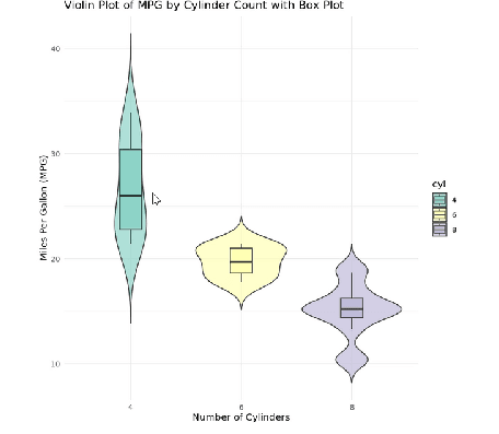
This code will result in a comprehensive violin plot that depicts the density of mpg according to the number of cylinders. The incorporation of the boxplot provides additional information regarding the median and interquartile ranges. This layered approach not only creates effective data visualization but also enhances interpretability, showcasing how a violin plot can convey information about the data distribution, complementing insights that might be less visible with other chart types.
In contrast to the Python example, R’s ggplot2 package offers a highly customizable environment, allowing users to explore various aesthetics and annotations that improve the visual understanding of the data. With proper adjustments, the R violin plot serves to deliver a visually appealing and informative representation of the data.
Interpreting Violin Plot: Insights and Comparisons
Violin plots are a sophisticated graphical tool that provides insights into the distribution and density of data across different categories. They effectively convey complex information by combining the features of box plots and density plots. The shape of the violin indicates the data distribution, while the central line within the plot often represents the median. Understanding the density curves within a violin plot is crucial for interpreting the underlying data; wider sections indicate higher concentrations of data points, while narrowed areas suggest fewer observations.
Additionally, the presence of outliers can be visually identified in a graph which enables researchers to pinpoint anomalies in their datasets. Outliers, typically marked as individual points outside the density curves, represent values significantly deviating from the majority of observations. Analyzing these outliers alongside the density distribution can provide valuable insights regarding data variety or potential measurement errors.
When comparing violin plots to traditional box plots, one can recognize the additional information that violin plots offer. Box plots primarily summarize data through quartiles, highlighting medians and interquartile ranges. In contrast, violin plots allow for a deeper understanding of the data distribution and nuances, revealing patterns that may not be visible through a box plot alone. The ggplot violin plot and the seaborn violin plot in Python, for instance, provide excellent tools for visualizing such data.
To convey findings effectively based on the visual output from violin plots, practitioners should focus on the shapes and widths of the violins, relative positioning of the density curves across groups, and any notable outliers. These graph examples from varied datasets can strengthen interpretations by illustrating specific findings and revealing comparative differences. This holistic view of the data empowers researchers to draw more nuanced conclusions and communicates insights with clarity.
Comparing Violin Plot to Box Plot
Violin plots and box plots are both effective tools for visualizing the distribution of a dataset; however, they serve different purposes and cater to varying analytical needs. A box plot provides a concise summary of the dataset through five key metrics: minimum, first quartile, median, third quartile, and maximum. This compact display makes it easy to identify outliers and central tendencies. In contrast, a violin plot extends this by illustrating the distribution shape and density of the data, making it particularly advantageous when assessing the underlying distribution.
One of the significant strengths of the violin plot is its ability to reveal more about the distribution than the box plot. While the latter simply shows summary statistics, the violin plot encapsulates the density of the values at different points, allowing for the visualization of multimodal distributions. This distinction is particularly relevant in fields such as biology or ecology, where understanding complex, varied data distributions is crucial. For instance, in genomic data analysis, a seaborn violin plot can reveal distinct expression levels across different genes, which may not be apparent in a simpler box plot.
Despite their advantages, violin plots can also present challenges. Their complexity may lead to misinterpretation, especially for audiences unfamiliar with statistical visualizations. In scenarios where specific summary statistics are required, such as in regulatory reporting or basic exploratory data analysis, box plots may prove more effective and easier to digest. For example, during the analysis of survey data, a clear ggplot violin plot could visually overwhelm audiences looking solely for median responses and quartile distributions that a box plot elegantly conveys.
# Python code to compare violin and box plots
plt.figure(figsize=(12, 5))

plt.subplot(1, 2, 1)
sns.boxplot(x="day", y="total_bill", data=tips)
plt.title("Box Plot")

plt.subplot(1, 2, 2)
sns.violinplot(x="day", y="total_bill", data=tips)
plt.title("Violin Plot")

plt.tight_layout()
plt.show()
# R code to compare violin and box plots
library(gridExtra)

plot1 <- ggplot(tips, aes(x=day, y=total_bill)) +
  geom_boxplot() +
  ggtitle("Box Plot")

plot2 <- ggplot(tips, aes(x=day, y=total_bill)) +
  geom_violin() +
  ggtitle("Violin Plot")

grid.arrange(plot1, plot2, ncol=2)
In settings where both plots could apply, combining them can yield a more comprehensive understanding. A box plot overlaid on a violin plot can provide a holistic view, highlighting summary statistics while showcasing distribution shapes. Thus, while each visualization has unique strengths and limitations, selecting between them depends on the specific context and audience needs.
Conclusion and Further Reading
Throughout this blog post, we have delved into the intricacies of violin plots, a powerful tool for visualizing data distributions. This plotting method effectively merges the qualities of box plots and density plots, providing a comprehensive view of the data landscape. By utilizing libraries such as Seaborn and Matplotlib in Python, as well as ggplot in R, users can create informative visual representations tailored to their specific datasets. We have explored several violin plot examples, demonstrating how these visualizations can reveal patterns, outliers, and variations within multiple data categories.
In practice, implementing a violin plot R or utilizing the Seaborn violin plot in Python can enhance one’s ability to convey complex statistical information succinctly. When contextualizing this visual tool, choosing between methods such as the violin plot matplotlib or ggplot can depend on user preference and specific analytical needs. The capability of these tools to visualize distributions side by side proves beneficial when comparing multiple groups.
For those aspiring to expand their skill set, numerous resources are available to deepen your understanding of violin plots and data visualization techniques. To begin your journey, check the official documentation for both Seaborn and Matplotlib, which includes thorough guides on generating violin plots. Furthermore, online tutorials, courses, and communities dedicated to data science and visualization can provide valuable insights and practical exercises. Engaging with these resources can greatly enhance your proficiency in creating effective visualizations, ultimately leading to more impactful data analysis.
We encourage readers to continue exploring the world of data visualization, experimenting with different types of plots, and honing their analytical skills through practice and further study.