Introduction to Time Series Plot
Time series plot are a fundamental tool in data analysis, playing a crucial role in visualizing data points that are indexed in time order. These plots serve to illustrate trends, cycles, and seasonal variations in data, making them particularly valuable in various fields such as finance, economics, and meteorology. By systematically aligning the data along a time axis, they allow analysts to observe how factors fluctuate over time, providing insights that might not be obvious through tabular or non-visual data representations.
The significance of time series plots becomes evident when one considers their applications. In finance, for instance, stakeholders utilize time series visualizations to track stock prices, interest rates, and economic indicators, thereby aiding in decision-making processes. Similarly, in weather forecasting, meteorologists rely on time series analysis to predict future weather conditions based on historical data patterns. Such insights are vital for resource management and planning across numerous sectors.
There are various libraries and tools available for creating time series plots, with matplotlib and Plotly being two of the most widely used in Python. Both libraries offer capabilities to generate visually appealing and informative time series plots that help in understanding data dynamics. In R, packages like ggplot2 and plotly provide similar functionalities, allowing users to create effective visualizations for Python Homework or R Programming Assignments tailored to their specific analysis needs.
- Identifying trends and patterns
- Spotting seasonality in data
- Forecasting future values
- Detecting anomalies or outliers
Overall, time series analysis enriched by visual representation not only enhances the interpretation of complex datasets but also facilitates informed decision-making. By leveraging tools available in Python and R, data practitioners can effectively utilize time series plots to reveal trends and make predictions that are essential in today’s data-driven environment.
Understanding Time Series Data
Time series data represents a sequence of observations recorded over time, often utilized in various fields such as finance, economics, and environmental science. The primary characteristic of time series data is its temporal ordering, where data points are collected at consistent intervals. This feature distinguishes time series from cross-sectional data, where observations are collected at a single point in time.
One of the fundamental components of time series data is the trend, which reflects the long-term movement in the data. Trends can be upward, downward, or flat, and identifying a trend is crucial for understanding overall performance over time. For example, a plotly time series plot can effectively illustrate a trend by providing a clear visual representation of changes across a specified timeline.
Another key element is seasonality, which refers to periodic fluctuations that occur at regular intervals due to external factors, such as seasons, holidays, or economic cycles. Seasonality can greatly influence data interpretation, making it essential to account for these patterns in both matplotlib time series and R visualization methods. Recognizing and adjusting for seasonal effects help in ensuring that the analysis accurately reflects underlying trends.
Furthermore, noise in time series data indicates the random variability that can obscure real movements. Noise arises from various sources such as measurement errors or external influences that are not related to the underlying trend or seasonal patterns. When creating time series plots, particularly in Python or R, it is crucial to differentiate between actual signals and noise. This differentiation enhances the quality of insights obtained from the data.
In summary, understanding the components of time series data—trends, seasonality, and noise—constitutes a foundational element in effectively analyzing and interpreting the data. By employing efficient visualization techniques through libraries such as matplotlib for Python or using ggplot2 in R, practitioners can enhance their analyses and derive meaningful insights from time series plots.
Creating Time Series Plot in Python: Using Matplotlib
Time series data is crucial for various analytical tasks and understanding trends over time. To visualize this type of data effectively in Python, the Matplotlib library can be utilized. Below, we outline a detailed, step-by-step approach to creating a time series plot using Matplotlib, complete with code snippets for clarity.
First, ensure that you have the necessary libraries installed. You will need Matplotlib and potentially Pandas for handling data. Install these using pip if you haven’t already:
pip install matplotlib pandasNext, import the libraries in your Python script:
import pandas as pd
import matplotlib.pyplot as plt
Now, let’s load some time series data. For demonstration purposes, you can create a Pandas DataFrame with date ranges and some dummy values:
dates = pd.date_range(start='2020-01-01', periods=100)
data = pd.Series(range(100), index=dates)
With the data prepared, it’s time to craft your time series plot. Utilize the plot() method to visualize the data:
plt.figure(figsize=(10, 5))
data.plot()
plt.title('Time Series Plot using Matplotlib')
plt.xlabel('Date')
plt.ylabel('Value')
plt.grid(True)
plt.show()
This code snippet will generate a basic time series plot. Note that you can customize the aesthetics further. For instance, you might change the line style, add markers, or modify the color to enhance readability. Each plot element contributes significantly to how the time series data is perceived. Adding titles, labels, and adjusting styles can make it more informative.
Overall, creating a time series plot with Matplotlib in Python provides a robust way to visualize trends and patterns over time. As you delve deeper into time series analysis, you may explore additional libraries like Plotly for interactive plots that enhance visual engagement and analysis.
Need Help in Programming?
I provide freelance expertise in data analysis, machine learning, deep learning, LLMs, regression models, NLP, and numerical methods using Python, R Studio, MATLAB, SQL, Tableau, or Power BI. Feel free to contact me for collaboration or assistance!
Follow on Social

Creating Time Series Plot in Python: Using Seaborn
Seaborn is a powerful visualization library in Python that builds on the capabilities of Matplotlib, making it particularly attractive for creating aesthetically pleasing time series plots. To begin, ensure you have Seaborn installed in your working environment. You can easily install Seaborn via pip with the command pip install seaborn. Once installed, you can leverage its features to create insightful time series visualizations.
To illustrate the process, let’s take a sample dataset containing time series data. A common practice involves importing necessary libraries, including Pandas for data manipulation and Seaborn for plotting. Upon loading your dataset, the first step in crafting your time series plot is to convert your date column into a datetime format using pd.to_datetime(). This conversion allows Seaborn to effectively interpret the dates along the x-axis.
Next, utilize the seaborn.lineplot() function to create the time series plot. You need to specify your time variable on the x-axis and your data variable on the y-axis. The Seaborn library offers various parameters to enhance your plot’s aesthetics, such as changing the color palette or adding markers. Additionally, you can implement the style or hue parameters to differentiate multiple time series within the same plot.
To improve interpretability, consider adding title and labels using plt.title(), plt.xlabel(), and plt.ylabel(). Incorporating a legend is essential if you are visualizing multiple variables, enhancing the clarity of your time series in Python. Once you’ve configured your plot, display it using plt.show().
import matplotlib.pyplot as plt
import seaborn as sns
import pandas as pd

# Create DataFrame
df = pd.DataFrame({
    'Date': pd.date_range(start='2023-01-01', periods=120, freq='D'),
    'Value': [i + (i * 0.1) + (5 * (i % 7)) for i in range(120)]
})

plt.figure(figsize=(12, 6))
sns.lineplot(data=df, x='Date', y='Value', color='green', linewidth=2.5)
plt.title('Time Series Plot with Seaborn', fontsize=16)
plt.xlabel('Date', fontsize=14)
plt.ylabel('Value', fontsize=14)
plt.grid(True, linestyle='--', alpha=0.5)
plt.xticks(rotation=45)
plt.tight_layout()
plt.show()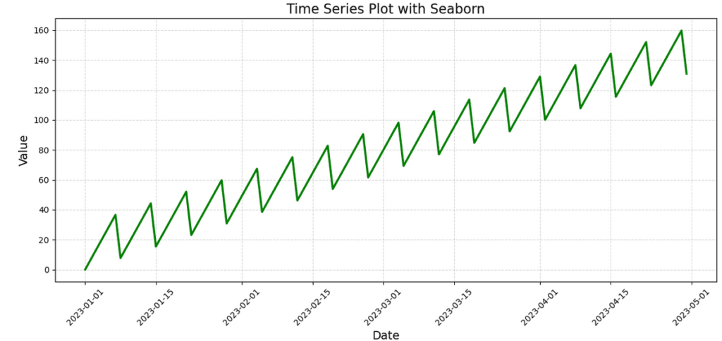
By focusing on aesthetics and the clarity of visual information, Seaborn allows users to easily create compelling time series plots that can effectively communicate trends and patterns within the data. The combination of Seaborn with other libraries offers a robust framework for visual analysis of time series data. In summary, employing Seaborn enhances both the function and appearance of time series plots, facilitating a deeper understanding of the underlying temporal dynamics.
Creating Time Series Plot in Python: Using Plotly
Creating interactive time series plots in Python can be efficiently achieved through the use of Plotly, a powerful library for data visualization. Plotly facilitates the generation of web-based, interactive graphs that enhance the analysis and presentation of time series data. To illustrate the capabilities of Plotly for time series visualization, we will employ a real-world dataset, enabling you to grasp its practical application.
To get started, first ensure that you have the Plotly library installed. You can do this using pip:
pip install plotlyOnce the library is ready, you can begin creating your time series plot. Import the necessary libraries, including Pandas for data manipulation, and load your dataset. A common approach is to set the date column as the index to facilitate time-based plotting.
For instance, consider a dataset consisting of daily sales figures. After loading the data, you can use Plotly’s plotly.graph_objects module to construct a time series plot. The following snippet exemplifies the process:
import pandas as pd
import plotly.graph_objects as go
# Load your dataset
data = pd.read_csv('sales_data.csv', parse_dates=['date'], index_col='date')
# Create the time series plot
fig = go.Figure()
fig.add_trace(go.Scatter(x=data.index, y=data['sales'], mode='lines+markers', name='Sales'))
This code snippet generates an interactive time series plot that enables users to hover over data points for additional information while viewing the trend of sales over time. One of Plotly’s significant advantages is the ability to zoom in on specific periods for detailed analysis. Users can easily select a range on the x-axis to inspect areas of interest.
Moreover, Plotly offers options to export your plots as HTML files, making them suitable for web applications or reports. By incorporating these features, you can create visually appealing and informative time series plots that enhance your data storytelling, showcasing the potential of time series in Python through Plotly.
Learn Python for Data Analysis Assignment
This guide offers a thorough introduction to Python, presenting a comprehensive guide tailored for beginners who are eager to embark on their journey of learning Python from the ground up.

Creating Time Series Plot in R: Using ggplot2
Creating time series plots in R can effectively visualize trends over time, especially when employing the versatile ggplot2 package. ggplot2 is a powerful tool that adheres to the grammar of graphics, allowing users to construct layered visualizations. To begin, ensure that your R environment has the ggplot2 package installed. If it is not already available, you can install it using the command install.packages("ggplot2").
Once ggplot2 is installed, you can start creating a basic time series plot. For instance, consider a dataset containing dates and corresponding values. You can create a time series plot by using the ggplot() function, combined with geom_line() to illustrate the data points over time. Here’s a simple coding example:
library(ggplot2)
data <- data.frame(date = as.Date('2020-01-01') + 0:29, value = rnorm(30))ggplot(data, aes(x = date, y = value)) + geom_line() + labs(title = "Time Series Plot", x = "Date", y = "Value")
This basic approach provides a straightforward line graph. However, customization enhances readability, enabling deeper insight into trends. You can change aesthetics, such as color and line type, or include additional layers to better illustrate data patterns. Adding smooth lines with geom_smooth() helps visualize general trends clearly.
library(ggplot2)
library(lubridate)

# Create sample data
dates <- seq(as.Date("2023-01-01"), by="day", length.out=120)
values <- 1:120 + (1:120 * 0.1) + (5 * ((1:120) %% 7))

# Create data frame
df <- data.frame(Date = dates, Value = values)

# Create time series plot
ggplot(df, aes(x = Date, y = Value)) +
  geom_line(color = "steelblue", size = 1) +
  labs(title = "Time Series Plot with ggplot2",
       x = "Date",
       y = "Value") +
  theme_minimal() +
  theme(plot.title = element_text(size = 16, face = "bold"),
        axis.title = element_text(size = 14),
        axis.text.x = element_text(angle = 45, hjust = 1)) +
  scale_x_date(date_labels = "%b %Y", date_breaks = "1 month")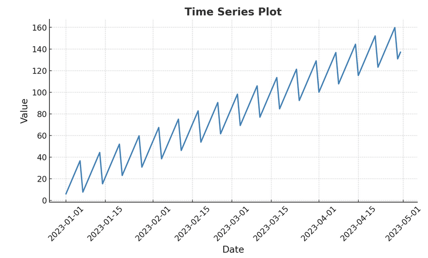
With ggplot2, you can also modify the scale and theme of your plot. For instance, using scale_x_date() allows for date formatting, and theme_minimal() gives your plot a clean, modern look. By customizing your time series plots in R, you can derive significant insights from complex data sets.
Examples with Real-World Datasets
Time series plots offer invaluable insights across various domains by enabling the visualization of data over time. In this section, we will explore diverse real-world examples that leverage Python and R for creating effective time series visualizations. Whether you are studying stock prices, tracking temperature changes, or analyzing sales trends, employing libraries like matplotlib for Python or leveraging plotly in both languages can enhance the interpretation of your datasets.
For instance, consider the stock price data of a leading technology company. Using a matplotlib time series approach, you can plot the daily closing prices over several years. This visualization empowers investors and analysts to identify long-term trends, seasonal patterns, and anomalies in the stock’s performance, providing a strong basis for informed decision-making.
Similarly, analyzing temperature records is critical for climate research. Utilizing the time series in R framework, researchers can plot historical temperature data to visualize rising trends in global temperatures. This enables comprehension of climate anomalies and can guide policy changes in environmental practices.
Sales data is another prime candidate for time series analysis. For businesses, understanding sales trends over time can uncover valuable insights regarding consumer behavior. By utilizing plotly time series capabilities in R, companies can create interactive visualizations that allow stakeholders to explore sales patterns, identify peak seasons, and strategize future marketing efforts.
Real-World Example: Air Passenger DataPython Implementation
import pandas as pd
import matplotlib.pyplot as plt
import seaborn as sns

# Load built-in dataset
data = sns.load_dataset('flights')

# Plot monthly passengers
plt.figure(figsize=(14, 7))
sns.lineplot(data=data, x='year', y='passengers', hue='month',
             palette='viridis', linewidth=2.5)
plt.title('Monthly Air Passengers (1949-1960)', fontsize=16)
plt.xlabel('Year', fontsize=14)
plt.ylabel('Passengers (thousands)', fontsize=14)
plt.legend(title='Month', bbox_to_anchor=(1.05, 1), loc='upper left')
plt.grid(True, linestyle='--', alpha=0.5)
plt.tight_layout()
plt.show()
R Implementationlibrary(ggplot2)
library(datasets)
# Load AirPassengers data
data <- data.frame(
Date = as.Date(paste(rep(1949:1960, each=12), rep(1:12, 12), 1),
Passengers = as.vector(AirPassengers)
)
# Plot
ggplot(data, aes(x = Date, y = Passengers)) +
geom_line(color = "darkorange", size = 1) +
labs(title = "Monthly Air Passengers (1949-1960)",
x = "Year",
y = "Passengers (thousands)") +
theme_minimal() +
theme(plot.title = element_text(size = 16, face = "bold"),
axis.title = element_text(size = 14)) +
scale_x_date(date_labels = "%Y", date_breaks = "1 year")
library(ggplot2)
library(datasets)

# Load AirPassengers data
data <- data.frame(
  Date = as.Date(paste(rep(1949:1960, each=12), rep(1:12, 12), 1),
  Passengers = as.vector(AirPassengers)
)

# Plot
ggplot(data, aes(x = Date, y = Passengers)) +
  geom_line(color = "darkorange", size = 1) +
  labs(title = "Monthly Air Passengers (1949-1960)",
       x = "Year",
       y = "Passengers (thousands)") +
  theme_minimal() +
  theme(plot.title = element_text(size = 16, face = "bold"),
        axis.title = element_text(size = 14)) +
  scale_x_date(date_labels = "%Y", date_breaks = "1 year")
These examples highlight how time series plots serve as essential tools for data visualization and interpretation across various fields. By leveraging the capabilities of Python and R, analysts and researchers can effectively communicate complex datasets, making informed decisions based on empirical evidence. In conclusion, the effective use of time series plots enhances our understanding of trends and patterns that define our world.
Case Study: Time Series Analysis of Apple Stock Prices
Objective
In this case study, we will:
- Download historical stock price data for Apple Inc. (AAPL)
- Perform basic time series visualization (closing prices over time)
- Perform advanced time series analysis (daily returns, volatility)
Why Analyze Stock Prices?
Stock prices are a classic example of time series data. Analyzing them helps investors:
- Identify trends (upward or downward movements)
- Understand volatility (how much the stock price fluctuates)
- Make informed decisions based on historical performance
1. Import Libraries and Download Data
import yfinance as yf
import pandas as pd
import matplotlib.pyplot as plt
import seaborn as sns

# Download Apple stock data
ticker = "AAPL"
data = yf.download(ticker, start="2018-01-01", end="2023-01-01")

# Display the first few rows
print(data.head())
2. Plot Closing Prices Over Time
plt.figure(figsize=(12, 6))

# Plot the closing prices
plt.plot(data.index, data['Close'], color='blue', label='Closing Price', linewidth=1.5)

# Add title and labels
plt.title(f'{ticker} Stock Closing Prices (2018-2023)', fontsize=16)
plt.xlabel('Date', fontsize=14)
plt.ylabel('Closing Price (USD)', fontsize=14)

# Customize the plot
plt.grid(True, linestyle='--', alpha=0.7)
plt.legend(fontsize=12)
sns.despine()

# Show the plot
plt.tight_layout()
plt.show()
3. Analyze Daily Returns (Volatility)
# Calculate daily returns
data['Daily_Return'] = data['Close'].pct_change() * 100

# Plot daily returns
plt.figure(figsize=(12, 6))
plt.plot(data.index, data['Daily_Return'],
         color='purple',
         label='Daily Returns',
         linewidth=1)

# Add horizontal line at zero
plt.axhline(y=0, color='black', linestyle='--', linewidth=0.8)

# Add title and labels
plt.title(f'{ticker} Stock Daily Returns (Volatility)', fontsize=16)
plt.xlabel('Date', fontsize=14)
plt.ylabel('Daily Return (%)', fontsize=14)

# Customize the plot
plt.grid(True, linestyle='--', alpha=0.5)
plt.legend(fontsize=12)
sns.despine()

# Show the plot
plt.tight_layout()
plt.show()
4. Advanced Analysis: Moving Averages
# Calculate moving averages
data['50_MA'] = data['Close'].rolling(window=50).mean()
data['200_MA'] = data['Close'].rolling(window=200).mean()

# Plot with moving averages
plt.figure(figsize=(14, 7))
plt.plot(data.index, data['Close'], color='blue', label='Closing Price', alpha=0.5)
plt.plot(data.index, data['50_MA'], color='orange', label='50-Day MA', linewidth=2)
plt.plot(data.index, data['200_MA'], color='red', label='200-Day MA', linewidth=2)

# Add title and labels
plt.title(f'{ticker} Stock Price with Moving Averages', fontsize=16)
plt.xlabel('Date', fontsize=14)
plt.ylabel('Price (USD)', fontsize=14)

# Customize the plot
plt.grid(True, linestyle='--', alpha=0.5)
plt.legend(fontsize=12)
sns.despine()

# Show the plot
plt.tight_layout()
plt.show()
Key Insights from Apple Stock Analysis
- Long-term Trend: The stock shows a strong upward trend from 2018 to 2023
- Volatility Patterns: Higher volatility observed during market uncertainty (e.g., COVID-19 pandemic in 2020)
- Moving Average Crossovers: Golden crosses (50MA crossing above 200MA) often precede bullish trends
- Daily Returns: Most daily fluctuations are within ±5%, with occasional larger spikes

Interpreting Time Series Plots
Interpreting time series plots is an essential skill in data analysis, as it allows analysts to draw meaningful insights from temporal data. When reviewing a time series plot, one must look for specific elements that reveal the underlying patterns and behaviors of the data over time. Among the key features to identify are trends, seasonal patterns, and anomalies.
Trends in a time series plot indicate the general direction in which the data is moving over the observed period. For instance, when using Plotly time series or Matplotlib time series, trends can often be discerned through ascending or descending lines that persist across multiple data points. Recognizing these trends helps in forecasting future values and making informed decisions based on projected growth or decline.
When analyzing a time series plot, look for these key characteristics:
- Trend: Is the data generally increasing, decreasing, or stable over time?
- Seasonality: Are there regular patterns that repeat at fixed intervals (daily, weekly, yearly)?
- Cycles: Are there fluctuations that don't occur at fixed intervals (often related to economic factors)?
- Irregularities: Are there unexpected spikes or drops that might indicate anomalies?
- Stationarity: Does the statistical properties (mean, variance) remain constant over time?
Seasonal patterns refer to regular fluctuations that occur at specific periods within the data. For example, a time series in Python may show increased sales in the holiday season each year. Identifying these patterns can be crucial for businesses as they incorporate seasonality into their planning and decision-making processes. It's important to distinguish between genuine seasonal effects and random noise; tools like Python’s statsmodels library can be helpful in this analysis.
Finally, anomalies are unexpected deviations from the established patterns. These outliers may signify critical events or errors in the data collection process. In R, identifying anomalies can be achieved through various statistical techniques that flag these irregularities for further investigation. Understanding anomalies helps in mitigating risks and adapting strategies accordingly.
In conclusion, effective interpretation of time series plots is vital for comprehensive data analysis. By recognizing trends, seasonal components, and anomalies, analysts can leverage time series analysis for better decision-making and strategic planning.
Conclusion and Best Practices
Creating a time series plot is an essential skill for anyone involved in data analysis, particularly in fields such as finance, economics, and environmental studies. As outlined in this blog post, whether you utilize libraries like matplotlib in Python or plotly for interactive visualizations, the ability to effectively illustrate trends over time is invaluable. A well-constructed time series plot not only aids in identifying patterns but also assists in communicating insights to stakeholders.
To achieve clarity in your visualizations, it is crucial to select appropriate colors and markers. Using contrasting colors can help differentiate between various data series, thereby enhancing readability. Avoiding overly complex designs ensures that the viewer's attention is directed where it is most needed—on the data itself. Including labels for axes and legends can further mitigate ambiguity, ensuring your audience accurately interprets the information presented.
When working on time series in Python or R, think critically about the data visualizations you create. Incorporate titles that succinctly describe the plot and provide context. For instance, employing phrases like "Annual Revenue Trends" or "Monthly Temperature Variability" enables viewers to grasp the essence of the presented data at a glance. Additionally, consider the use of grid lines or reference lines that can help with comparative analysis, thereby enriching the viewer's understanding of the key trends.
Overall, effective plotting techniques in time series analysis can greatly enhance the storytelling power of your data. By adhering to best practices, such as clarity, appropriate color usage, and thoughtful data representation, you ensure that your audience successfully engages with and understands the intricacies of time series plots, regardless of the platform or library utilized.
Additional Resources
As you delve deeper into the world of time series analysis and visualization, having access to quality resources is essential for enhancing your understanding and skillset. Numerous books, online courses, and documentation can aid you in mastering the techniques necessary for creating impactful time series plots. For those interested in Python, several excellent texts can guide you through analyzing time series in Python using libraries such as Matplotlib and Plotly. A highly recommended book is "Python for Data Analysis" by Wes McKinney, which covers data manipulation and provides insights into various plotting libraries. Additionally, the "Hands-On Time Series Analysis with R" course on platforms like Coursera will equip you with foundational knowledge and practical examples to create effective time series plots.
For R enthusiasts, "Forecasting: Principles and Practice" by Rob J. Hyndman and George Athanasopoulos is an invaluable resource, offering comprehensive coverage of time series in R, including methods and practical applications. Their online resources frequently accompany the book, making it easier to visualize and understand complex concepts. Moreover, the official documentation for libraries such as ggplot2 and tidyquant provides a treasure trove of information on creating sophisticated time series plots.
Online platforms such as Udemy, edX, and DataCamp offer a range of courses specifically focused on time series analysis, tailored for both R and Python. These courses often feature hands-on projects, allowing you to practice your skills in real-time. Furthermore, GitHub repositories are replete with open-source projects that illustrate various time series plotting techniques using Matplotlib and Plotly, serving as practical examples to inspire your projects.
Engaging with community forums, such as Stack Overflow and dedicated Reddit threads, will also enhance your learning experience, as it allows you to seek advice and share insights on time series analysis challenges. Utilizing these resources will not only deepen your understanding of time series plotting but also foster a continuous learning journey in this fascinating field.