Introduction to Scatter Plot
Scatter plots are a fundamental tool in data visualization, used to assess the relationship between two quantitative variables. By plotting data points on a two-dimensional graph, scatter plot allow researchers and analysts to discern patterns, trends, and correlations that might not be apparent through other means. This blog will teach all the necessary skills to generate scatter plot in Python. A clear understanding of data relationships can guide decision-making and hypothesis testing in various fields, including finance, research, and social sciences.
One compelling aspect of scatter plot is their ability to reveal trends. For example, when you observe a group of points moving in a certain direction as you read along the x-axis, this visual cue indicates a relationship between the variables. Such a trend can indicate whether one variable tends to increase or decrease as the other changes, providing insights into underlying phenomena. Furthermore, scatter plot are instrumental in identifying outliers—data points that deviate significantly from the pattern established by the majority of the data. Recognizing these outliers is crucial, as they can profoundly affect statistical analyses and interpretations.
Clusters are another vital feature highlighted by scatter plot. Through visual segregation of data points, analysts can identify groups that share similar characteristics. This clustering can be particularly useful for segmenting data and uncovering insights specific to subsets of a population, which is relevant for tasks like market segmentation or performance analysis.
Creating scatter plot is achievable using various Python libraries such as Matplotlib, Seaborn, and Plotly. Each of these libraries has unique features, enabling users to customize their visualizations to effectively communicate their findings. The Python scatter plot functionalities provide users with a robust toolkit for highlighting relationships in data and delivering impactful visuals that support decision-making and further inquiry.
Learn Python for Data Analysis Assignment
This guide offers a thorough introduction to Python, presenting a comprehensive guide tailored for beginners who are eager to embark on their journey of learning Python from the ground up.

Getting Started with Python Visualization Libraries
Data visualization is a critical step in data analysis, and Python offers a rich ecosystem of libraries tailored for this purpose. Among these, Matplotlib, Seaborn, and Plotly are three prominent libraries widely utilized for crafting scatter plot and other visualizations. Understanding how to leverage these libraries effectively is key to enhancing your data representation skills.
To begin with, Matplotlib is one of the foundational libraries in Python for creating static, interactive, and animated plots. To install Matplotlib, you can use pip, Python’s package installer. The installation command is straightforward: pip install matplotlib. Once installed, you can easily create scatter plot by utilizing the plt.scatter function, which allows you to visualize the relationship between two variables on a Cartesian plane.
Seaborn, on the other hand, is built on top of Matplotlib and provides a high-level interface for drawing attractive statistical graphics. It simplifies the process of creating scatter plot by offering enhanced color palettes and statistical functions, making it a favorite among data scientists. Installation can be done with pip install seaborn. The Seaborn scatter plot can be created with just a single function call: seaborn.scatterplot, which also allows for easy customization regarding aesthetics.
Lastly, Plotly brings interactivity into the mix, enabling users to create dynamic visualizations that can be embedded into web applications. The library can be installed using pip install plotly. With Plotly, you can generate interactive scatter plot that offer features like zooming and hover information, enhancing user engagement in data exploration.
In conclusion, these libraries—Matplotlib, Seaborn, and Plotly—provide diverse functionalities for creating scatter plot in Python. Their installation and basic setup are essential prerequisites for getting started in data visualization.
Creating Scatter Plot in Matplotlib with Python
Creating a scatter plot in Python using the Matplotlib library is a straightforward process that allows for data visualization with clarity and precision. First, ensure that you have installed Matplotlib in your Python environment. You can install it via pip if you haven’t done so:
pip install matplotlibOnce the library is ready to use, the next step is to import it and prepare your data. For example, let us consider you have two lists of data points, x and y, which represent the coordinates of the points on the scatter plot.
import matplotlib.pyplot as pltx = [1, 2, 3, 4, 5]y = [2, 3, 5, 7, 11]To create the scatter plot, utilize the plt.scatter function, which is designed specifically for this purpose. Here’s a basic example:
plt.scatter(x, y)This command generates a simple scatter plot where the x values are on the horizontal axis and the y values on the vertical axis. To enhance the plot, you can customize various parameters, such as marker size, color, and labels.
plt.scatter(x, y, color='blue', marker='o', s=100)In the example above, the color is set to blue, the marker is circular ‘o’, and the size of the markers is set to 100. Additionally, adding titles and axes labels can significantly improve your plot’s readability:
plt.title('My Scatter Plot')plt.xlabel('X-axis Label')plt.ylabel('Y-axis Label')Finally, to display the scatter plot, use the plt.show() method. This will render the plot in a new window:
plt.show()Matplotlib also provides the option to annotate specific points on the scatter plot using the plt.annotate function. This feature can help highlight significant data points, improving the overall interpretability of your visualizations.
import matplotlib.pyplot as plt
import numpy as np

# Sample Data
np.random.seed(42)
x = np.random.rand(50) * 10
y = np.random.rand(50) * 10

# Create Scatter Plot
plt.figure(figsize=(8, 5))
plt.scatter(x, y, color='blue', marker='o', edgecolors='black', alpha=0.7)

# Customize Plot
plt.xlabel("X-axis Label")
plt.ylabel("Y-axis Label")
plt.title("Scatter Plot Using Matplotlib")
plt.grid(True)

# Show Plot
plt.show()
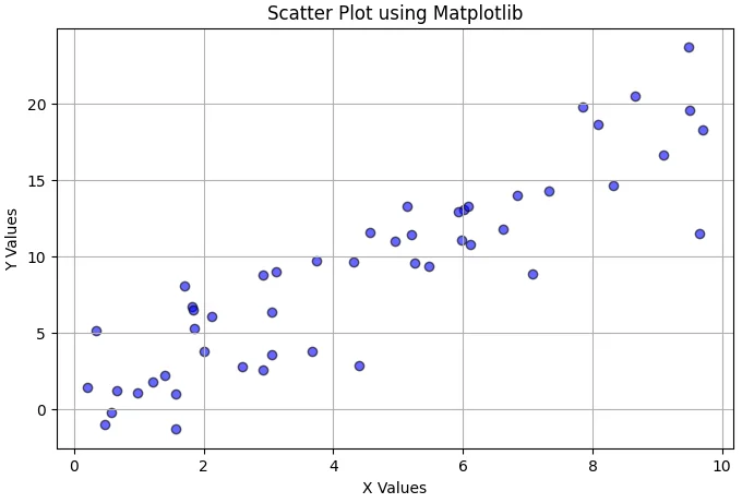
In conclusion, utilizing the Matplotlib library to create scatter plots in Python is an elementary yet powerful way to visually represent data. The ability to customize various aspects makes it a preferred choice for data scientists and analysts.
Learn Python for Data Analysis Assignment
This guide offers a thorough introduction to Python, presenting a comprehensive guide tailored for beginners who are eager to embark on their journey of learning Python from the ground up.
Creating Scatter Plot in Seaborn with Python
Seaborn is a powerful Python data visualization library built on top of Matplotlib, designed to create visually appealing plots with enhanced statistical functions. One of its prominent features is the ability to generate scatter plot with ease. By utilizing Seaborn, users can create scatter plot that are not only informative but also aesthetically pleasing and impactful.
To get started with a scatter plot in Seaborn, ensure that the library is installed alongside Matplotlib and any other dependencies. Install Seaborn using the pip package manager if you haven’t done so already:
pip install seabornBelow is a simple example demonstrating how to create a scatter plot using the Seaborn library. First, we would import the necessary packages and load a dataset:
import seaborn as snsimport matplotlib.pyplot as plt# Load example datasettips = sns.load_dataset('tips')Next, we can utilize the scatterplot function to create a basic scatter plot, featuring total bill amounts against the tips received:
sns.scatterplot(data=tips, x='total_bill', y='tip')plt.title('Total Bill vs Tip')plt.show()Seaborn allows users to enhance their scatter plot with options for color coding and point size adjustments. For instance, including a hue argument can separate the points based on different categories, such as day of the week:
sns.scatterplot(data=tips, x='total_bill', y='tip', hue='day', size='size', sizes=(20, 200), legend='full')This customization feature helps convey additional insights through color and size, enhancing the readability of the scatter plot. By leveraging Seaborn’s built-in themes, you can further refine the aesthetics of your scatter plot. Experiment with various styles using:
sns.set_style('whitegrid')import seaborn as sns
import pandas as pd
# Create DataFrame
df = pd.DataFrame({'X': x, 'Y': y})
# Create Scatter Plot
plt.figure(figsize=(8, 5))
sns.scatterplot(x='X', y='Y', data=df, color='green', edgecolor='black')
# Customize Plot
plt.xlabel("X-axis Label")
plt.ylabel("Y-axis Label")
plt.title("Scatter Plot Using Seaborn")
plt.grid(True)
# Show Plot
plt.show()

In this section, we explored how to create scatter plot using the Seaborn library effectively. The ability to incorporate different visual parameters allows for a more sophisticated analysis, enabling users to present their data in a clearer and more engaging manner.
Creating Scatter Plot in Plotly with Python
Plotly is a powerful library that allows for the creation of interactive scatter plot in Python. Its core advantage lies in the interactivity it offers, allowing users to explore data visually by offering tools like hover text, zoom functionality, and customizable styling options. This renders data interpretation more intuitive, especially for complex datasets where visual intricacies are necessary for understanding trends and relationships.
To create a scatter plot in Plotly, one must first import the necessary library and prepare the dataset. Plotly can be easily accessed via the pip package manager. Here is an example of how to initiate a scatter plot:
import plotly.express as px
import pandas as pd
# Sample data
df = pd.DataFrame({'x': [1, 2, 3, 4, 5],'y': [10, 11, 12, 13, 14],'category': ['A', 'B', 'A', 'B', 'A']})
# Creating a scatter
plotfig = px.scatter(df, x='x', y='y', color='category', title='Scatter Plot Example')
fig.show()
The above code snippet illustrates the creation of a simple scatter plot where points are distinguished by different colors based on their category. By using the px.scatter function, one can customize the aesthetics such as colors and titles.
In addition to basic functionality, Plotly’s scatter plot can be enhanced with interactive features. For example, hover information can be added to give users context about individual data points. This is achieved by modifying the hover_name parameter:
fig = px.scatter(df, x='x', y='y', color='category', hover_name='category')fig.show()Moreover, the visual appearance can be fine-tuned with options for markers, sizing, and additional layout controls. This makes Plotly scatter plot a preferred choice among data scientists and analysts looking for robust visualization capabilities.
import plotly.express as px

# Create DataFrame
df = pd.DataFrame({'X': x, 'Y': y})

# Create Scatter Plot
fig = px.scatter(df, x='X', y='Y', color_discrete_sequence=['red'],
                 title="Scatter Plot Using Plotly")

# Show Plot
fig.show()
To summarize, Plotly provides an excellent framework for creating interactive scatter plot in Python, empowering users to engage deeply with the data. Whether one is presenting findings or exploring datasets, the interactive features of Plotly elevate the experience beyond traditional static visualizations.
Comparing Matplotlib, Seaborn, and Plotly
When it comes to creating scatter plot in Python, three prevalent libraries stand out for their capabilities: Matplotlib, Seaborn, and Plotly. Each library offers unique strengths and caters to different user needs, so understanding their characteristics is crucial for selecting the right tool for your data visualization tasks.
Matplotlib serves as the foundation for many Python plotting libraries, providing a robust framework for generating a wide variety of static, animated, and interactive visualizations. Its flexibility allows users to customize plots extensively, making it an excellent choice for users who require detailed adjustments to their scatter plot. However, this power comes at the cost of complexity; beginners may find the syntax and customization options overwhelming initially.
In contrast, Seaborn is built on top of Matplotlib and simplifies the process of creating attractive statistical graphics. Particularly renowned for its ability to create informative and visually appealing scatter plot, Seaborn handles the plotting of complex datasets with ease. Its integrated themes and color palettes can enhance the aesthetics of a plot almost effortlessly, making it a preferred option for users focused on explorative data analysis. Nonetheless, those seeking customization beyond the predefined settings may encounter limitations.
Plotly stands out for its emphasis on interactive visualizations. The Plotly scatter plot capabilities allow users to create dynamic plots that can be embedded in web applications or shared online. This interactivity can significantly enhance data exploration and presentation, making it especially useful for dashboard applications or contexts where user engagement is key. However, Plotly may impose a steeper learning curve for those unaccustomed to working with JavaScript frameworks or web technologies.
In conclusion, the choice between Matplotlib, Seaborn, and Plotly ultimately depends on the specific demands of your data visualization tasks. For those prioritizing customizability and control, Matplotlib is ideal, while Seaborn excels in ease of use and visual appeal. On the other hand, if interactivity and online collaboration are paramount, Plotly is worth considering. Each library brings distinct advantages, enhancing the user’s ability to effectively communicate insights from data through scatter plots in Python.
Tips for Customizing Scatter Plot in Python
Customizing scatter plots enhances their interpretability and ensures the key information is communicated effectively. When using Matplotlib, Seaborn, or Plotly, various features can be adjusted to improve the overall presentation of your visualization. The first aspect to consider is the choice of colors and markers. Different colors can represent different categories or clusters within your data, making it easy to distinguish between them. For instance, when using plt.scatter in Matplotlib, you can specify both the color and marker style to create a visually appealing plot. In Seaborn, the scatter plot function allows for similar customization via the hue parameter.
Another important customization tip includes adjusting the axis labels and the plot title. Clear labeling not only guides audiences in understanding the data but also enhances the professionalism of your scatter plot. In Matplotlib, this can be done with the xlabel and ylabel functions, while in Plotly, the layout object provides parameters to set titles and axis labels succinctly. Additionally, consider adding legends to your plots if you have multiple datasets represented on the same graph. This is crucial, especially when users need to differentiate between categories easily. Matplotlib offers the legend function, while Seaborn can handle legend entries automatically based on the hue.
Finally, accessibility in your plot is key. Ensure that colors used are distinguishable by individuals with color blindness by selecting color palettes designed for clarity. Additionally, maintaining sufficient contrast between plot elements and the background will enhance readability. By following these tips, you will create effective scatter plots using scatter plot python tools, whether through the strong functionalities of matplotlib scatter, the aesthetics of the seaborn scatter plot, or the interactivity offered by plotly scatter.
Matplotlib Example
plt.figure(figsize=(8, 5))
plt.scatter(x, y, c=x, cmap='viridis', marker='s', edgecolors='black', s=100, alpha=0.8)

# Customize Labels & Title
plt.xlabel("X-axis Label")
plt.ylabel("Y-axis Label")
plt.title("Customized Scatter Plot")

# Color Bar
plt.colorbar(label="Color Scale")

# Grid
plt.grid(True, linestyle="--", alpha=0.6)

# Show Plot
plt.show()
Adding Trend Line (Seaborn)
plt.figure(figsize=(8, 5))
sns.regplot(x='X', y='Y', data=df, scatter_kws={"color": "blue"}, line_kws={"color": "red"})

# Customize
plt.xlabel("X-axis Label")
plt.ylabel("Y-axis Label")
plt.title("Scatter Plot with Trend Line (Seaborn)")

plt.show()
Interactive Hover Information (Plotly)
fig = px.scatter(df, x='X', y='Y', color='Y', hover_data=['X', 'Y'],
                 title="Interactive Scatter Plot with Hover Info")

fig.show()
Practical Examples and Use Cases
Scatter plots are powerful visual tools that serve a variety of purposes across multiple domains such as finance, healthcare, and social sciences. By plotting relationships between variables, these graphical representations help to identify trends, correlations, and patterns in complex datasets. In finance, for example, a scatter plot in python can illustrate the relationship between the return on investment (ROI) and risk for different assets, providing investors with insights that can inform their decisions. By utilizing libraries like matplotlib scatter, analysts can quickly create effective visuals that summarize extensive financial information.
In the field of healthcare, scatter plots can assist researchers in understanding the connection between various factors, such as weight and blood pressure. A seaborn scatter plot is particularly useful here due to its ability to enhance the aesthetics of the plot and include additional information, such as confidence intervals. Researchers can derive meaningful conclusions from these visualizations, identifying at-risk groups or determining the efficacy of treatments based on real patient data.
Furthermore, in the realm of social sciences, scatter plots can be used to analyze relationships between different survey responses or demographic variables. For instance, a plotly scatter can be used to assess the relationship between education levels and income. Through interactive features, plotly allows users to explore data points in depth, offering a more comprehensive view of social dynamics. Encouraging readers to replicate these examples using the tutorials provided earlier can deepen their understanding of how to implement a python scatter effectively across various datasets. By engaging with these practical examples, one can appreciate the essential role scatter plots play in data analysis and decision-making.
Downloading Jupyter Notebooks for Practice
To facilitate a hands-on learning experience, we have made available a series of Jupyter Notebooks containing the code examples and visualizations discussed throughout this blog post. These notebooks are designed to provide you with the opportunity to explore the various methods for creating scatter plots using Python libraries such as Matplotlib, Seaborn, and Plotly.
To download the Jupyter Notebooks, simply visit the designated link provided at the end of this article. Once you have downloaded the files, you can start by installing the required libraries if you have not done so already. You can easily do this using pip. For instance, to install Matplotlib, Seaborn, and Plotly, run the following commands in your terminal:
pip install matplotlibpip install seabornpip install plotly
After ensuring that the necessary packages are installed, launch Jupyter Notebook from your terminal or Anaconda Navigator. Navigate to the folder where you saved the downloaded notebooks and open them directly within the Jupyter interface. Each notebook is structured to provide clear instructions along with the code snippets required to generate your scatter plots. You will find various examples, such as python scatter demonstrations, plt scatter implementations, and seaborn scatter plot showcases, all designed to enhance your understanding of scatter plot visualizations in Python.
As you interact with the code, we encourage you to customize the parameters and datasets to better grasp the underlying concepts. Experiment with different data points, colors, and styles, whether through the matplotlib scatter functionality or with the interactive capabilities of plotly scatter. Don’t hesitate to manipulate the variables to see how changes affect the overall output. This practice is invaluable in developing your skills in data visualization.
By downloading these Jupyter Notebooks, you are taking a significant step toward mastering scatter plots in Python. We hope you find them useful in your data exploration and analysis journey.