Introduction to Sankey Diagrams
Sankey diagrams are a specialized type of flow diagram that visually represent the movement of resources, data, or energy between different stages or categories. Characterized by their distinctive arrows, which vary in width based on the magnitude of flow they depict, these diagrams provide a clear and intuitive means to understand relationships and proportions within complex datasets. The origins of the Sankey diagram can be traced back to Captain Matthew Henry Sankey, who first utilized this visual format in the late 19th century to illustrate energy efficiency. Over time, the application of Sankey diagrams has expanded significantly, making them a valuable tool in numerous fields including finance, energy management, and inventory tracking.
One of the primary advantages of using a Sankey diagram is that it effectively consolidates information into a single visual framework, allowing for immediate comprehension of data flows. Traditional charts or tables may fail to convey the same level of insight, especially when dealing with intricate relationships. By employing a sankey diagram, stakeholders can quickly identify key components, variations, and trends, thus making informed decisions based on the depicted flows. Furthermore, the innovative nature of this graphical representation has made it popular in interactive storytelling, where users can explore data dynamically.
For those interested in utilizing these diagrams in their projects, various programming languages provide libraries and tools designed specifically for creating effective visualizations. For instance, in Python, libraries such as Plotly offer robust capabilities for generating Sankey diagrams, while R users can leverage packages like ‘networkD3’ or ‘ggalluvial’ to develop similar visualizations. Additionally, the flexibility of these tools ensures that individuals can tailor the diagrams to suit their specific data visualization needs, enhancing both clarity and engagement.
Use Cases of Sankey Diagrams
Sankey diagrams are increasingly recognized for their ability to visually represent flows and relationships within data, making them valuable tools across various fields and most advanced Python Homework or Assignments. One prominent application is in energy flow analysis, where these diagrams illustrate the movement of energy through systems. For instance, they can effectively depict the input and output of renewable energy sources, providing insights into energy efficiency and consumption. By visualizing energy distribution, policymakers can better understand where to allocate resources for sustainable development.
Another significant application of Sankey diagrams is in business for cost allocation and financial analysis. Organizations utilize these diagrams to trace the flow of funds, helping them comprehend where money is generated and spent. By using a Sankey diagram in Python or R, companies can visualize complex financial data, such as revenue generation from various products against operational costs. This clarity aids in strategic planning and budgeting, facilitating informed decision-making and resource optimization.
In the realm of resource management, Sankey diagrams prove invaluable in illustrating the distribution and utilization of materials and resources within industries. For example, in supply chain management, a Sankey diagram created with Plotly Sankey can reveal how materials move from suppliers to production and eventual sales. This visual representation aids in identifying inefficiencies and bottlenecks, empowering companies to refine their processes and improve overall productivity.
- Energy flow visualization
- Website user journey analysis
- Supply chain and logistics
- Financial flow analysis
- Migration patterns
Furthermore, Sankey diagrams are utilized in environmental studies to visualize the flow of materials, such as waste management or the lifecycle of products. They help stakeholders comprehend the impact of consumption patterns and resource depletion, promoting more sustainable practices. Overall, the diverse applications of Sankey diagrams underscore their effectiveness in communicating complex data relationships, making them an essential tool in various analytical domains.
Setting Up the Environment for Visualization
Creating a Sankey diagram requires a proper setup of the programming environment to ensure smooth execution and visualization. This section outlines the steps necessary to prepare your environment for generating Sankey diagrams using both Python and R.
For Python, the primary library recommended for creating Sankey diagrams is Plotly, which offers extensive capabilities for interactive data visualization. To install Plotly in your Python environment, you can use the Python package manager, pip. Open your command line interface and execute the following command:
pip install plotlyThis command downloads and installs the Plotly library along with its dependencies. After successful installation, you can start creating Sankey diagrams using Plotly’s Sankey chart functionalities. A basic workflow includes importing the library along with any other necessary modules, such as Pandas for data manipulation.
In an R environment, the process is somewhat similar. The “plotly” package in R also supports the creation of Sankey diagrams. To install it, utilize the following command in your R console:
install.packages("plotly")After installation, load the library with the command:
library(plotly)Once the Plotly library is successfully loaded, you can access all the functions needed to develop Sankey diagrams in R. Additionally, you may want to install the “networkD3” package, which provides further resources for advanced visualizations. Use:
install.packages("networkD3")With the correct libraries installed in both Python and R, your environment is now ready for creating detailed and informative Sankey diagrams. Utilizing these tools enables you to effectively visualize your data flows and relationships, enhancing overall analytical capabilities.
Creating Sankey Diagrams in Python using Plotly
Sankey diagrams are a powerful visualization tool used to depict the flow of data or resources between different dimensions. In Python, the Plotly library provides a robust framework for creating interactive Sankey diagrams, making it easy for analysts and developers alike to represent complex datasets visually. This tutorial will walk you through the steps to create a Sankey diagram using real-world datasets, highlighting how to configure nodes and links while customizing the diagram’s appearance.
First, ensure that you have the Plotly library installed in your Python environment. You can install it via pip with the command: pip install plotly. Once the library is installed, you can start importing the required modules to create your Sankey diagram. Here’s a basic setup example:
import plotly.graph_objects as go
Next, define the nodes of your Sankey diagram. The nodes represent the various entities in your dataset. For example, if you’re analyzing a flow of funds between different departments in a company, each department would be a node. Here’s how to define them:
labels = ["Department A", "Department B", "Department C"]
Following this, you will need to define the links, which represent the flow between these nodes. Each link needs to specify a source and a target, alongside a value. The source refers to the index of the source node, while the target refers to the index of the target node:
source = [0, 1, 0]target = [1, 2, 2]value = [10, 20, 30]
Now, with the nodes and links defined, you can create the Sankey diagram using Plotly by providing the data structured appropriately. To customize the visual appearance, such as colors and text, you can enhance the diagram settings within the go.Sankey function. Finally, display your map:
fig = go.Figure(go.Sankey(node=dict(label=labels), link=dict(source=source, target=target, value=value)))fig.update_layout(title_text="Sankey Diagram Example", font_size=10)fig.show()
Through this approach, you can effectively visualize complex relationships within your data using Sankey diagrams in Python with Plotly, emphasizing the transitions and flows in a clear and interactive manner.
Creating Sankey Diagrams in R using Plotly
Creating Sankey diagrams in R can be efficiently achieved using the Plotly library, which provides a versatile and intuitive way to visualize flow data. To begin, you will need to install and load the necessary libraries if you haven’t done so already. The following command installs the Plotly package:
install.packages("plotly")Once you have Plotly installed, it can be loaded with the library function. The foundation of a Sankey diagram lies in defining the nodes and links that accurately represent the flows between them. In R, you can create these objects easily using data frames.
To construct a basic Sankey diagram, you would typically define a data frame for nodes and another for links. For instance:
nodes <- data.frame("label" = c("Input A", "Input B", "Output C", "Output D"))This defines four nodes with relevant labels. Next, you will establish the links indicating the flow between these nodes. For example:
links <- data.frame("source" = c(0, 1), "target" = c(2, 3), "value" = c(8, 4))In this scenario, ‘source’ indicates the originating node (e.g., Input A and Input B), while ‘target’ signifies where the flow is directed (e.g., Output C and Output D). The ‘value’ field represents the magnitude of the flow from the source to the target.
With your nodes and links defined, you can utilize the `plot_ly` function from the Plotly library to generate the Sankey diagram. Here’s how you can do that:
plot_ly(type = "sankey", node = list(pad = 15, thickness = 20, line = list(color = "black", width = 0.5), label = nodes$label), link = list(source = links$source, target = links$target, value = links$value))This code will produce a visually appealing Sankey diagram, effectively illustrating the flow of values between your specified nodes. The Plotly package offers customization options, allowing further enhancement of the diagram’s aesthetics as needed.
Need Help in Programming?
I provide freelance expertise in data analysis, machine learning, deep learning, LLMs, regression models, NLP, and numerical methods using Python, R Studio, MATLAB, SQL, Tableau, or Power BI. Feel free to contact me for collaboration or assistance!
Follow on Social

By following these guidelines, you can create compelling Sankey diagrams in R using Plotly, providing essential insights into data flows and relationships, much like the functionality seen in Python’s counterpart. Thus, using tools in R to generate sankey plots offers a practical approach for data visualization.
Create a Stunning Sankey diagram in Python with Plotly
In this tutorial, we dive deep into creating Sankey diagrams in Python using the powerful Plotly library. You’ll learn how to transform raw data into stunning visualizations that provide clear insights into the flow and distribution of data.
Here’s what we’ll cover:
- -Categorizing values efficiently with pandas.cut.
- -Using groupby and size() to count occurrences and organize your data.
- -Customizing color codes for different categories to make your Sankey diagrams visually distinct.
- -Step-by-step guide to creating an interactive Sankey diagram in Python with Plotly.

Real-World Examples of Sankey Diagram
Sankey diagrams are powerful visualization tools that allow for an intuitive understanding of complex data relationships. They effectively illustrate the flow of values between different categories or entities. Below, we explore several real-world examples that highlight the versatility of sankey diagrams created using Python and R.
One prominent case study involves energy consumption visualization. In this example, a sankey diagram created using Plotly illustrates the distribution of energy sources—such as coal, natural gas, and renewables—across different sectors like transportation, residential, and industrial. This visualization allows stakeholders to quickly grasp the reliance on particular energy sources and identify patterns or discrepancies in energy usage. By employing sankey diagram Python libraries like Plotly, users can create interactive visualizations that provide deeper insights into the underlying data.
Another example can be found in the analysis of financial transactions within a corporation. A sankey plotly diagram can effectively visualize how capital flows between various departments and projects. For instance, one might use R and the ‘networkD3’ library to create a sankey diagram that highlights budget allocations and expenditures across departments in a fiscal year. Such a visualization not only aids in identifying areas of overspending but also facilitates strategic decision-making based on comprehensive financial insight.
Healthcare is yet another sector where sankey diagrams prove beneficial. By employing sankey diagram R capabilities, visualizations can clarify patient flow through various departments, showcasing trends in service utilization and movement between wards. These diagrams can illustrate the connections between patient demographics and healthcare outcomes, enhancing the understanding of operational efficiency and enabling health administrators to target areas for improvement.
Real-World Sankey diagram Example in Python: Energy Flow
import plotly.graph_objects as go

# Energy flow data (simplified)
labels = ["Coal", "Oil", "Gas", "Electricity", "Residential", "Commercial", "Industrial"]
sources = [0, 0, 1, 1, 2, 2, 3, 3, 3]
targets = [3, 4, 3, 5, 3, 6, 4, 5, 6]
values = [15, 3, 10, 2, 8, 4, 5, 7, 10]

fig = go.Figure(go.Sankey(
    node=dict(
        label=labels,
        pad=15,
        thickness=20,
        line=dict(color="black", width=0.5),
        color="blue"
    ),
    link=dict(
        source=sources,
        target=targets,
        value=values
    )
))

fig.update_layout(title_text="Energy Flow Sankey Diagram", font_size=10)
fig.show()
Real-World Sankey diagram Example in R Programming: Customer Journey
library(plotly)

# Customer journey data
labels <- c("Homepage", "Product Page", "Cart", "Checkout", "Purchase", "Exit")
sources <- c(0, 0, 1, 1, 2, 2, 3, 3)
targets <- c(1, 5, 2, 5, 3, 5, 4, 5)
values <- c(1000, 200, 800, 100, 700, 50, 650, 50)

fig <- plot_ly(
    type = "sankey",
    orientation = "h",
    node = list(
        label = labels,
        pad = 15,
        thickness = 20,
        line = list(color = "black", width = 0.5)
    ),
    link = list(
        source = sources,
        target = targets,
        value = values
    )
)

fig <- fig %>% layout(
    title = "Website Customer Journey",
    font = list(size = 10)
)
fig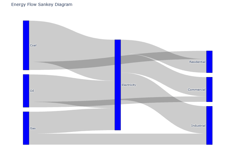
These case studies demonstrate the utility and effectiveness of sankey diagrams in various sectors, showcasing how data visualization can enhance comprehension and facilitate informed decision-making.
Interpreting Sankey Diagram
Sankey diagrams are a powerful visualization tool that facilitates the understanding of the flow of information, resources, or energy between different entities or categories. When analyzing a Sankey diagram, one must begin by recognizing the various nodes that represent different elements within the system. Each node corresponds to a specific category or item, and the connections between nodes symbolize the flow or transfer taking place.
The thickness of the arrows or flows within the Sankey diagram is of vital importance, as it indicates the quantity or magnitude of the flow between two nodes. A thicker arrow signifies a higher quantity being transferred, while a thinner arrow suggests a lesser amount. This feature allows viewers to quickly compare the sizes of flows between different categories, making it easier to identify significant relationships or trends within the data set. For instance, if a Sankey diagram displays data related to energy consumption, one might observe that a larger flow from one energy source to consumption indicates a dominant energy provider.
When interpreting a Sankey diagram, familiarity with the underlying data is crucial. The relationships depicted in a Sankey plotly can reveal insights that are not immediately apparent from raw numerical data. Additionally, analysts or policymakers can use these diagrams to track changes over time or assess the impact of different factors on the flow. For those utilizing tools like Sankey diagram Python or Sankey diagram R, they can manipulate the data further to explore various scenarios or outcomes based on different variables.
Key Elements to Analyze
- Flow Width: The thickness of the lines represents the quantity – wider means more flow
- Node Size: The size of nodes indicates the total inflow/outflow
- Flow Direction: Shows the path of movement between categories
- Color Coding: Often used to represent different categories or types
Common Patterns to Look For
- Bottlenecks: Where flows narrow significantly
- Major Pathways: The thickest flows show dominant routes
- Leakage Points: Where significant quantities exit the system
- Unexpected Flows: Connections you might not have anticipated
Furthermore, identifying patterns within the Sankey diagram can help reveal trends, such as shifts in resource allocation or changing consumer behaviors. Analysts may notice that certain flows have increased or decreased over time, prompting further investigation. In conclusion, understanding how to interpret the sizes of flows, the direction of movement, and the overall structure of the Sankey diagram equips users with the necessary tools to derive meaningful insights from complex datasets.
Common Challenges and Solutions
Sankey diagrams are a powerful visual tool for displaying flow data across various categories, but creating them can be accompanied by a number of challenges. One common issue is ensuring data accuracy. When using a sankey diagram, it is crucial to have precise data inputs; inaccurate or poorly structured data can lead to misleading visualizations. To mitigate this, data validation techniques should be employed prior to diagram creation. Users should verify their data sources and ensure consistency in the format before constructing the diagram using libraries such as Sankey diagram Python or Sankey diagram R.
Another challenge involves the complexity of flow representations. As the number of flows increases, the Sankey diagram can become cluttered and difficult to interpret. This can lead to confusion for viewers, diminishing the diagram’s effectiveness. In this case, one solution is to simplify the diagram by consolidating flows or omitting less significant ones. Using tools like Plotly Sankey or Sankey Plotly allows users to easily adjust the granularity of their diagrams. It is advisable to keep the design intuitive and ensure that the most critical flows are highlighted effectively.
Moreover, managing layout and aesthetics presents its own challenges. A poorly structured Sankey diagram may lead to overlaps and awkward placement of nodes. To address this, it is important to consider design principles such as color coding and spacing. When utilizing visualization libraries, leveraging options for customizing node sizes and colors can enhance clarity. Users should also consider interactive features provided by Plotly Sankey, allowing viewers to engage dynamically with the data, making the visualization clearer.
In conclusion, while creating Sankey diagrams involves navigating various challenges, implementing structured data validation, simplifying complex flows, and adhering to design principles can significantly enhance their effectiveness and clarity.
Conclusion and Further Reading
In this blog post, we have explored the importance and applications of Sankey diagrams, as well as the different tools available for their creation in both Python and R. We began by defining what a Sankey diagram is, emphasizing its ability to visualize the flow of data between different states or categories. The richness of information conveyed through Sankey diagrams makes them exceptionally useful in fields such as data analysis, resource allocation, and decision-making processes.
We examined how to create Sankey diagrams using Python libraries, specifically focusing on Plotly. This library not only offers an intuitive syntax but also produces interactive visualizations that enhance user engagement. Moreover, we analyzed the functionality available in R for creating effective Sankey diagrams, which allows users to leverage the powerful data manipulation capabilities of R languages. The integration of these tools showcases the versatility of creating effective visual representations of complex data flows.
Encouraging readers to take the next step, I would recommend experimenting with different datasets by utilizing the skills acquired in this blog post. Whether you are using the Sankey diagram Python methods or the Sankey diagram R approaches, begin visualizing data that is relevant to your projects. Doing so will help solidify your understanding of the tools and enhance your data storytelling abilities.
For further reading, numerous resources are available that delve deeper into data visualization techniques. Websites, research articles, and workshops focusing on visualization tools like Plotly or other libraries will provide invaluable insights. Engaging in this further exploration can bolster your skills in data analysis, expand your knowledge of Sankey plots, and aid in producing compelling visual narratives that resonate with audiences.