Introduction to Plotly
Plotly is an advanced graphing library that empowers users to create interactive and visually compelling data visualizations. These visualizations can be seamlessly integrated into web applications, enabling data analysts, scientists, and developers to convey their findings effectively. One of the key advantages of Plotly is its ability to handle large datasets with ease, ensuring that performance does not suffer even as data complexity increases.
Python Setup
import plotly.graph_objects as go
import plotly.express as px
import pandas as pd

print("Plotly version:", plotly.__version__)
JavaScript Setup
<head>
    <script src="https://cdn.plot.ly/plotly-latest.min.js"></script>
</head>
At its core, this library is designed for convenience and user-friendliness. It provides a straightforward API for creating a myriad of charts and graphs, making data representation more accessible to those who may not possess extensive programming expertise. With Plotly in Python, users can produce interactive visualizations using a few simple commands, which enhances both productivity and creativity in data analysis. Similarly, Plotly.js, the JavaScript counterpart, offers powerful tools for web-based applications, allowing developers to create responsive and engaging dashboards.
Another notable feature of this library is its versatility across different platforms. By supporting both Python and JavaScript, it bridges the gap between data analytics and web development. This interchangeability ensures that developers can leverage their existing knowledge while working on data visualizations. Moreover, the library is highly customizable, enabling users to tailor visual elements to suit their specific requirements. From simple line graphs to intricate 3D plots, the possibilities with Plotly are virtually limitless.
In conclusion, Plotly stands as a significant tool for anyone looking to enhance their data visualization capabilities. Its robust functionalities, compatibility with multiple programming languages, and the ability to generate interactive dashboards make it an invaluable asset for professionals in various fields. Through this blog post, we will explore how to harness the full potential of Plotly and guide you through the process of creating impactful visualizations.
Getting Started with Plotly
To begin utilizing Plotly for interactive data visualizations, it is crucial to set up the necessary libraries in both Python and JavaScript. Plotly is designed to provide a seamless experience for developers and data scientists in creating plots and dashboards. The initial step involves installation, where users can easily set up Plotly with a few commands, depending on their programming environment.
For Python users, the installation can be achieved using pip, the package manager. Simply execute the following command in your terminal:
pip install plotlyThis command will download and install the Plotly library required for creating Plotly graphs. After installation, it is essential to import the library in your Python script or Jupyter Notebook by including the following line:
import plotly.express as pxPlotly Express is a simple and high-level interface for creating visualizations easily. Users can integrate Plotly in Python seamlessly and start generating plots simply by calling functions and passing their data.
Similarly, for JavaScript, you need to include the Plotly.js library by adding a script tag in your HTML. You can either download the library or link to a CDN. Here’s the script tag you would use:
<script src="https://cdn.plot.ly/plotly-latest.min.js"></script>Once the library is included, you can begin crafting interactive charts by utilizing Plotly’s API, which elegantly handles various types of data visualizations. Users can create dashboards that dynamically respond to user interactions, thus enhancing data exploration.
For additional support, both official documentation and active community forums provide extensive resources and examples. Users are encouraged to consult these resources to deepen their understanding of Plotly in Python and JavaScript, facilitating a smoother development process.
Creating Scatter Plots with Plotly
Scatter plots are an essential tool in data visualization, allowing analysts to display relationships between two or more variables effectively. Plotly, a versatile graphing library, offers powerful functionalities to create interactive scatter plots in both Python and JavaScript. This section will explore how to implement scatter plots using Plotly, providing detailed tutorials with code snippets and customization options.
Python Example
To begin creating scatter plots in Plotly in Python, you first need to install the Plotly library if you haven’t already. You can do this by executing the following command:
pip install plotlyOnce installed, you can create a basic scatter plot with a few lines of code. Here’s an example:
import plotly.express as px
# Sample data
data = {'x': [1, 2, 3, 4], 'y': [10, 11, 12, 13]}
fig = px.scatter(data, x='x', y='y', title='Basic Scatter Plot')
fig.show()
# Create a simple scatter plot with Plotly Express
df = px.data.iris()
fig = px.scatter(df, x="sepal_width", y="sepal_length",
color="species", size="petal_length",
title="Iris Dataset Scatter Plot")
fig.show()
# With Graph Objects for more customization
fig = go.Figure()
fig.add_trace(go.Scatter(
x=df['sepal_width'],
y=df['sepal_length'],
mode='markers',
marker=dict(
size=df['petal_length']*2,
color=df['species_id'],
colorscale='Viridis',
showscale=True
)
))
fig.update_layout(title='Customized Scatter Plot')
fig.show()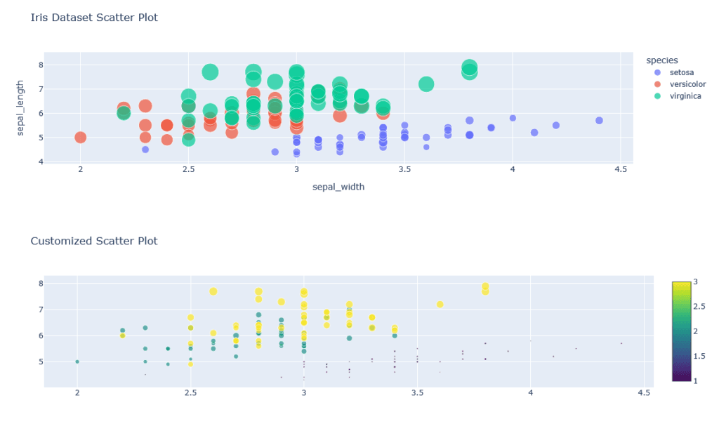
This example demonstrates how to plot simple points on a graph. The function px.scatter takes in data and allows you to customize markers and layout. For additional customization, you could modify the marker color, size, or even add a hover feature to display more information when the user hovers over a data point.
JavaScript Example
In JavaScript, creating scatter plots utilizing Plotly.js is equally straightforward. You begin by including the Plotly library in your HTML file as follows:
<script src='https://cdn.plot.ly/plotly-latest.min.js'></script>Next, you can define your data and layout before rendering the plot. Here’s how to create a simple scatter plot:
var trace1 = {
  x: [1, 2, 3, 4],
  y: [10, 11, 12, 13],
  mode: 'markers',
  type: 'scatter'
};

var data = [trace1];

Plotly.newPlot('myDiv', data);
const data = {
x: [1, 2, 3, 4, 5],
y: [10, 11, 12, 13, 14],
mode: 'markers',
type: 'scatter',
marker: {
size: [15, 20, 25, 30, 35],
color: [1, 2, 3, 4, 5]
}
};
const layout = {
title: 'JavaScript Scatter Plot',
xaxis: {title: 'X Axis'},
yaxis: {title: 'Y Axis'}
};
Plotly.newPlot('myDiv', [data], layout);By utilizing these examples, you can start exploring the capabilities of scatter plots with Plotly. Understanding how to effectively implement and customize these visualizations can enrich your data analysis process, making your findings clearer and more accessible.
Building Box Plots with Plotly
Box plots play a crucial role in statistical analysis by providing a visual representation of data distribution. They display the median, quartiles, and potential outliers, making it easier to compare datasets. Utilizing this library, one can create interactive box plots seamlessly in both Python and JavaScript. In this section, we will delve into the process of constructing box plots using Plotly, emphasizing their significance in data analysis.
Python Example
To begin, let’s consider a basic example of creating a box plot in Python using the plotly Python library. First, ensure you have installed the Plotly library in your Python environment. You can leverage Plotly’s built-in functions to create a simple box plot.
The following code snippet demonstrates how to generate a box plot:
import plotly.express as px
import pandas as pd

data = pd.DataFrame({
    "Category": ["A", "A", "B", "B", "C", "C"],
    "Values": [1, 2, 3, 4, 5, 1]
})

fig = px.box(data, x="Category", y="Values")
fig.show()
# Box plot with Plotly Express
df = px.data.tips()
fig = px.box(df, x="day", y="total_bill", color="smoker",
             title="Box Plot of Total Bill by Day")
fig.show()

# Grouped box plot with Graph Objects
fig = go.Figure()
for day in df['day'].unique():
    fig.add_trace(go.Box(
        y=df[df['day'] == day]['total_bill'],
        name=day,
        boxpoints='all',
        jitter=0.5,
        whiskerwidth=0.2
    ))
fig.update_layout(title='Detailed Box Plot')
fig.show()
This snippet creates a box plot that groups data based on categories while illustrating the values associated with each category. Outliers can easily be identified, helping analysts determine data credibility and integrity.
In addition to basic box plots, you can customize them by adding titles, changing colors, and modifying axis labels. This customization is particularly beneficial when developing a Plotly dashboard where conveying information clearly is paramount.
Learn Python for Data Analysis Assignment
This guide offers a thorough introduction to Python, presenting a comprehensive guide tailored for beginners who are eager to embark on their journey of learning Python from the ground up.

JavaScript Example
Furthermore, for JavaScript users, Plotly.js offers similar functionalities. Using a straightforward approach, you can create an interactive box plot right in your web applications. The following structure represents how to achieve this:
var data = [
  {
    y: [1, 2, 3, 4, 5, 1],
    type: 'box'
  }
];

Plotly.newPlot('myDiv', data);
const trace1 = {
y: [10, 12, 13, 14, 15, 16, 17, 18, 19, 20],
type: 'box',
name: 'Group A'
};
const trace2 = {
y: [15, 16, 17, 18, 19, 20, 21, 22, 23, 24],
type: 'box',
name: 'Group B'
};
const layout = {
title: 'JavaScript Box Plot Example'
};
Plotly.newPlot('boxPlotDiv', [trace1, trace2], layout);In summary, box plots are an invaluable tool for statistical analysis, and this library provides a powerful avenue to create dynamic visualizations. By utilizing Plotly in Python or PlotlyJS, you can efficiently communicate complex data relationships, enhancing interpretations and decision-making processes in your analyses.
Creating Interactive Dashboards with Plotly
The creation of interactive dashboards using Plotly significantly enhances data visualization and analysis capabilities. Plotly, particularly with its Python library, allows for seamless integration of interactive elements like sliders, dropdowns, and multiple plots within a single interface. Building an effective dashboard begins with understanding the key components and functionalities that Plotly offers.
Python Dash Example
from dash import Dash, dcc, html, Input, Output
import plotly.express as px

app = Dash(__name__)

df = px.data.gapminder()

app.layout = html.Div([
    dcc.Dropdown(
        id='country-dropdown',
        options=[{'label': country, 'value': country}
                 for country in df['country'].unique()],
        value=['Canada', 'United States'],
        multi=True
    ),
    dcc.Graph(id='life-exp-graph')
])

@app.callback(
    Output('life-exp-graph', 'figure'),
    Input('country-dropdown', 'value')
)
def update_graph(selected_countries):
    filtered_df = df[df['country'].isin(selected_countries)]
    fig = px.line(filtered_df, x='year', y='lifeExp',
                 color='country', title='Life Expectancy Over Time')
    return fig

if __name__ == '__main__':
    app.run_server(debug=True)
One of the primary advantages of using Plotly in Python is its ability to generate dynamic visualizations. For instance, you can use sliders to enable users to filter data based on specific criteria, such as dates or numerical ranges. This interactivity allows users to explore data trends in real time, enhancing their analytical experience. Similarly, dropdown menus can be utilized to switch between different datasets or visual scenarios within the same dashboard, providing a more versatile analytical tool.
To illustrate the power of dashboard components, consider a scenario where a dataset contains information about sales performance across various regions and time periods. By integrating multiple Plotly graphs—such as line charts, bar graphs, and scatter plots—into a single Plotly dashboard, you can offer comprehensive insights. Each graph can be tailored to respond to user inputs from sliders and dropdowns, effectively creating a dynamic storytelling experience around the data.
Need Help in Programming?
I provide freelance expertise in data analysis, machine learning, deep learning, LLMs, regression models, NLP, and numerical methods using Python, R Studio, MATLAB, SQL, Tableau, or Power BI. Feel free to contact me for collaboration or assistance!
Follow on Social

JavaScript Dashboard Example
When building dashboards with Plotly.js, the further flexibility it offers comes with the ability to customize visual transitions, styles, and functional interactions. This helps in presenting complex data in a user-friendly manner, ensuring clarity and engagement. As you explore the vast functionalities of Plotly in Python and JavaScript, you’ll find that creating interactive dashboards can transform standard data displays into informative and engaging presentations that drive decision-making processes.
<div id="dashboard">
    <div id="controls">
        <select id="country-select" multiple>
            <option value="Canada">Canada</option>
            <option value="United States">United States</option>
            <option value="Mexico">Mexico</option>
        </select>
    </div>
    <div id="graph"></div>
</div>

<script>
    const data = {
        Canada: {years: [2000, 2005, 2010], lifeExp: [79, 80, 81]},
        'United States': {years: [2000, 2005, 2010], lifeExp: [77, 78, 79]},
        Mexico: {years: [2000, 2005, 2010], lifeExp: [75, 76, 77]}
    };

    document.getElementById('country-select').addEventListener('change', function() {
        const selectedCountries = Array.from(this.selectedOptions).map(opt => opt.value);
        updateGraph(selectedCountries);
    });

    function updateGraph(countries) {
        const traces = countries.map(country => ({
            x: data[country].years,
            y: data[country].lifeExp,
            type: 'line',
            name: country
        }));

        Plotly.newPlot('graph', traces, {
            title: 'Life Expectancy Dashboard',
            xaxis: {title: 'Year'},
            yaxis: {title: 'Life Expectancy'}
        });
    }

    // Initialize with default selection
    updateGraph(['Canada', 'United States']);
</script>
Examples of Plotly Dashboards for Data Analysis
Plotly has emerged as a powerful tool for data visualization, particularly in the realms of Python and JavaScript. Many industries have started adopting Plotly dashboards to streamline their data analysis processes. This section showcases several case studies that illustrate the effectiveness of dashboards in real-world applications, effectively communicating critical insights through visually appealing interfaces.
One notable example is a sales analysis dashboard utilized by a retail company to track monthly performance metrics. The dashboard incorporates various Plotly graphs, such as bar charts, line graphs, and pie charts, each displaying different key performance indicators (KPIs). By utilizing Plotly in Python, the developers created interactive graphs that allow users to drill down into data for specific products and regions, thereby uncovering trends and anomalies that would otherwise go unnoticed.
Another exemplary dashboard is the financial portfolio tracker developed for investment firms. This Plotly dashboard visualizes the allocation of assets over time, integrating multiple datasets to reflect real-time market changes. Through responsive design, users can interactively filter and manipulate the data displayed. Using Plotly.js, the team was able to incorporate features such as hover effects and zoom capabilities, enhancing the user experience while facilitating in-depth analysis.
A further example can be seen in the healthcare sector, where a dashboard was built to visualize patient outcomes across various treatment protocols. Leveraging the robust features of Plotly in Python, this dashboard helps healthcare professionals identify successful treatment plans and patient demographics that respond best to specific interventions. With the integration of diverse datasets, the Plotly graphs allow for comprehensive comparisons and foster informed decision-making.
These examples underscore the versatility and effectiveness of Plotly dashboards in different fields, showcasing their ability to transform complex data into actionable insights. By employing this library tools effectively, organizations can significantly enhance their data-driven decision-making processes.
Special Features of Plotly for Advanced Users
Plotly offers an array of advanced features designed to elevate data visualization, catering to users looking for rich interactivity and engagement in their presentations. One of the standout capabilities is the creation of 3D plots.
Python Styling Example
By employing Plotly in Python, users can generate three-dimensional scatter plots, surface plots, and other complex visualizations that allow for a deeper exploration of multi-dimensional datasets. These plots not only add a layer of depth to the visual representation but also enable the audience to intuitively understand correlations and trends that might be missed in two-dimensional formats.
In addition to 3D plots, this library also supports geographic maps, enabling users to visualize data spatially. This feature is particularly useful for representing data such as demographic statistics, economic trends, or any information with a geographical component. With Plotly Dashboards, users can embed these maps seamlessly, enhancing the storytelling aspect of data visualization. Users can leverage map layers and customize them to highlight specific regions or datasets, providing a more comprehensive view of geographical relationships.
fig = go.Figure()

fig.add_trace(go.Scatter(
    x=[1, 2, 3, 4],
    y=[10, 11, 12, 13],
    mode='markers+lines',
    line=dict(color='firebrick', width=4, dash='dot'),
    marker=dict(size=12, symbol='diamond')
))

fig.update_layout(
    title='Styled Plot',
    xaxis=dict(
        title='X Axis',
        showgrid=True,
        gridcolor='lightgray',
        gridwidth=0.5
    ),
    yaxis=dict(
        title='Y Axis',
        showgrid=True,
        gridcolor='lightgray',
        gridwidth=0.5
    ),
    plot_bgcolor='white',
    paper_bgcolor='lightgray'
)

fig.show()
JavaScript Animation Example
Another compelling feature is the ability to create animations in visualizations. With animations, users can depict changes over time, transforming static data into dynamic narratives. This can significantly enhance audience engagement by providing a clearer understanding of trends and shifts in the data. Implementing animations using Plotly.js involves setting up frame transitions that allow the audience to visualize data flow effectively. To utilize these features efficiently, it is essential to keep the audience’s needs in mind, ensuring that the animations enhance rather than distract from the data being presented.
const frames = [];
for (let i = 0; i < 10; i++) {
    frames.push({
        name: `frame-${i}`,
        data: [{
            x: [1, 2, 3, 4],
            y: [i, i*2, i*3, i*4]
        }]
    });
}

Plotly.newPlot('animationDiv', [{
    x: [1, 2, 3, 4],
    y: [0, 0, 0, 0],
    line: {color: '#80CAF6'}
}], {
    title: 'Animated Plot'
}).then(function() {
    Plotly.addFrames('animationDiv', frames);
    Plotly.animate('animationDiv', null, {
        frame: {duration: 200, redraw: false},
        transition: {duration: 0}
    });
});
By incorporating these advanced functionalities, users can take full advantage of Plotly for creating compelling visual stories that resonate with their audience.
Deploying Plotly Visualizations on Websites
Embedding Plotly visualizations on websites allows for the creation of interactive and engaging applications that enhance user experience. There are various methods to deploy Plotly graphs, making it a versatile choice for developers and data analysts alike. One of the most common approaches is to integrate Plotly directly into HTML documents. This method involves using the Plotly.js library, which can be included in the HTML file through a simple script tag. Once integrated, users can create visually appealing graphs by leveraging JavaScript capabilities to manipulate and customize their data visualizations.
Python to HTML Export
# Save plot as HTML file
fig = px.scatter(df, x="gdpPercap", y="lifeExp", size="pop", color="continent")
fig.write_html("plotly_visualization.html", full_html=False)

# For embedding in existing HTML
html_string = fig.to_html(full_html=False, include_plotlyjs='cdn')
JavaScript Embedding Options
<!-- Option 1: Directly using Plotly.js -->
<div id="myPlot"></div>
<script>
    // Your Plotly code here
</script>

<!-- Option 2: Using an iframe -->
<iframe src="plotly_visualization.html" width="100%" height="500"></iframe>

<!-- Option 3: Using Plotly with React -->
import Plot from 'react-plotly.js';

function MyPlotComponent() {
    return (
        <Plot
            data={[{
                x: [1, 2, 3],
                y: [2, 6, 3],
                type: 'scatter'
            }]}
            layout={{width: 800, height: 400, title: 'React Plotly Example'}}
        />
    );
}
Another effective method for deploying Plotly visualizations is through the use of Plotly Dash. Dash is a Python web framework specifically designed for building analytical web applications. By combining Plotly in Python with Dash, developers can create interactive dashboards that are server-side rendered, enabling seamless user experiences. This approach is particularly beneficial for displaying complex datasets where real-time updates and interactivity are crucial. The simplicity of connecting inputs and outputs through Dash callbacks allows for dynamic functionality in the resulting applications.
When deploying Plotly dashboards on websites, it is essential to consider best practices to optimize performance and user experience. Large datasets can slow down load times, so it is advisable to limit the amount of data processed in real-time and to utilize optimally sized visualizations for the target device. Additionally, facilitating user interaction through responsive designs ensures that the applications work well across different screen sizes. Finally, proper caching strategies can significantly improve the loading times for commonly accessed Plotly graphs, providing an overall smoother experience for users. By adhering to these practices, developers can maximize the effectiveness of their Plotly visualizations embedded on websites.
Conclusion and Further Resources
In conclusion, the utilization of Plotly for interactive data visualization offers powerful capabilities for both beginners and advanced users alike. Throughout this blog post, we explored the fundamentals of Plotly and how it can enhance data presentation through both Python and JavaScript. By understanding the distinctive features of this library and its ability to create compelling visual representations—be it through Plotly graphs or comprehensive Plotly dashboards—users can significantly enhance the comprehension and communication of data-driven insights.
Furthermore, we delved into the specifics of Plotly in Python, emphasizing the library’s flexibility and ease of integration within various coding environments. The seamless user experience provided by PlotlyJS for web applications adds another layer of interactivity, allowing developers to engage end-users effectively. The broad array of customization options available ensures that users can generate tailored visualizations that meet diverse analytical needs, making this library an indispensable tool in any data analyst’s toolkit.
For those interested in further enhancing their knowledge and skills in using this library, a curated selection of resources is available. Popular books such as “Interactive Data Visualization with Python” provide in-depth coverage of the library’s capabilities. Additionally, online platforms like Coursera and Udemy offer comprehensive courses focused entirely on utilizing Plotly for creating data visualizations, aimed at various levels of expertise. Finally, joining communities such as Stack Overflow or the official Plotly user forums can facilitate knowledge exchange and troubleshooting, allowing users to connect with other data enthusiasts and professionals.
By exploring these resources and continuously experimenting readers can develop a robust understanding of data visualization that empowers their work in presenting and interpreting data effectively.