Introduction to Box Plot
Box plot, also known as box-and-whisker plots, are a standardized way of displaying the distribution of data based on a five-number summary: minimum, first quartile (Q1), median (Q2), third quartile (Q3), and maximum. They provide a visual insight into the spread and skewness of the data, making them essential tools in exploratory data analysis. Box plots are particularly beneficial for comparing multiple groups or datasets, as they allow for the clear juxtaposition of statistical summaries.
In a traditional box plot, the central box represents the interquartile range (IQR), which is the range between the first and third quartiles. The line within the box marks the median, offering a quick visual reference for the center of the data distribution. Whiskers extend from the edges of the box to the smallest and largest observations within 1.5 times the IQR, guiding observers to potential outliers that fall outside this range. Identifying outliers visually can help analysts focus on peculiar data points that may warrant further investigation.
Box plots are implemented in various programming environments, such as Python and R, making them accessible for users in data science and statistical analysis. For instance, in Python, libraries like Matplotlib and Seaborn facilitate the creation of informative box plots, while R provides comprehensive functionalities through the ggplot2 package. These tools contribute significantly to the customization of box plots, allowing for the representation of complex datasets effectively. The versatility of box plots in visualizing various data distributions underscores their importance in data-driven decision-making processes.
Significance of Box Plot in Data Analysis
Box plots, often referred to as box-and-whisker plots, are a powerful graphical representation used in data analysis to summarize and visualize the distribution of a dataset. One of their primary advantages is their ability to display the spread of the data, illustrating key statistics such as the median, quartiles, and possible outliers. By providing a clear visual summary, box plots enable analysts to quickly discern the central tendency and variability within the data, which is essential for informed decision-making.
In scenarios where comparisons between multiple datasets are required, box plots serve as an effective tool. For instance, when using a box plot in Python with matplotlib or seaborn, it becomes easy to juxtapose various groups side-by-side, facilitating a straightforward understanding of differences and similarities in their distributions. This comparative capability is invaluable in various fields, such as healthcare, finance, and social sciences, where stakeholders often need to analyze disparate data resources to draw conclusions.
Furthermore, box plots excel at highlighting outliers, which can represent anomalies or significant variances within a dataset. Identifying these outliers is crucial, as they may indicate errors, unique cases, or areas deserving further investigation. By incorporating a box plot in R or utilizing ggplot, researchers can visually emphasize these outliers, ensuring that they are not overlooked during analysis. Real-world applications abound, from assessing test scores in educational settings to analyzing sales performance in business, showcasing the versatility of box plots across various domains.
Overall, the significance of box plots in data analysis cannot be overstated. Their ability to provide a clear, concise view of data distributions, facilitate comparison between datasets, and draw attention to potential outliers makes them an integral tool for any data analyst seeking to derive meaningful insights.
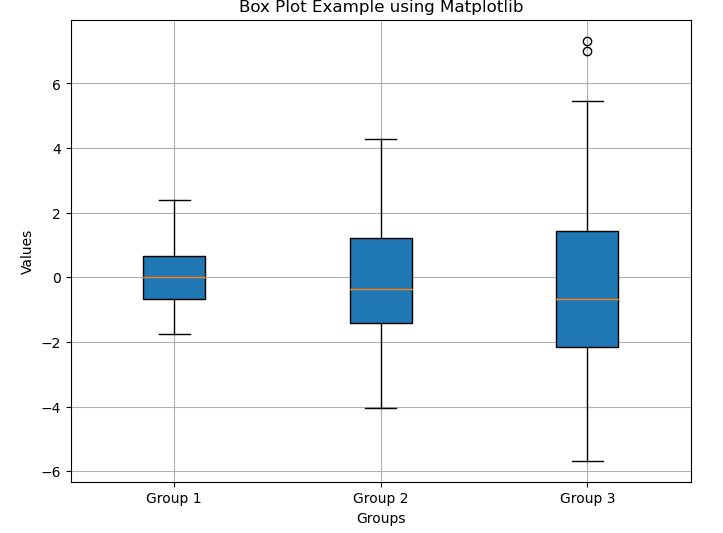
Creating Box Plot in Python Using Matplotlib
To create box plots in Python, one of the most widely used libraries is Matplotlib. This powerful plotting library provides extensive functionalities to generate various types of visualizations, including box plots. To start using Matplotlib, ensure that you have it installed in your Python environment. You can easily install it using pip:
pip install matplotlib
Once the installation is complete, you can import Matplotlib and its `pyplot` module. The `pyplot` module contains functions that enable you to create a variety of plots, including box plots.
Here is an example of how to create a box plot using Matplotlib:
import matplotlib.pyplot as plt
import numpy as np

# Sample data
data = [np.random.normal(0, std, 100) for std in range(1, 4)]

# Create a box plot
plt.figure(figsize=(8, 6))
plt.boxplot(data, patch_artist=True, labels=['Group 1', 'Group 2', 'Group 3'])

# Customize the plot
plt.title('Box Plot Example using Matplotlib')
plt.xlabel('Groups')
plt.ylabel('Values')
plt.grid(True)

plt.show()
In this example, we generate random data from a normal distribution using NumPy’s `random.normal` function and then create a box plot with `plt.boxplot()`. After defining the plot title and y-axis label, calling `plt.show()` will display the box plot on the screen.
For further customization, you can enhance your box plot using additional arguments such as `vert`, which specifies whether the box plot should be vertical or horizontal, and `patch_artist`, to fill the boxes with color. Example:
plt.boxplot(data, vert=True, patch_artist=True)
This simple example demonstrates the ability of Matplotlib to generate effective box plots in Python. By further exploring functionalities and tweaking visual settings, you can create more insightful and aesthetically pleasing visual representations of your data.
Creating Box Plot in Python Using Seaborn
Seaborn is a powerful visualization library in Python that builds on Matplotlib and provides a high-level interface for drawing attractive statistical graphics. One of the primary advantages of using Seaborn for creating box plots is its simplicity and the aesthetically pleasing visualizations it generates. Unlike Matplotlib, Seaborn allows for easier customization and enhanced default styles, making it a preferred choice for many data scientists.
To create a box plot using Seaborn, you first need to ensure that you have the library installed. If you haven’t already, you can install it using pip:
pip install seaborn
Once Seaborn is installed, you can load your dataset, which can be in various formats such as a Pandas DataFrame. For demonstration, let’s assume we have a dataset of student exam scores saved in a DataFrame called `data`. A box plot can then be created using the `boxplot` function within Seaborn, as follows:
import seaborn as sns
import pandas as pd

# Sample DataFrame
data = pd.DataFrame({
    'Category': ['A']*50 + ['B']*50 + ['C']*50,
    'Value': list(np.random.normal(0, 1, 50))
             + list(np.random.normal(5, 1, 50))
             + list(np.random.normal(10, 2, 50))
})

# Create a box plot
plt.figure(figsize=(8, 6))
sns.boxplot(x='Category', y='Value', data=data, palette='Set2')

# Customize the plot
plt.title('Box Plot Example using Seaborn')
plt.grid(True)

plt.show()
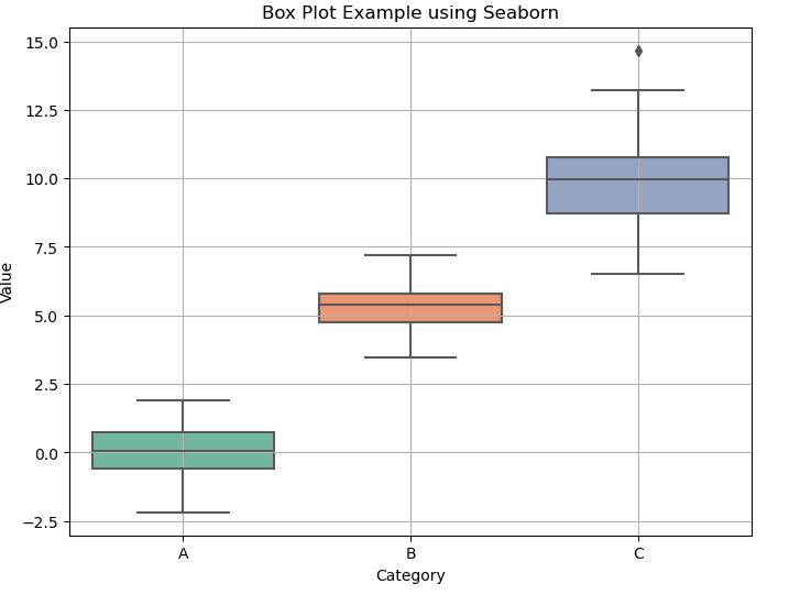
In this example, a box plot illustrates the distribution of ages across different passenger classes in the Titanic dataset. The `x` parameter indicates the categorical variable (class), while the `y` parameter represents the numerical variable (age). Seaborn also offers several customization options, allowing users to enhance their box plots further. You can add hues to represent another variable, adjust colors, and set additional aesthetics to better fit your analysis needs.
Need Help in Programming?
I provide freelance expertise in data analysis, machine learning, deep learning, LLMs, regression models, NLP, and numerical methods using Python, R Studio, MATLAB, SQL, Tableau, or Power BI. Feel free to contact me for collaboration or assistance!
Follow on Social

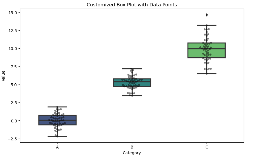
Customizing Box Plot (Python – Seaborn)
In addition to basic box plots, Seaborn enables users to create box plots with varying styles and themes, which can be advantageous for presentations or reports. By employing Seaborn, data analysts can effectively visualize distributions, identify outliers, and better understand the underlying data patterns in a more intuitive manner.
plt.figure(figsize=(10, 6))
sns.boxplot(
    x='Category',
    y='Value',
    data=data,
    palette='viridis',
    width=0.5,
    linewidth=2.5
)

# Add swarmplot for data points
sns.swarmplot(x='Category', y='Value', data=data, color='black', alpha=0.5)

plt.title('Customized Box Plot with Data Points')
plt.show()
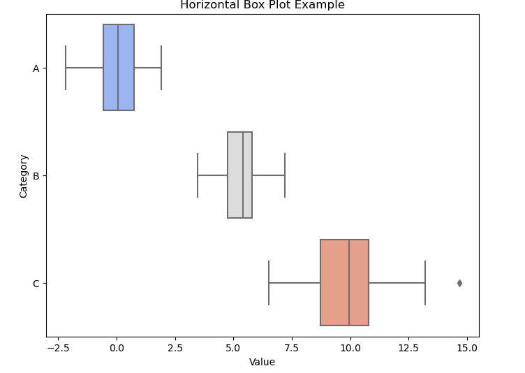
Horizontal Box Plots (Python – Seaborn)
plt.figure(figsize=(8, 6))
sns.boxplot(y='Category', x='Value', data=data, palette='coolwarm')

plt.title('Horizontal Box Plot Example')
plt.show()
Learn Python for Data Analysis Assignment
This guide offers a thorough introduction to Python, presenting a comprehensive guide tailored for beginners who are eager to embark on their journey of learning Python from the ground up.

Creating Box Plot in R Using ggplot2
Creating box plots in R using the ggplot2 package is a straightforward process, and it provides an effective way to visualize data distribution and identify outliers. First, ensure you have the ggplot2 package installed. This can be done using the command install.packages("ggplot2") in your R console. Once installed, you can load the library with library(ggplot2).
To create a basic box plot in R, you need a dataset. A commonly used dataset is the mtcars dataset, which is readily available in R. For example, you can plot the box plot of miles per gallon (mpg) against the number of cylinders (cyl) by using the code:
ggplot(mtcars, aes(x = factor(cyl), y = mpg)) +
geom_boxplot() +
labs(title = "Box Plot of MPG by Cylinder Count",        x = "Number of Cylinders",        y = "Miles per Gallon")
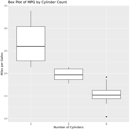
This code snippet creates a box plot where the x-axis represents the factor levels of the number of cylinders and the y-axis represents the miles per gallon. The geom_boxplot() function adds the box plot layer, displaying the median, quartiles, and potential outliers effectively.
To enhance your box plot, ggplot2 allows for extensive customization. You can change colors, add themes, or even overlay points using functions like geom_jitter() to indicate individual data points. For example:
ggplot(mtcars, aes(x = factor(cyl), y = mpg)) +
geom_boxplot(fill = "lightblue", alpha = 0.7) +
geom_jitter(color = "darkred", size = 2, alpha = 0.5) +
theme_minimal() +
labs(title = "Enhanced Box Plot of MPG by Cylinder Count",        x = "Number of Cylinders",        y = "Miles per Gallon")
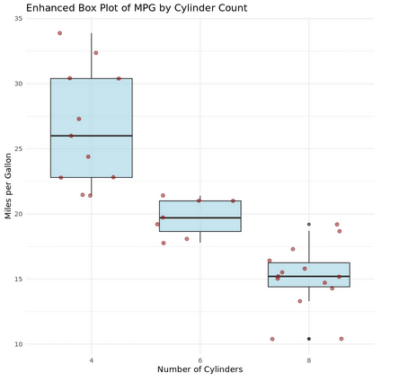
This visualization helps you gain deeper insights into the data distribution while highlighting points clustered around the box plot. Overall, using the ggplot2 package for box plots in R offers flexibility and clarity, making it a crucial skill in data visualization.
Customizing Box Plots (R – ggplot2)
# Sample data
set.seed(123)
data <- data.frame(
  Category = rep(c("A", "B", "C"), each = 50),
  Value = c(rnorm(50, mean = 0, sd = 1),
            rnorm(50, mean = 5, sd = 1),
            rnorm(50, mean = 10, sd = 2))
)

ggplot(data, aes(x = Category, y = Value, fill = Category)) +
  geom_boxplot(alpha = 0.7, outlier.color = "red", outlier.size = 3) +
  geom_jitter(width = 0.2, alpha = 0.5) +  # Add data points
  labs(title = "Customized Box Plot with ggplot2", x = "Groups", y = "Values") +
  scale_fill_brewer(palette = "Set2") +
  theme_bw()
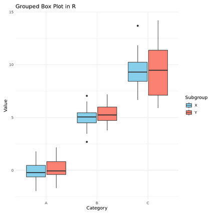
Grouped Box Plots (R – ggplot2)
# Adding another grouping variable
data$Subgroup <- rep(c("X", "Y"), each = 25, times = 3)

ggplot(data, aes(x = Category, y = Value, fill = Subgroup)) +
  geom_boxplot(position = position_dodge(0.8)) +
  labs(title = "Grouped Box Plot in R", x = "Category", y = "Value") +
  scale_fill_manual(values = c("skyblue", "salmon")) +
  theme_minimal()
Understanding Box Plot Components
A box plot, or box-and-whisker plot, is a standardized way of displaying the distribution of data based on a five-number summary: minimum, first quartile (Q1), median, third quartile (Q3), and maximum. By understanding the components of a box plot, one can gain significant insights into the spread and center of a dataset, as well as identify potential outliers.
The main element of the box plot is the box itself, which represents the interquartile range (IQR) or the distance between the first (Q1) and third quartiles (Q3). This section of the plot captures the middle 50% of the data, making it a crucial area to observe in any analysis. The line within the box indicates the median, or the 50th percentile, which serves as a useful measure of central tendency. When utilizing box plot libraries such as box plot matplotlib, box plot seaborn, or box plot ggplot, this central line will help users easily discern the median value at a glance.
Extending from the box are the whiskers, which are lines that stretch towards the smallest and largest values within a defined limit, typically equal to 1.5 times the IQR. These whiskers help in contextualizing the “spread” of the data, indicating variability while excluding potential outliers. Outliers are data points that fall significantly outside the whiskers and are often represented as individual points on the plot. When coding in Python or R, visual representations of these outliers can be easily customized, enhancing the overall interpretability of the box plot.
In conclusion, understanding the different components of a box plot, including the box, whiskers, median line, and outlier points, is essential for proper interpretation. This knowledge equips the analyst with the tools necessary to make informed decisions based on the data’s statistical properties.
Interpreting Box Plots and Identifying Outliers
Box plots, also known as box-and-whisker plots, serve as a powerful tool in statistical data visualization, providing insights into the distribution and variability of a dataset. When interpreting a box plot, one begins by examining its main components: the box, the whiskers, and the individual data points. The box itself represents the interquartile range (IQR), which captures the middle 50% of the data, while the line within the box indicates the median, offering a clear view of the central tendency.
The whiskers extend from the box to exhibit the range of the data, but it is essential to understand how far these whiskers can reach. Often, whiskers will extend to 1.5 times the IQR above and below the box; data points outside this range are depicted as individual dots and are considered potential outliers. Identifying these outliers is crucial as they can heavily influence statistical analyses and, subsequently, decision-making processes. For instance, in a box plot created using Python’s Matplotlib library, outliers are distinctly marked, enhancing the discernibility of anomalous values in the dataset.
Consider a practical example illustrating box plots in R. If analyzing test scores for a set of students, one might observe that while the majority score between 65 and 85, a few scores fall outside this range significantly; these represent outliers. Understanding these figures aids in data interpretation—whether these scores suggest errors in data entry, exceptional cases, or varying student circumstances. Moreover, employing visualizations such as those generated by Seaborn or ggplot allows analysts to draw meaningful insights into the data, guiding effective decision-making based on the statistical distribution and outlier identification. Overall, proper interpretation of box plots is essential for robust data analysis in various fields, from education to finance.
Interpreting Box Plot (Python – Identifying Outliers)
# Data with outliers
outlier_data = [np.random.normal(0, 1, 50),
                np.concatenate([np.random.normal(5, 1, 45), np.random.normal(20, 1, 5)])]

plt.figure(figsize=(8, 6))
plt.boxplot(outlier_data, labels=['Group 1', 'Group 2'])
plt.title('Box Plot with Outliers')
plt.show()
Interpreting Box Plot (R – Statistical Summary)
# Get statistical summary
boxplot_stats <- boxplot(Value ~ Category, data = data, plot = FALSE)
print(boxplot_stats$stats)  # Shows min, Q1, median, Q3, max for each group
Best Practices for Creating Box Plots
Creating an effective box plot requires careful consideration of various factors, including the dataset, selected variables, and the overall visual presentation. The first step in this process is to choose the right dataset. Box plots are particularly useful for visualizing the central tendency and variability of numerical data across different categories. Therefore, ensure that your dataset is relevant and adequately represents the population you are studying. When using programs like Python and R, it’s crucial to have a clean dataset to avoid skewed results.
After selecting the dataset, the next step is to choose appropriate variables. The effectiveness of a box plot largely depends on the choice of these variables. It is advisable to focus on one dependent variable and one or more categorical independent variables. For instance, in creating a box plot in Python using libraries like Matplotlib or Seaborn, strategically selecting your variables enhances the interpretability of the data presented. In R, the same principle applies when using ggplot2 for box plots.
Clarity in visual presentation is essential. Ensure that the box plot displays clear labels on both axes and uses consistent color schemes and styles to avoid confusion. Adding annotations or legends can further enhance understanding, especially when comparing multiple groups. Furthermore, be cautious of common pitfalls: avoid overcrowding the plot with excessive data points, and ensure you are aware of any outliers that might skew the analysis. Properly managing outliers can help you present a more accurate representation of the data.
By adhering to these best practices, you can effectively leverage the capabilities of box plots to present your data meaningfully, whether using Python or R. Consequently, your analysis will be clear, concise, and valuable for further interpretation.
Conclusion and Future Directions
In this tutorial, we have explored the creation of box plots using two popular programming languages: Python and R. Box plots serve as a valuable visualization tool, providing insights into the distribution of data through their graphical representations. By utilizing libraries such as Matplotlib and Seaborn in Python, or ggplot2 in R, users can effectively create box plots that highlight the central tendency, variability, and potential outliers in their datasets.
The ability to customize box plots enhances their utility in various contexts, allowing data analysts to tailor visualizations to suit specific audiences or datasets. Advanced features such as adding jitter, modifying colors, or incorporating additional statistical elements can further improve the clarity and effectiveness of the box plot. It is recommended that users experiment with these functionalities to maximize their understanding and application of box plot visualizations.
For those seeking to deepen their knowledge of data visualization, numerous resources are available online. Tutorials and documentation are plentiful for both Python and R, offering diverse approaches to creating effective data visualizations. Furthermore, alternative visualization techniques—such as violin plots, histograms, or scatter plots—can also complement or enhance the insights generated from box plots. Engaging in these materials may provide readers with a robust toolkit for their data analysis tasks.
We encourage readers to apply the knowledge gained from this tutorial to their own data analysis projects. By implementing box plots in Python or R, practitioners can significantly enhance their data storytelling, leading to more informed decision-making. Embracing these visualization techniques not only aids in comprehending complex data but also facilitates effective communication of findings to stakeholders.