Introduction to Correlation Plot
Correlation plot are a vital tool in statistical analysis, serving to visualize the relationships between different variables in a dataset. These graphical representations allow analysts and researchers to observe patterns and correlations that may not be immediately apparent through numeric values alone. By displaying data points in a scatter graph correlation, these plots facilitate an understanding of how one variable may change in relation to another, enhancing insight into underlying trends within the data.
The importance of scatter plots and correlation cannot be overstated, as they provide a clear and intuitive method for assessing the strength and direction of a relationship. For instance, a strong positive correlation indicates that as one variable increases, the other does as well, while a negative correlation suggests an inverse relationship. Such insights are crucial in diverse fields, including finance, biology, and social sciences, where understanding variable interdependencies can inform critical decisions.
In the realm of data analysis, correlation and scatter plots are particularly useful in exploratory data analysis (EDA). They allow data scientists to identify potential outliers and trends before performing further investigations. Additionally, scatter diagrams and correlation serve as foundational elements in predictive modeling, helping inform algorithms that require an assessment of linear or nonlinear relationships among multiple variables.
Moreover, correlation plots are not limited to simple two-variable analyses; they can extend to multivariate approaches, showing the interplay among several variables simultaneously. This capability is invaluable in situations where complex data relations exist, such as in climate studies or market trend analysis. Overall, correlation plots stand as a significant method for understanding intricate datasets, making them indispensable in both academic and professional contexts.
Understanding Correlation: A Statistical Overview
Correlation is a fundamental statistical concept that illustrates the relationship between two or more variables. It assists in determining the extent to which one variable may change in response to a change in another. Typically quantified through correlation coefficients, the strength and direction of this relationship can be classified as positive, negative, or nonexistent. A positive correlation indicates that as one variable increases, the other also tends to increase, reflecting a direct relationship. Conversely, a negative correlation implies that an increase in one variable is associated with a decrease in another, indicating an inverse relationship.
Understanding these relationships is essential for effective data analysis. For example, researchers often utilize scatter plots to visually depict the correlation between two variables, enabling a clearer understanding of their interdependence. Scatter diagrams and correlation help in identifying trends that may otherwise not be apparent. These visualizations can assist analysts in making predictions based on observed data points, ultimately guiding decision-making processes.
Correlation coefficients, ranging from -1 to 1, quantitatively measure the degree of correlation. A correlation coefficient of 1 implies a perfect positive correlation, while -1 indicates a perfect negative correlation. A coefficient of 0 suggests no correlation exists between the variables. Recognizing the nuances of correlation and scatter plots is crucial, as it allows data practitioners to draw logical conclusions from their findings. For instance, when creating a correlation plot, it is essential to consider the context of the data, as correlation alone does not imply causation. This distinction is vital in avoiding misinterpretations that may arise during analysis.
Use Cases for Correlation Plot
Correlation plots serve as vital tools in various fields, providing insights into the relationships between different variables. In finance, they are particularly useful for stock price predictions. Analysts often use scatter plots and correlation analyses to determine how closely related the prices of different stocks are over time. For instance, a positive correlation between two stock prices may suggest that they move in tandem, which can influence investment decisions. By visualizing this correlation through scatter diagrams and correlation plots, investors can glean deeper insights into market trends and make informed choices.
In the healthcare sector, correlation plots play a significant role in analyzing patient data. Researchers and healthcare professionals utilize scatter graphs to study the relationships between various health indicators, such as body mass index (BMI) and blood pressure. By applying correlation and scatter plots, they can identify trends that might indicate potential health risks or the efficacy of certain treatment methods. Moreover, these visualizations assist in understanding how different lifestyle factors correlate with health outcomes, ultimately aiding in public health policy development.
The social sciences also benefit greatly from the utilization of correlation plots. Researchers in this field often employ scatter plots to examine behavioral patterns and social phenomena. For instance, they may analyze the correlation between educational attainment and income levels, using correlation diagrams to interpret data sets. Such analyses help in understanding societal dynamics, enabling policymakers to design effective interventions grounded in empirical data. The application of scatter diagrams and correlation in social research is invaluable, as it uncovers hidden relationships and provides a basis for further inquiry.
Throughout these fields, the real-world relevance of correlation analysis, particularly through visual tools like correlation plots, cannot be overstated and they often incorporated into Python Assignments or Homework. They enhance understanding and decision-making across disciplines, demonstrating the multifaceted applications of this essential analytical method.
Creating Correlation Plot in Python with Seaborn
Correlation plots provide valuable insights into the relationships among different variables in a dataset. One efficient method for creating these visualizations in Python is by using the Seaborn library, which is built on top of Matplotlib. Before beginning, ensure you have installed the necessary libraries. You can install Seaborn, along with Pandas and NumPy, using pip if they are not already set up in your environment:
pip install seaborn pandas numpyStart by importing the required libraries for your analysis:
import seaborn as sns
import pandas as pd
import numpy as np
Next, load your dataset. For example, we can use the well-known Iris dataset, which is perfect for demonstrating correlation analysis:
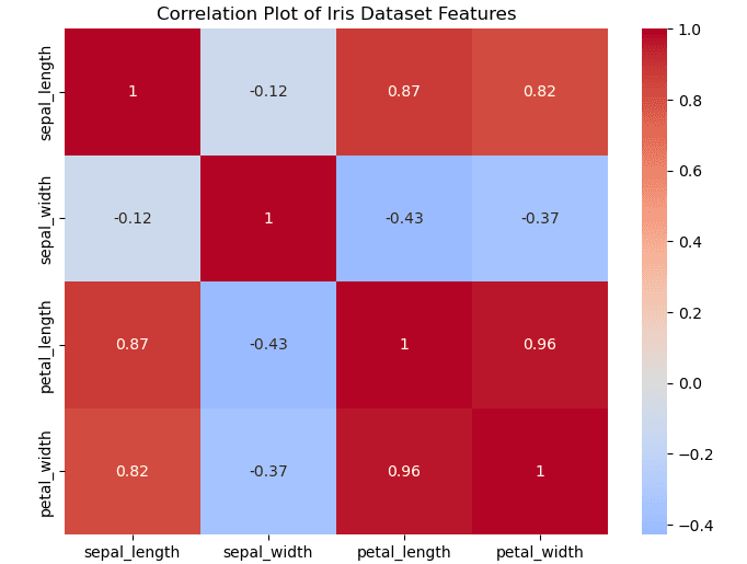
iris = sns.load_dataset('iris')After loading the dataset, the next step is to compute the correlation matrix. This matrix quantifies the strength and direction of the relationships between the variables. Use the following code to generate the correlation matrix:
correlation_matrix = iris.corr()Now that you have the correlation matrix, it’s time to visualize it as a heatmap. A heatmap is an ideal representation of a correlation matrix and allows you to easily identify patterns. You can generate a correlation plot directly with this function:
sns.heatmap(correlation_matrix, annot=True, cmap='coolwarm')In the above code, the `annot=True` argument displays the correlation coefficients within the heatmap cells, while the `cmap=’coolwarm’` argument sets the color scheme. By examining the resulting scatter graph correlation, you can identify which variables have strong positive or negative relationships. For instance, in the Iris dataset, petal length and petal width may show a strong correlation, which can be highlighted in your correlation and scatter plots.
Need Help in Programming?
I provide freelance expertise in data analysis, machine learning, deep learning, LLMs, regression models, NLP, and numerical methods using Python, R Studio, MATLAB, SQL, Tableau, or Power BI. Feel free to contact me for collaboration or assistance!
Follow on Social

Seaborn Correlation Heatmap
import seaborn as sns
import matplotlib.pyplot as plt
import pandas as pd

# Load dataset
df = pd.read_csv('https://raw.githubusercontent.com/mwaskom/seaborn-data/master/iris.csv')

# Calculate correlation matrix using only numeric columns
# This excludes the 'species' column which contains string values
corr_matrix = df.select_dtypes(include=['float64', 'int64']).corr()

# Create heatmap
plt.figure(figsize=(8, 6))
sns.heatmap(corr_matrix, annot=True, cmap='coolwarm', center=0)
plt.title('Correlation Plot of Iris Dataset Features')
plt.show()
Seaborn Pairplot (Scatter Matrix)
# Create pairplot (scatter matrix) with correlation
sns.pairplot(df, hue='species')
plt.suptitle('Scatter Plots and Correlation Visualization', y=1.02)
plt.show()
Utilizing scatter diagrams and correlation along with heatmaps provides a comprehensive view of variable relationships, assisting data analysis significantly. This method effectively illustrates the necessary steps in creating a correlation plot using Seaborn in Python, rendering complex data into understandable visualizations.
Learn Python for Data Analysis Assignment
This guide offers a thorough introduction to Python, presenting a comprehensive guide tailored for beginners who are eager to embark on their journey of learning Python from the ground up.

Creating Correlation Plot in Python with Matplotlib
Creating correlation plots in Python can be effectively accomplished using the Matplotlib library, which offers significant flexibility and power for visualizing data relationships. While Seaborn also provides excellent tools for this purpose, Matplotlib stands out due to its extensive customization capabilities, making it an ideal choice for many data scientists and analysts.
To create a basic correlation plot, one typically starts by plotting scatter diagrams and correlation among the variables. A scatter plot displays individual data points, providing a visual representation of the relationship between two variables. The correlation and scatter plots can highlight trends or patterns in data, indicating the strength and direction of the relationship. Here is a simple code snippet to create a scatter plot using Matplotlib:
import matplotlib.pyplot as plt
import pandas as pd
# Sample dataset
data = pd.DataFrame({    'X': [1, 2, 3, 4, 5],    'Y': [2, 3, 4, 5, 6]})
# Creating the scatter plot
plt.scatter(data['X'], data['Y'])
plt.title('Scatter Plot Correlation')
plt.xlabel('X-axis Label')
plt.ylabel('Y-axis Label')
plt.grid()
plt.show()
This code generates a scatter graph correlation between the variables X and Y. To customize the plot further, one can adjust marker styles, colors, and axis limits, allowing for a clearer presentation of data trends. For instance, changing the color can enhance differentiability, particularly in cases involving multiple scatter plots representing different datasets.
Moreover, integrating correlation metrics can provide additional context. Computing the Pearson correlation coefficient, for instance, offers a quantifiable measure of the strength of the relationship, which can be overlaid directly onto the scatter diagram for clarification. Overall, Matplotlib serves as a powerful tool for carrying out detailed analysis through correlation plots and scatter plots, enhancing one’s ability to interpret data effectively.
Creating Correlation Plot in R with ggplot2
To generate correlation plots in R with the ggplot2 package, it is essential to follow a systematic approach. First, ensure that you have the necessary libraries installed. The primary libraries required are ggplot2 and psych for data visualization and correlation computations, respectively. Install any missing packages using the command install.packages("package_name").
Once the libraries are loaded, prepare your dataset. For demonstration purposes, we can use the built-in mtcars dataset, which consists of various automobile attributes. Use the command data(mtcars) to load this dataset. Next, select relevant columns to compute the correlation. This can be done using the select() function from the dplyr package or base R functionalities.
Now, compute the correlation matrix using the cor() function. This matrix illustrates the correlation coefficients between pairs of variables, offering insights into their linear relationships. To visualize this matrix effectively, use the ggplot2 capabilities. Begin by reshaping the correlation matrix using the melt() function from the reshape2 package, which transforms the matrix into a long format suitable for ggplot2.
Proceed to create the scatter plots and correlation visualizations using ggplot(). Utilize the geom_tile() function to fill tiles based on correlation coefficients, and employ scale_fill_gradient2() to apply a color gradient that visually represents the degree of correlation. Additionally, adding labels can enhance clarity by indicating the precise values of correlations. By integrating these elements, you will construct a comprehensive correlation plot that not only visualizes the relationships but also makes interpretation intuitive.
1. ggplot2 Correlation Heatmap
library(ggplot2)
library(reshape2)

# Load dataset
data(mtcars)

# Calculate correlation matrix
cor_matrix <- cor(mtcars)

# Melt the correlation matrix
melted_cormat <- melt(cor_matrix)

# Create heatmap
ggplot(data = melted_cormat, aes(x=Var1, y=Var2, fill=value)) +
  geom_tile() +
  scale_fill_gradient2(low = "blue", high = "red", mid = "white",
                       midpoint = 0, limit = c(-1,1), space = "Lab",
                       name="Correlation") +
  theme_minimal() +
  theme(axis.text.x = element_text(angle = 45, vjust = 1, size = 10, hjust = 1)) +
  coord_fixed() +
  ggtitle("Correlation Plot of mtcars Dataset")
2. ggplot2 Scatter Plot with Correlation
# Scatter plot with correlation
ggplot(mtcars, aes(x=wt, y=mpg)) +
  geom_point() +


  geom_smooth(method=lm, se=FALSE) +
  ggtitle(paste("Scatter Graph Showing Correlation (r =",
               round(cor(mtcars$wt, mtcars$mpg), 2), ")")) +
  xlab("Weight (1000 lbs)") +
  ylab("Miles per Gallon")
3. GGally Pairplot (Scatter Matrix)
library(GGally)

# Create pairplot with correlation coefficients
ggpairs(mtcars[, c("mpg", "wt", "hp", "drat")],
        title = "Scatter Diagrams and Correlation Matrix")
In conclusion, following these steps allows you to create insightful correlation plots in R using ggplot2, facilitating the analysis of scatter diagrams and correlation effectively.
Interpreting Correlation Plot
Correlation plots serve as powerful tools for visualizing the relationships among multiple variables in datasets. To effectively interpret these plots, it is essential to understand various components, including color gradients, correlation coefficient values, and potential pitfalls that may lead to misleading conclusions.
Color gradients in correlation plots typically range from shades of one color representing strong positive correlations to shades of another indicating strong negative correlations. In many cases, blue hues may represent positive correlations while red may denote negative ones. The intensity of the color often correlates directly with the strength of the relationship; darker shades suggest a stronger correlation, whereas lighter shades indicate a weaker association. This visual representation allows analysts to quickly grasp the interdependencies among variables, making it easier to identify potential patterns and trends.
The correlation coefficient, often displayed on the correlation plot, quantifies the degree of relationship between two variables. Coefficients range from -1 to 1; a value close to 1 indicates a strong positive correlation, a value near -1 signifies a strong negative correlation, and a value around 0 suggests no significant correlation. While high correlation can imply that two variables move together, it is crucial to note that correlation does not imply causation. Analysts must be cautious of interpreting correlation plots naively, as underlying variables or external factors might influence the observed relationships.
Python Correlation Interpretation
# Print correlation values with interpretation
# First, select only numeric columns for correlation calculation
numeric_df = df.select_dtypes(include=['number'])  # This selects only numeric columns

corr_values = numeric_df.corr().unstack().sort_values().drop_duplicates()
print("Correlation Interpretation Guide:")
print("-1.0 to -0.7: Strong negative correlation")
print("-0.7 to -0.3: Moderate negative correlation")
print("-0.3 to +0.3: Little to no correlation")
print("+0.3 to +0.7: Moderate positive correlation")
print("+0.7 to +1.0: Strong positive correlation")
print("\nActual correlation values in the dataset:")
print(corr_values)
Correlation Interpretation Guide:
-1.0 to -0.7: Strong negative correlation
-0.7 to -0.3: Moderate negative correlation
-0.3 to +0.3: Little to no correlation
+0.3 to +0.7: Moderate positive correlation
+0.7 to +1.0: Strong positive correlation
Actual correlation values in the dataset:
sepal_width petal_length -0.428440
petal_width -0.366126
sepal_length sepal_width -0.117570
petal_width 0.817941
petal_length 0.871754
petal_length petal_width 0.962865
sepal_length sepal_length 1.000000
dtype: float64
R Correlation Interpretation
# Correlation interpretation function
interpret_correlation <- function(r) {
  if (r >= 0.7) return("Strong positive correlation")
  if (r >= 0.3) return("Moderate positive correlation")
  if (r > -0.3) return("Little to no correlation")
  if (r > -0.7) return("Moderate negative correlation")
  return("Strong negative correlation")
}

# Apply to mtcars dataset
cor_values <- cor(mtcars)
diag(cor_values) <- NA
melted_cor <- melt(cor_values, na.rm = TRUE)
melted_cor$interpretation <- sapply(melted_cor$value, interpret_correlation)

head(melted_cor)
Moreover, common pitfalls in interpreting scatter plots and correlation include assuming that correlation implies predictability or overlooking non-linear relationships. Scatter diagrams may display clustered patterns that suggest correlations, yet hidden complexities could exist. For instance, two variables might appear closely correlated within an initial range but exhibit different behaviors outside that range. It is vital to ensure a holistic and critical approach when analyzing correlation and scatter plots, ultimately leading to more accurate conclusions regarding data relationships.
Common Mistakes in Correlation Analysis
Correlation analysis is a vital tool in data science and statistical research that allows analysts to explore and understand relationships between variables. However, common mistakes can arise during this process, affecting the overall validity of the results. One significant error is the misinterpretation of correlation and causation. While correlation plots can effectively illustrate the strength and direction of relationships, they do not imply that one variable causes changes in another. Analysts must avoid jumping to conclusions about causality without substantial evidence.
Another common mistake is overlooking confounding variables. In correlation analysis, certain external factors may influence the association between the studied variables. For instance, in a scatter graph illustrating the relationship between physical activity and weight loss, factors such as diet or metabolic rate could confound the results. This oversight can lead to flawed interpretations of correlation and ultimately bias the conclusions drawn from the data. It is crucial for analysts to identify and control for these confounding variables to ensure accurate results.
Additionally, analysts sometimes assume linearity in relationships that may be non-linear. Correlation coefficients often presume a linear association, and when this assumption does not hold true, correlation plots can be misleading. In such cases, scatter diagrams and correlation might suggest a weak relationship, while a more nuanced model could reveal a strong non-linear association. To combat this mistake, analysts should explore various forms of scatter plots, including polynomial regression, to identify the true nature of relationships that do not conform to linearity. Careful consideration of these common pitfalls can significantly enhance the reliability of correlation analyses.
Advanced Techniques and Customization
Creating effective correlation plots is not only about visualizing data relationships but also about enhancing their interpretability through various advanced techniques and customizations. In both Python and R, users can implement numerous methods to improve the effectiveness of scatter plots and correlation diagrams.
One widely used technique for enhancing scatter graphs is the addition of regression lines. These lines help show the trend within the data, allowing viewers to grasp the strength and direction of the correlation quickly. In Python, libraries such as Seaborn provide functions like `sns.regplot()` that facilitate the incorporation of these lines seamlessly. Similarly, in R, the `geom_smooth()` function within the ggplot2 package is instrumental in adding linear regression lines to scatter plots.
Another aspect of customization involves aesthetic modifications. Colors, sizes, and shapes of data points can significantly affect how the information is perceived. Utilizing hue in Python’s Matplotlib library or manipulating the `scale_color_manual()` option in R’s ggplot2 enables clearer distinctions among different subsets of data. It is also possible to highlight specific points by changing their color or size to draw attention to key observations or outliers, emphasizing important aspects of the correlation and scatter plots.
When preparing correlation plots for reports and presentations, clarity should be paramount. It is advisable to maintain a balance between aesthetic appeal and informational integrity. Ensuring axes are clearly labeled and legends are included will enhance understanding for the audience. Moreover, utilizing titles and subtitles effectively can guide viewers in navigating through the data correlations presented. With these advanced techniques and careful consideration of presentation aspects, correlation plots can serve as powerful visual tools in conveying meaningful aspects of data relationships.