Understanding Contour Plot
Contour plot are graphical representations that depict the relationship between three-dimensional data on a two-dimensional plane. Originating from mathematical principles, these plots utilize contour lines to connect points of equal value, effectively illustrating variations in a given dataset. Typically, each contour line represents a specific value, allowing observers to visualize trends and gradients in data where traditional x-y plots might fall short. The depth of information conveyed through these lines makes contour plots an essential tool in various scientific and engineering disciplines.
The primary significance of contour lines lies in their ability to indicate areas of equal values within the data being analyzed. For example, in meteorology, contour plots are prevalent for depicting atmospheric pressure, temperature, or rainfall amounts across different regions. A meteorologist may use a contour plot in Python to create visual representations of weather patterns, facilitating easier comprehension and analysis for forecasting purposes. Similarly, in geography, contour lines can illustrate topographical features, showcasing elevations above sea level and creating an intuitive understanding of the terrain.
In engineering, contour plots play a pivotal role in design and analysis. For instance, they can be used in the analysis of fluid dynamics, where engineers leverage contour plots to visualize and analyze flow patterns, pressures, and velocities in two-dimensional flows. Using tools like MATLAB and Python libraries such as Matplotlib, engineers can generate these insightful visualizations, aiding in decision-making processes.
Overall, contour plots serve as a vital visual tool across a multitude of fields. Their ability to represent complex three-dimensional datasets in an accessible manner establishes their importance in fostering deeper insights and informed decision-making in diverse applications, showcasing the utility of contour plots in both research and practical settings.
Use Cases for Contour Plot
Contour plots serve as a powerful visualization tool across various fields, enabling professionals to interpret complex datasets effectively. One common application is in meteorology, where contour plots are commonly employed to illustrate weather patterns. These plots can display equal areas of temperature, pressure, or precipitation, allowing for quick identification of weather systems and patterns across the geographic landscape. For instance, a contour plot showing isotherms (lines of equal temperature) can help meteorologists predict weather changes or track heat waves, providing crucial information to both the public and agriculture sectors.
Another significant application of contour plots is in geological surveys. Contour plots in geological contexts are often used to represent land elevation or depth variations in subsurface structures. By providing a visual representation of terrain or geological features, contour plots can aid in decision-making for construction projects, mining operations, and environmental assessments. These plots facilitate a clearer understanding of the topography and subsurface characteristics, which are essential for planning purposes and risk assessments.
In the realm of science and engineering, contour plots are valuable in fields such as fluid dynamics and electrostatics. For example, in fluid dynamics, a contour plot can represent streamlines around an object, providing insight into flow patterns and pressure distributions. This visualization helps engineers optimize designs for better efficiency and performance. In electrostatics, contour plots can demonstrate electric field lines and equipotential surfaces, aiding in the analysis of electric forces and charged particle behaviors.
These diverse applications underscore the versatility and practical importance of contour plots across multiple disciplines. Utilizing libraries such as Matplotlib for contour plot in Python, or MATLAB for contour MATLAB, can enhance the ability to analyze and visualize critical data effectively.
Setting Up Your Environment: Python and MATLAB
To create effective contour plots, having the right environment set up is essential. This section will provide guidance on how to prepare both Python and MATLAB for generating contour plots, ensuring that users have access to the necessary tools and libraries.
For Python users, the primary library for creating contour plots is Matplotlib. To get started, it is advisable to first install Python, which can be downloaded from the official Python website. Once Python is installed, you can make use of package management tools like pip to install Matplotlib and NumPy, which are crucial for numerical computations and plotting. The installation command is straightforward: simply open a command prompt or terminal and execute pip install matplotlib numpy. After successful installation, you can import these libraries in your Python scripts to begin working with contour plots in Python. The matplotlib contour function provides an easy way to visualize data with contour plots.
On the other hand, MATLAB provides a robust environment for generating contour plots directly. It comes pre-packaged with a multitude of built-in functions, including those for contour plotting. To get started with MATLAB, download it from the MathWorks website. After installation, you can open MATLAB and use the built-in contour function to create contour plots effectively. The MATLAB environment is user-friendly and supports a variety of plotting functions that simplify the process. It’s also recommended to familiarize yourself with the MATLAB documentation, which provides extensive examples on how to generate various types of contour plots, helping to leverage the full capabilities of the platform.
In conclusion, having the appropriate software setup is critical before diving into the creation of contour plots. By following these guidelines, you will ensure that you have a smooth experience crafting contour plots, be it in Python or MATLAB.
Creating a Contour Plot in Python Using Matplotlib
Creating a contour plot in Python can be efficiently accomplished using the Matplotlib library, a fundamental tool for visual plotting in the Python ecosystem. To get started, you must first install the Matplotlib library if it is not already available in your environment. This can be done through pip using the command: pip install matplotlib.
Once the library is installed, you will need to import it along with NumPy, which is often used for numerical data manipulation. The essential imports can be done as follows:
import matplotlib.pyplot as plt
import numpy as np
Next, you need to define the data that will be represented in the contour plot. In this example, we will create a simple grid of values. You can use NumPy’s meshgrid function complemented with a mathematical function to generate Z-values across your X and Y grids.
X = np.linspace(-5, 5, 100)
Y = np.linspace(-5, 5, 100)
X, Y = np.meshgrid(X, Y)
Z = np.sin(np.sqrt(X**2 + Y**2))
With the data defined, creating the contour plot is straightforward. Use the contour function from Matplotlib to visualize the data, specifying the number of levels for clarity:
plt.contour(X, Y, Z, levels=20)
plt.colorbar()
plt.title('Contour Plot in Python')
plt.xlabel('X-axis')
plt.ylabel('Y-axis')
plt.show()
This basic example provides a solid foundation for creating customized contour plots. By modifying the dataset and attributes, you can generate more complex visualizations tailored to your specific analytical needs. Matplotlib’s contourf function can also be utilized for filled contour plots, enhancing your data presentation even further.
For readers interested in more advanced applications, exploring additional options like contour lines, labels, and color maps can enhance the interpretability of your contour plots in Python.
Python Assignment Help
If you’re looking for Python assignment help, you’re in the right place! I offer expert assistance with Python homework help, covering everything from basic coding to complex simulations. Whether you need help with a Python assignment, debugging code, or tackling advanced Python assignments, I’ve got you covered.
Why Trust Me?
- Proven Track Record: Thousands of satisfied students have trusted me with their Python projects.
- Experienced Tutor: Taught Python programming to over 1,000 university students worldwide, spanning bachelor’s, master’s, and PhD levels through personalized sessions and academic support
- 100% Confidentiality: Your information is safe with us.
- Money-Back Guarantee: If you’re not satisfied, we offer a full refund.
Example: Contour Plot with Real-World Dataset in Python
To illustrate how to create a contour plot in Python, we will use a real-world dataset consisting of elevation data across a specific geographic area. This type of dataset is particularly suited for contour plotting as it provides a continuous representation of height variations over terrain. For this example, we will utilize the ‘topographic’ dataset from the National Center for Atmospheric Research (NCAR).
The first step involves importing necessary libraries, including numpy and matplotlib. We also need Pandas to load our dataset. Ensure you have these libraries installed; you can use pip if necessary:
pip install numpy matplotlib pandasNext, we will load the dataset using Pandas. The dataset can be in a CSV format, containing columns for latitude, longitude, and elevation. We can load this data as follows:
import pandas as pddata = pd.read_csv('elevation_data.csv')After loading the data, we will extract the relevant columns to create variables for latitude, longitude, and elevation. Using numpy, we can then create a grid of latitude and longitude points:
import numpy as np
x = data['Longitude'].values
y = data['Latitude'].values
z = data['Elevation'].values
Next, we will generate a grid for the contour plot using matplotlib. The matplotlib function for contour plotting allows us to visualize those elevation levels effectively:
import matplotlib.pyplot as plt
plt.contourf(x, y, z, levels=15, cmap='viridis')
Finally, we can enhance the plot by adding a color bar and labels:
plt.colorbar(label='Elevation (m)')
plt.title('Contour Plot of Elevation Data')
plt.xlabel('Longitude')
plt.ylabel('Latitude')
plt.show()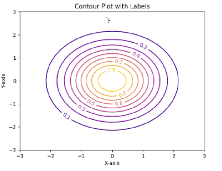
This process will generate a contour plot showcasing the fluctuations in elevation across the specified area. Each contour line represents a specific elevation level, making it easier to visualize how the terrain changes. By applying this method using real-world datasets, you can reinforce your understanding of contour plots in Python, expanding your data visualization toolkit effectively.
Creating a Contour Plot in MATLAB
Creating a contour plot in MATLAB is a straightforward process that allows users to visualize three-dimensional data in a two-dimensional format. It is especially useful for representing spatial data where altitude or depth might vary, making the contour plot an essential tool in fields like meteorology, geology, and more. The basic MATLAB function used for generating contour plots is contour, which takes in grid data as inputs.
To begin, the first step is to create a grid of data points using the meshgrid function. For example, consider two variables X and Y, which can be generated using linspace to create vectors that cover the desired range. The next step involves evaluating the function over the grid using these vectors. For instance:
X = linspace(-5, 5, 100);Y = linspace(-5, 5, 100);[x, y] = meshgrid(X, Y);z = sin(sqrt(x.^2 + y.^2));Once the data is generated, the contour function can be called to create the plot:
figure;contour(x, y, z);This simple command displays the contour lines representing the sinusoidal function. Users can further customize their contour plot by adjusting several parameters. For instance, the contourf function can be utilized to create filled contour plots, enhancing visual representation by coloring the spaces between contour lines.
Additionally, MATLAB provides further options for enhancing contour plots. For example, adding color maps using the colormap function allows for better visualization of the data, while clabel lets you label specific contour lines for clarity. By implementing MATLAB’s capabilities effectively, users can create informative and visually appealing contour plots that accurately represent their data sets.
Example: Contour Plot with Real-World Dataset in MATLAB
To illustrate the application of contour plots in a practical scenario, we will utilize a real-world dataset showcasing temperature variations across a geographical area. This analysis will take place in MATLAB, which provides robust tools for visualizing multidimensional data through contour plots. To start, ensure that you have your dataset prepared, typically in the form of a matrix where each entry corresponds to a specific geographical coordinate.
The first step is data preprocessing. Import your data into MATLAB using the appropriate function, such as readtable for CSV files. Once you load the data, verify its structure and dimensions using commands like size and head. Depending on your data, you may need to interpolate points for smoother visualization. The griddata function can effectively interpolate scattered data points onto a grid, aligning perfectly with our requirement for a contour plot in MATLAB.
Having preprocessed the data, the next stage involves generating the contour plot. Use the contourf function in MATLAB to create filled contour plots. This function requires the x and y coordinates, along with the corresponding z values that represent the temperature in our dataset. An example command could look like this: contourf(X, Y, Z, levels);, where levels allows you to specify contours’ thresholds. It is crucial to choose an appropriate color map for clarity; popular options include jet or hot.
Once the contour plot is rendered, provide an interpretation of the results. The different colors will indicate varying temperature zones across the plotted area, allowing for insight into geographical temperature distributions. Understanding these variations can be essential for many applications, such as climate studies or urban planning. Through this example, we demonstrate how MATLAB’s powerful tools can transform raw datasets into insightful visual representations, enhancing our comprehension of complex data.
MATLAB Assignment Help
If you’re looking for MATLAB assignment help, you’re in the right place! I offer expert assistance with MATLAB homework help, covering everything from basic coding to complex simulations. Whether you need help with a MATLAB assignment, debugging code, or tackling advanced MATLAB assignments, I’ve got you covered.
Why Trust Me?
- Proven Track Record: Thousands of satisfied students have trusted me with their MATLAB projects.
- Experienced Tutor: Taught MATLAB programming to over 1,000 university students worldwide, spanning bachelor’s, master’s, and PhD levels through personalized sessions and academic support
- 100% Confidentiality: Your information is safe with us.
- Money-Back Guarantee: If you’re not satisfied, we offer a full refund
Interpreting Contour Plots
Contour plots serve as a crucial tool for visualizing three-dimensional data on a two-dimensional plane. By providing an intuitive representation, these plots enable users to interpret the underlying topological features of a dataset effectively. Understanding the information represented in contour plots involves familiarity with contour intervals, contour lines, and levels, each contributing to a comprehensive analysis of the data displayed.
Contour intervals refer to the differences in value between consecutive contour lines. Each line represents a specific value of the variable being analyzed, making it essential to determine the contour interval to gauge how steeply the variable changes. For instance, closely spaced contour lines indicate a steep gradient, while widely spaced lines suggest a gentle slope. This understanding is particularly useful when interpreting data in applications such as terrain modeling or meteorology, where elevation and temperature variations are paramount.
The significance of contour lines lies in their ability to connect points of equal value. These lines facilitate visualizing trends and identifying regions of interest, such as peaks, valleys, or plateaus. As one may use contour plots in Python with libraries like Matplotlib, accurately setting contour levels is vital for delineating areas of different characteristics. Each color or shade in a contour plot typically corresponds to a range of values, enhancing the capacity to identify boundaries or transitions within the data.
To effectively interpret multi-dimensional data presented in 2D contour plots, it is recommended to start by identifying the highest and lowest contour lines, assessing the regions between these extremes. Considering the context of the data is also critical; knowing what the contours represent can provide valuable insights. Moreover, integrating visualization best practices—such as limiting the number of contour levels displayed—can improve clarity and comprehension. By following these methods, users can extract substantial insights from contour plots, both in MATLAB and Python environments.
Common Pitfalls and Best Practices
When creating a contour plot using tools such as Python or MATLAB, several common pitfalls can lead to misunderstandings or misrepresentations of data. One prevalent issue arises from inappropriate data scaling. Contour plots are inherently sensitive to the range and distribution of the data being visualized. If the dataset contains values that span several orders of magnitude, it can result in contour levels that are misleading. Therefore, it is essential to normalize or appropriately scale the data prior to visualization to capture critical features without distortion.
Another frequent misunderstanding is related to the interpretation of contour levels. Each contour line represents a specific value within the data, yet users sometimes misinterpret these lines as indicating constant rates of change. It is vital to recognize that contour levels are indicative of equal values, and the spacing between these lines reveals gradient information. Closely spaced contours imply rapid change, while widely spaced lines indicate a gradual change. Understanding this concept is crucial for proper data interpretation.
To enhance the clarity of contour plots, certain best practices should be adopted. Firstly, incorporating color gradients can effusively highlight variations in data. Utilizing libraries like Matplotlib in Python allows users to apply custom color maps that can make plots more intuitive. Secondly, ensuring that labels and titles are present and descriptive greatly aids in communicating the plot’s message effectively. This includes annotating contour levels, which allows viewers to quickly grasp the data being represented.
Troubleshooting issues is another aspect of proficiency in creating contour plots. Beginners often encounter challenges like insufficient resolution in their plots. To address this, incrementally refining the input data grid can dramatically improve visual outcomes. Employing tools such as the ‘griddata’ function in Python can facilitate better interpolation of scattered data points. Fostering awareness of these common errors and best practices will undoubtedly empower users to produce clearer, more informative contour plots.