Introduction to Bubble Plot
A bubble plot is a sophisticated data visualization tool that employs circles (or “bubbles”) to represent three dimensions of data within a two-dimensional space. Unlike traditional scatter plots that utilize two dimensions—typically the X and Y axes—to depict relationships between two variables, bubble plots provide an additional layer of information through the size of the bubbles. This additional dimension often represents a third quantitative variable, allowing for a more nuanced analysis of the data.
The primary benefit of using a bubble plot in R or Python lies in its ability to convey complex relationships among three variables simultaneously. For instance, a bubble plot can illustrate how sales figures may correlate with marketing expenditure while also indicating the size of the target demographic, all within a single visual representation. This characteristic makes bubble plots particularly effective in fields such as business analytics, where stakeholders need to evaluate multiple dimensions of data at once.
Bubble plot are particularly useful in scenarios where one seeks to discern patterns, trends, or outliers involving three numerical variables. For example, one can effectively showcase the impact of different marketing strategies on customer acquisition and retention rates alongside the size of the customer base through a bubble plot created in Python with matplotlib or R libraries. With proper execution, bubble plot examples can reveal insights that might be obscured in simpler visualizations, enhancing decision-making processes.
In summary, bubble plots stand out as a versatile and informative tool in the data visualization toolkit and mostly given as task in Python Homework or R Programming Assignment Work, making them indispensable for anyone requiring a detailed analysis of three-dimensional relationships within their data sets.
Use Cases of Bubble Plot
Bubble plots serve as a powerful visualization tool across various fields, providing insights through the use of three dimensions in a two-dimensional space. By utilizing the size of the bubbles to represent an additional variable, these plots can effectively convey complex data sets in a digestible format. A common use case for bubble plots is in the realm of economic data visualization. Here, bubble plots can illustrate the relationship between different economic indicators such as GDP growth, population size, and unemployment rates. For instance, a bubble plot might display countries where bubble size corresponds to GDP, allowing for immediate visual comparison of economic performance.
In the context of demographic studies, bubble plots can highlight trends across different populations. Researchers can use a bubble plot in R to visualize attributes such as age, income level, and education. This facilitates the identification of correlations or anomalies within the data sets that could inform policy decisions or targeted interventions. The clear display of three dimensions allows researchers to discern underlying patterns that might not be apparent through traditional chart types.
Scientific research also benefits significantly from bubble plots. For example, ecologists may employ a bubble plot in Python to represent species populations in different geographical areas, where the size of each bubble correlates with population density. This visualization enables scientists to make data-driven decisions regarding conservation efforts or resource allocation. In addition, using libraries such as matplotlib can enhance the aesthetic appeal and clarity of the bubble plot, further bringing attention to critical findings.
Overall, bubble plots are versatile and informative, making them an invaluable asset in both business and research contexts. Their ability to visually represent multidimensional data not only aids in decision-making but also enhances communication of complex information to varied audiences.
Creating Bubble Plot in Python using Matplotlib
Creating bubble plots in Python can be efficiently executed using the Matplotlib library, a powerful tool for visualizing data. Before beginning the process, it is essential to ensure that the library is installed. If it is not already installed, you can do so using pip with the following command: pip install matplotlib. This will allow you to access all of Matplotlib’s functionalities, enabling you to create sophisticated bubble plots.
Once you have set up your environment, the next step is to prepare your dataset. A bubble plot is useful for visualizing three dimensions of data at once, typically represented by the x-axis, y-axis, and the size of the bubbles. For example, consider a dataset that includes GDP, population, and country names. This data can be organized into three lists or columns, where x could represent GDP, y could represent population, and the size of the bubble could be determined by the area of the country.
With your data in place, you can begin plotting using Matplotlib’s scatter() function. The syntax is as follows:
plt.scatter(x, y, s=size, c=color, alpha=0.5, edgecolors="w", linewidth=0.5)
In this command, x and y are your coordinates, while s defines the sizes of the bubbles, and c allows for color customization, giving an aesthetic appeal to your bubble plot. The alpha parameter controls the transparency of the bubbles, enhancing visibility when bubbles overlap.
import matplotlib.pyplot as plt
import numpy as np

# Sample data
x = np.random.rand(50)
y = np.random.rand(50)
sizes = np.random.randint(100, 1000, 50)
colors = np.random.rand(50)

plt.figure(figsize=(10, 6))
plt.scatter(x, y, s=sizes, c=colors, alpha=0.5, cmap='viridis')
plt.colorbar(label='Color intensity')
plt.title('Bubble Plot with Matplotlib')
plt.xlabel('X-axis')
plt.ylabel('Y-axis')

# Add size legend
for size in [100, 500, 1000]:
    plt.scatter([], [], s=size, c='gray', alpha=0.5, label=str(size))
plt.legend(title='Bubble Size', labelspacing=1.5)

plt.show()
For a tangible example, if you were using GDP and population data of various countries, your resulting bubble plot might reveal insightful trends, such as which countries have a high population coupled with a low GDP. These visualizations can serve as an effective tool in comprehensive data analysis.
Need Help in Programming?
I provide freelance expertise in data analysis, machine learning, deep learning, LLMs, regression models, NLP, and numerical methods using Python, R Studio, MATLAB, SQL, Tableau, or Power BI. Feel free to contact me for collaboration or assistance!
Follow on Social

Creating Bubble Plot in Python using Seaborn
Seaborn is a powerful visualization library built on Matplotlib that provides a high-level interface for drawing attractive statistical graphics. One of the many visualizations that Seaborn supports is the bubble plot, which can help convey relationships between multiple variables in a dataset. The advantages of using Seaborn to create bubble plots in Python include its easy-to-use syntax, built-in themes for enhanced visual appeal, and capability for intricate statistical visualizations with minimal setup.
To create a bubble plot in Python using Seaborn, you typically start by importing the necessary libraries. You will need Seaborn and Matplotlib, which can be easily installed via pip if not already available. Once you have your environment set up, you can load your dataset—make sure it contains at least three numerical variables, as bubble plots utilize these dimensions to represent different aspects of the data.
A basic structure for generating a bubble plot involves using the scatterplot() function from Seaborn. In this function, you can specify the x and y-axis variables, and the size parameter allows you to define the size of the bubbles based on another numeric column. For example, if you are analyzing health metrics, you might use “life expectancy” for the x-axis, “GDP per capita” for the y-axis, and the indicator of “population” for bubble size.
Here’s an example implementation:
import seaborn as sns
import matplotlib.pyplot as plt
data = sns.load_dataset('gapminder')
bubble_plot = sns.scatterplot(data=data[data['year'] == 2007],  x='gdpPercap',  y='lifeExp',  size='pop',   sizes=(40, 400),  alpha=0.5) plt.title('Bubble Plot Example: Life Expectancy vs GDP per Capita (2007)')
plt.show()
In this example, you can clearly visualize the relationship between GDP per capita and life expectancy across different countries, making it an effective bubble plot example for conveying valuable insights in social studies.
import seaborn as sns
import pandas as pd

# Create DataFrame
df = pd.DataFrame({
    'GDP_per_capita': [3000, 12000, 25000, 40000, 8000],
    'Life_Expectancy': [65, 72, 78, 82, 68],
    'Population': [50000000, 8000000, 3000000, 10000000, 20000000],
    'Country': ['A', 'B', 'C', 'D', 'E']
})

plt.figure(figsize=(10, 6))
sns.scatterplot(data=df, x='GDP_per_capita', y='Life_Expectancy',
                size='Population', sizes=(100, 1000),
                hue='Country', alpha=0.7)

plt.title('Bubble Plot with Seaborn: GDP vs Life Expectancy')
plt.xlabel('GDP per capita ($)')
plt.ylabel('Life Expectancy (years)')
plt.legend(bbox_to_anchor=(1.05, 1), loc='upper left')
plt.tight_layout()
plt.show()
Creating Bubble Plot in R using ggplot2
Bubble plots are a useful method for visualizing multidimensional data, and R’s ggplot2 package offers a robust framework for creating these plots. To get started, you need to ensure you have the ggplot2 library installed. If it is not already installed, it can be added easily using the following command: install.packages("ggplot2"). After installing, load the library by executing library(ggplot2).
Before crafting a bubble plot, it is vital to prepare your dataset appropriately. Typically, this entails structuring your data frame to have at least three continuous variables: one for the x-axis, one for the y-axis, and one that defines the size of the bubbles. In this example, we will utilize environmental data, which may include variables like carbon emissions, population density, and GDP ratios.
Once your data is ready, you can start creating the bubble plot using the ggplot() function. Here’s a simple syntax for producing a bubble plot in R:
ggplot(data, aes(x = variable1, y = variable2, size = variable3)) +
geom_point(alpha = 0.6) +
theme_minimal() +
labs(title = "Bubble Plot Example", x = "X-Axis Label", y = "Y-Axis Label")
In this template, data is your data frame, while variable1, variable2, and variable3 should be replaced with your specific column names. The geom_point() function creates the individual bubbles, where size initializes the bubble sizes. Additionally, setting alpha to a value less than 1 allows for transparency, enabling overlapping bubbles to be seen more clearly.
library(ggplot2)
library(gapminder)

# Using gapminder dataset
data <- gapminder %>% filter(year == 2007)

ggplot(data, aes(x = gdpPercap, y = lifeExp, size = pop, color = continent)) +
  geom_point(alpha = 0.7) +
  scale_size(range = c(2, 20), name = "Population (M)") +
  scale_x_log10() +
  labs(title = "Bubble Plot with ggplot2: GDP vs Life Expectancy (2007)",
       x = "GDP per capita (log scale)",
       y = "Life Expectancy (years)") +
  theme_minimal() +
  theme(legend.position = "bottom")

# Customizing the plot further
ggplot(data, aes(x = gdpPercap, y = lifeExp, size = pop, color = continent)) +
  geom_point(alpha = 0.5) +
  scale_size(range = c(1, 15),
             breaks = c(1000000, 100000000, 500000000),
             labels = c("1M", "100M", "500M")) +
  scale_x_log10(labels = scales::dollar) +
  scale_color_brewer(palette = "Set2") +
  labs(title = "Customized Bubble Plot",
       subtitle = "Size represents population, color represents continent",
       x = "GDP per capita",
       y = "Life Expectancy") +
  theme_bw() +
  guides(size = guide_legend(override.aes = list(color = "gray")))
By effectively utilizing these components, R’s ggplot2 facilitates the construction of bubble plots that can convey complex datasets efficiently, enriching the analysis with intuitive visualizations.
Learn Python for Data Analysis Assignment
This guide offers a thorough introduction to Python, presenting a comprehensive guide tailored for beginners who are eager to embark on their journey of learning Python from the ground up.

Creating Bubble Plot in R using Plotly
Creating bubble plots in R can be efficiently achieved through the use of the Plotly library, which offers users powerful tools for interactive data visualization. The primary advantage of employing Plotly for bubble plots is that it allows users to explore large datasets dynamically, making it an exceptional choice for presenting financial data or any datasets that benefit from interactive exploration. In this section, we will delve into how to create an interactive bubble plot using Plotly in R, including the necessary steps and code snippets to facilitate the process.
To get started, ensure you have the Plotly library installed. You can do this by running the following command in your R console:
install.packages("plotly")Once you have the library ready, you can load it into your R environment:
library(plotly)Next, let’s consider a financial dataset containing information about various companies. The dataset includes columns such as ‘Market Cap’, ‘Revenue’, and ‘Profit’. We will create a bubble plot that visualizes this data, with ‘Market Cap’ determining the size of the bubbles and ‘Revenue’ and ‘Profit’ represented on the X and Y axes, respectively.
The following code demonstrates how to create the bubble plot:
plot_ly(data = financial_data, x = ~Revenue, y = ~Profit, size = ~Market_Cap, type = 'scatter', mode = 'markers', text = ~Company_Name)This command generates a scatter plot where markers (bubbles) are sized according to the ‘Market Cap’, allowing for an immediate visual representation of each company’s scale relative to revenue and profit. Additionally, hovering over each bubble reveals the company’s name and other relevant details, enhancing the user’s ability to interact with the data. Other options for customization include adjusting colors and layouts to improve the visual appeal further.
In conclusion, utilizing Plotly in R for creating bubble plots provides a compelling approach to visualizing financial data interactively. This method not only enhances engagement but also facilitates a deeper understanding of the relationships and trends within the dataset.
Example Case Studies
Bubble plots are powerful visualization tools that allow analysts to display multi-dimensional data in a two-dimensional space. This technique has been employed in various fields, showcasing its versatility and effectiveness. Here, we explore three case studies that illustrate the practical applications of bubble plots in real-world scenarios.
The first example involves market analysis in the retail sector, where companies often aim to assess product performance across multiple dimensions such as sales volume, market share, and customer satisfaction ratings. A bubble plot in Python was developed to illustrate these relationships. Each product was represented by a bubble, with the size corresponding to total sales, positioning it on the x-axis based on its market share and the y-axis reflecting customer satisfaction. The insights derived indicated that while high market share products performed well in sales, some smaller market share items significantly outperformed in customer satisfaction, prompting the firm to rethink its marketing strategies for certain products.
Another compelling case study centers on public health assessments, particularly during the COVID-19 pandemic. Researchers utilized a bubble plot in R to visualize the correlation between vaccination rates, infection rates, and hospitalizations across different regions. Each region was represented as a bubble with sizes reflecting hospitalization rates. The analysis revealed that regions with higher vaccination rates tended to have lower hospitalization rates, underscoring the importance of vaccination in controlling the spread of the virus. This visualization provided critical insights that informed public health initiatives.
The third case highlights environmental impact studies related to carbon emissions. A bubble plot created using matplotlib illustrated the relationship between carbon emissions, GDP, and population density for various countries. The size of the bubbles indicated the total emissions, while the axes represented GDP and population density. This visualization showcased that countries with high GDP and population density contributed significantly to carbon emissions, prompting discussions on sustainability and environmental policies.
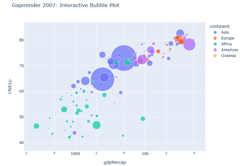
import plotly.express as px

df = px.data.gapminder().query("year == 2007")

fig = px.scatter(df, x="gdpPercap", y="lifeExp",
                 size="pop", color="continent",
                 hover_name="country", log_x=True,
                 size_max=60,
                 title="Gapminder 2007: Interactive Bubble Plot")

# Increase plot height
fig.update_layout(
    width=800,  # Adjust width if needed
    height=800  # Increase height
)

fig.show()
These case studies demonstrate the effectiveness of bubble plots in conveying complex data relationships, leading to actionable insights across various sectors.
Interpreting Bubble Chart
Bubble plots are a powerful tool for visualizing complex datasets, effectively presenting three dimensions of data through a two-dimensional format. Each bubble in a bubble plot represents an individual data point, and its position on the X and Y axes corresponds to two variables. The size and color of the bubble further convey additional variable information, enhancing the interpretative capacity of this type of plot significantly.
When analyzing bubble plots, the X and Y axes should first be assessed to understand the correlation between the two variables they represent. A positive correlation is indicated when bubbles ascend diagonally from the bottom left to the top right, whereas a negative correlation is depicted by a downward slope. Furthermore, the size of the bubble often corresponds to the magnitude or significance of a third variable, providing insight into the relationship’s context. For instance, in bubble plot examples where sales figures are represented, larger bubbles may indicate higher sales volumes compared to their smaller counterparts.
Color is another crucial aspect to interpret; it can signify categories or groupings within the dataset, allowing for a comparative analysis of clusters within the data. However, attention must be paid to potential misinterpretations. Inconsistent bubble sizes or overlapping bubbles can obscure meaningful relationships. Therefore, it is essential to ensure that the bubble dimensions do not mislead the viewer into drawing incorrect conclusions. Additionally, while the bubble plot in R and Python libraries such as Matplotlib can effectively illustrate these relationships, incorrect scaling or labeling can detract from the plot’s clarity.
When analyzing a bubble plot:
- First examine the x and y axes to understand the primary relationship
- Look for patterns in bubble sizes – are larger bubbles clustered in certain areas?
- Consider color groupings if present – do different categories behave differently?
- Watch for outliers – unusually large or small bubbles in unexpected positions
- Note the scale – bubble area or diameter may represent values differently
Common pitfalls to avoid:
- Don’t compare bubble sizes by diameter when they represent area
- Avoid too many bubbles which can lead to overplotting
- Be cautious with logarithmic scales – they can distort perception
To mitigate the likelihood of misinterpretation, always provide a legend that defines color codings and clarify the context of bubble sizes. Understanding these elements helps derive accurate insights from bubble plots, ensuring that the visual representation effectively communicates the underlying data relationships.
Conclusion
In this blog post, we explored the intricacies of creating bubble plots in both Python and R, shedding light on their unique features and functionalities. Bubble plots serve as an effective means for visualizing data with three dimensions, encompassing two quantitative variables and a categorical variable represented by the size and color of bubbles. This capability makes them particularly advantageous in fields such as data analysis, marketing, and scientific research.
We highlighted various bubble plot examples, illustrating their application in diverse scenarios, from analyzing economic data to visualizing social statistics. By utilizing libraries such as bubble plot matplotlib in Python and bubble plot in R, users can create visually compelling graphics that encapsulate complex information with clarity and precision. The flexibility and functionality of these tools make them a vital addition to any data visualization framework.
Encouraging readers to fully harness the potential of bubble plots, we recommend practicing with both Python and R. Engaging with interactive tutorials or comprehensive guides can significantly enhance understanding and proficiency. As data visualization continues to evolve, developing skills in using various plotting techniques, including bubble plots, is increasingly essential for analysts and researchers alike. Subsequently, incorporating these techniques into regular analysis will lead to richer insights and more effective communication of data findings.
Through exploration of bubble plots, we hope that readers feel inspired to experiment with their datasets and apply visual storytelling methods in their work. With continued learning and practice, the art of crafting effective visualizations will become an invaluable asset in any data-oriented endeavor.