Introduction to BoxPlot in R
Box plots, also known as whisker plots, are a distinctive graphical representation that provides a succinct summary of a dataset’s distribution. BoxPlot facilitate a quick assessment of various data characteristics, including central tendencies and variability. The primary components of a box plot include the median, quartiles, and possible outliers, making them particularly valuable in statistical analysis. This blog will teach you how to generate BoxPlot in R
At the heart of the box plot is the box itself, which encompasses the interquartile range (IQR), defined as the range between the first quartile (Q1) and the third quartile (Q3). The median, represented by a line within the box, indicates the dataset’s central value, effectively dividing the dataset into two equal halves. The whiskers extend from the box, typically reaching to the smallest and largest values within 1.5 times the IQR from the quartiles, while points outside this range are marked as potential outliers.
Box plots serve a dual purpose: they not only summarize data efficiently but also highlight differences between groups, making them an essential tool in comparative data analysis. In R, creating a box plot can be accomplished using various packages, including ggplot2, which brings forth intuitive functionality and aesthetic customization options. Visualizing data distributions through box plots can uncover patterns and anomalies that might remain hidden in raw data. Additionally, these plots can be adapted for various libraries in Python, such as boxplot seaborn and boxplot matplotlib, widening their applicability across different coding environments.
In essence, box plots encapsulate crucial statistical information in a straightforward format, providing users with a reliable foundation for understanding the underlying characteristics of their data. Their visual clarity fosters better decision-making based on the analyzed information, thus making them indispensable tools in the data analyst’s repertoire.
Setting Up Your R Environment
Before delving into the realm of data visualization with box plots, it is essential to prepare your R environment adequately. This preparation involves ensuring that you have the necessary software installed and that you are familiar with some basic functions within R. The creation of box plots, often used to display the distribution of data, can be enhanced greatly using packages such as ggplot2 and its integrated functionalities for generating box plots in R.
First, begin by installing R and RStudio, which provides an integrated development environment for R. You can download R from the Comprehensive R Archive Network (CRAN) and RStudio from their official website. Once installed, open RStudio and navigate to the console for command-line operations. To install the ggplot2 package, a powerful tool for data visualization and creating box plots, use the following command:
install.packages("ggplot2")
After successfully installing ggplot2, load it into your R session with:
library(ggplot2)
In addition to ggplot2, familiarity with base R functions is beneficial for creating box plots independently. You can also consider installing other relevant packages such as seaborn for Python users, which offers capabilities for crafting box plots seamlessly. If you are utilizing Python, ensure you have both seaborn and matplotlib installed with:
pip install seaborn matplotlib
To facilitate understanding of box plot examples, it is advisable to use sample datasets provided in R. One convenient dataset is the “mtcars” dataset, which can be accessed simply using:
data(mtcars)
With the environment set up and sample datasets ready, you are now prepared to start creating box plots using ggplot2 and base R, fully equipped to explore various boxplot configurations, visual representations and Do your R Assignment or Homework with ease. This foundation ensures that your journey into data visualization is effective and fruitful.
Creating Basic BoxPlot in Base R
Box plots, integral to data visualization, effectively summarize the distribution of a dataset through quartiles and outliers. In R, creating a basic box plot can be accomplished using the built-in functions provided by Base R, requiring no additional packages. This section will illustrate the process step-by-step and will help you easily generate your first boxplot in R.
To start, you will need a dataset to work with. For demonstration purposes, let us consider the built-in dataset ‘mtcars’, which contains various attributes of different car models. To create a box plot that visualizes the distribution of miles per gallon (mpg) across the number of cylinders (cyl), you can use the following code:
boxplot(mpg ~ cyl, data = mtcars, main = "MPG by Cylinder Count", xlab = "Number of Cylinders", ylab = "Miles Per Gallon", col = "lightblue", border = "darkblue")In this code, the formula mpg ~ cyl signifies that we want to analyze the mpg based on the categories in cyl. The main title, x-label, and y-label are customized to provide context to the viewer. The col parameter enhances the visual appeal, while border specifies the color of the box edges.
Once executed, R will generate a boxplot illustrating the distribution of mpg across the different cylinders. This basic box plot clearly visualizes the median, quartiles, and potential outliers within the mpg values characterized by cylinder counts. Utilizing box plots in R allows for quick insight into your data without overwhelming complexity.
When working with larger or more complex datasets, enhancing the basic box plot by integrating it with the ggplot2 package could improve clarity and aesthetics. However, understanding the fundamental principles of creating a box plot in Base R is essential for any data analyst. As boxplot examples demonstrate, Base R provides robust functionality for generating quick and effective visual representations of your data, serving as a vital tool in exploratory data analysis.
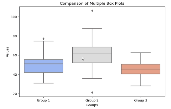
# Create sample data
data <- data.frame(
  group = rep(c("A", "B", "C"), each = 100),
  value = c(rnorm(100, mean = 5), rnorm(100, mean = 7), rnorm(100, mean = 6))
)

# Basic boxplot
boxplot(value ~ group, data = data,
        main = "Basic Boxplot with Base R",
        xlab = "Groups",
        ylab = "Values",
        col = "lightblue")
Customizing Base R Boxplot
# Customized boxplot
boxplot(value ~ group, data = data,
        main = "Customized Boxplot",
        xlab = "Categories",
        ylab = "Measurement",
        col = c("#FF9999", "#99FF99", "#9999FF"),
        border = "darkgray",
        notch = TRUE,
        outline = FALSE,  # Hide outliers
        las = 1,          # Horizontal axis labels
        boxwex = 0.5)     # Box width

# Add horizontal grid
grid(nx = NA, ny = NULL, col = "lightgray", lty = "dotted")
Enhancing BoxPlot with ggplot2 in R
The ggplot2 package in R offers a powerful and flexible framework for creating aesthetically pleasing box plots. By utilizing the grammar of graphics, ggplot2 makes it easier to customize various aspects of your box plot compared to base R graphics. To begin, ensure that you have the ggplot2 package installed and loaded into your R session by using the command library(ggplot2).
The essential syntax for creating a box plot with ggplot2 involves using the ggplot() function combined with geom_boxplot(). For instance, a simple box plot can be constructed using the following command:
ggplot(data = your_data, aes(x = factor_variable, y = numeric_variable)) +
geom_boxplot()
Customizing the box plot is where ggplot2 truly shines. You can alter the color scheme of your box plot through the fill aesthetic, enabling the distinction of various groups. For example:
ggplot(data = your_data, aes(x = factor_variable, y = numeric_variable, fill = group_variable)) +
geom_boxplot()
Enhancing the visual appeal can also be achieved by applying themes. The theme_minimal() function provides a clean and modern background. You can incorporate it into your plot as follows:
ggplot(data = your_data, aes(x = factor_variable, y = numeric_variable)) +
geom_boxplot() +
theme_minimal()
Furthermore, to improve interpretability, labels can be customized using the labs() function. This allows you to clearly label the x-axis, y-axis, and title of the box plot:
ggplot(data = your_data, aes(x = factor_variable, y = numeric_variable)) +
geom_boxplot() +
labs(title = "Your Title", x = "Factor Variable", y = "Numeric Variable")
These customizations significantly enhance the presentation of your box plot in R, while ensuring your visualizations convey the necessary information effectively. By exploring various options like these, users can create visually engaging box plots that demonstrate their data’s nuances through ggplot2.
Customizing Your BoxPlot in R
Box plots are an invaluable tool for visualizing data distributions and variations. Customization can significantly enhance the clarity and impact of your boxplot in R. Whether you are using Base R or the ggplot2 package, numerous options are available to tailor the appearance of your box plot to meet your analytical needs.
In Base R, adding a title to your box plot is simple and can be accomplished using the title() function immediately after you generate the box plot. For instance, you might use boxplot(data) followed by title(main = "My Box Plot"). You can also modify colors by using the col argument within the boxplot() function, allowing you to change the fill colors for the boxes, whiskers, and outliers respectively.
When transitioning to ggplot2, the customization options expand significantly. The ggplot() function is the basis for building your box plot, and you can use various functions to enhance it, such as labs(title = "My Custom Box Plot") to add a title. To modify colors, use the scale_fill_manual() function to specify colors for different categories, or theme() to adjust the overall aesthetics, including axis labels and text sizes.
Moreover, both Base R and ggplot2 allow you to display individual data points overlaid on the box plot. In Base R, this can be achieved by adding a points() function over your boxplot call. In ggplot2, you can layer a geom_jitter() or geom_point() to visualize the underlying data distribution clearly. Adjusting these elements not only adds functional benefits but also enhances the visual appeal of your boxplot.
The ability to fine-tune aesthetics, from coloring decisions to the display of data points, ensures your box plot delivers the message you intend, making your analyses more effective and visually engaging.
# Advanced ggplot2 boxplot
ggplot(data, aes(x = group, y = value, fill = group)) +
  geom_boxplot(
    alpha = 0.7,
    outlier.color = "red",
    outlier.shape = 8,
    outlier.size = 3
  ) +
  scale_fill_brewer(palette = "Set2") +
  ggtitle("Advanced ggplot2 Boxplot") +
  xlab("Categories") +
  ylab("Measurements") +
  theme_minimal() +
  theme(
    legend.position = "none",
    plot.title = element_text(hjust = 0.5, size = 14, face = "bold"),
    axis.text = element_text(size = 10),
    axis.title = element_text(size = 12)
  ) +
  stat_summary(
    fun = mean,
    geom = "point",
    shape = 18,
    size = 3,
    color = "black"
  )
Interpreting Box Plots
Box plots, frequently acknowledged for their efficiency in summarizing data distributions visually, are a vital tool in data analysis. The central component of a boxplot in R is the box itself, which reflects the interquartile range (IQR). The box encompasses the 25th percentile (Q1) and the 75th percentile (Q3), effectively demonstrating the spread of the middle 50% of the data. The line inside the box denotes the median (Q2), providing a clear indication of where the center of the dataset lies.
The whiskers of a box plot ggplot or box plot ggplot2 extend from the edges of the box to the smallest and largest values within 1.5 times the IQR from the quartiles. This section of the plot illustrates the range of the data outside of the quartiles, excluding potential outliers. Any points that fall outside of this whisker length are marked individually and flagged as outliers. Their identification through a boxplot is crucial as they may highlight data anomalies or variances worthy of further investigation.
To better grasp the implications of boxplot examples, let’s consider a practical application in education. Suppose we analyze student test scores across different schools. The box plot enables educators to see not only the average performance of the entire cohort but also to compare the performance between various schools. If School A has a significantly higher median score than School B, educators can further investigate the reasons for this discrepancy.
Another usage in the professional realm might involve assessing production times in manufacturing sectors. By utilizing boxplot seaborn or boxplot matplotlib, managers can identify inconsistencies in production times. The presence of outliers could signal disruptions in processes, warranting deeper analysis to rectify inefficiencies. Thus, interpreting box plots offers valuable insights across various fields by succinctly encapsulating data distribution and highlighting significant features that merit attention.
Grouped Boxplot in R
# Create sample data with subgroups
data_subgroup <- data.frame(
  group = rep(c("X", "Y"), each = 150),
  subgroup = rep(c("A", "B", "C"), each = 50, times = 2),
  value = c(rnorm(50, 5), rnorm(50, 6), rnorm(50, 7),
           rnorm(50, 6), rnorm(50, 5), rnorm(50, 8))
)

# Grouped boxplot with ggplot2
ggplot(data_subgroup, aes(x = group, y = value, fill = subgroup)) +
  geom_boxplot(position = position_dodge(0.8), width = 0.7) +
  scale_fill_manual(values = c("#66c2a5", "#fc8d62", "#8da0cb")) +
  labs(title = "Grouped Boxplot Example", x = "Main Group", y = "Value")
Identifying Outliers with BoxPlot
Box plots are powerful visual tools for identifying outliers in data sets. They provide a graphical representation of the distribution of data points, highlighting the central tendency, variability, and presence of any extreme values. The primary statistical basis for identifying outliers using box plots is the interquartile range (IQR). The IQR is defined as the difference between the first quartile (Q1) and the third quartile (Q3) of the data, thereby capturing the middle 50% of the dataset.
To identify outliers, one can determine the upper and lower bounds using the following formulas: an outlier is defined as any data point that falls below Q1 – 1.5 * IQR or above Q3 + 1.5 * IQR. This method is effective and simple, making it a popular choice among data analysts. For those who use R, creating a box plot can be done quickly with the `boxplot()` function, which automatically detects these outliers based on the IQR criteria. Additionally, visualizing these outliers is straightforward when employing the ggplot2 package, utilizing the `geom_boxplot()` function to make box plots. These box plot ggplot representations clearly indicate outliers with distinct points outside the whiskers.
For an empirical example, consider a dataset containing measurements of a certain variable. After creating a box plot in R, one can not only visualize the overall data distribution but also spot outliers directly represented as points outside the box plot’s whiskers. Similarly, Python users can leverage libraries such as seaborn and matplotlib to create boxplots in Python, enabling the visualization of outliers in a format familiar to R users. Boxplot examples in these libraries follow similarly structured syntaxes, allowing users from both programming environments to apply their knowledge to identify and analyze outliers effectively.
Real-World Applications of Box Plots
Box plots are powerful visualization tools utilized across various fields, effectively summarizing data distributions and identifying outliers. In healthcare, for example, researchers often employ boxplots to analyze patient data, studying the effectiveness of treatments. By comparing groups, such as before and after treatment outcomes, a box plot in R can reveal essential trends and variances in recovery rates. It enables stakeholders to make informed decisions regarding treatment protocols based on statistical evidence.
In academia, box plots serve as a valuable asset for statistical analysis in educational research. Educators and researchers can present scores from different test groups using box plot ggplot visualizations to illustrate the differences in performance. This visual representation helps to communicate variances in academic performance among various demographics, highlighting areas that may require targeted interventions or support.
Moreover, businesses utilize boxplots to analyze sales data, customer feedback, and operational metrics. For instance, boxplot examples can be used to evaluate customer satisfaction ratings across different products. By visualizing the customer feedback, companies can promptly identify products that underperform or exceed expectations, allowing for strategic marketing adjustments or product improvements. In data science, box plots seaborn and boxplot matplotlib implementations can efficiently display multi-dimensional data, assisting analysts in understanding complex datasets and driving data-informed decisions.
Overall, the versatility of box plots makes them invaluable across various sectors. Their ability to succinctly communicate the distribution of data enhances the analytic capabilities of professionals. As industries continue to rely on data to guide their strategies, the application of box plots will undoubtedly remain an essential practice in data visualization and analysis.
Real-World Example: Iris Dataset
# Boxplot of Sepal Length by Species
ggplot(iris, aes(x = Species, y = Sepal.Length, fill = Species)) +
  geom_boxplot() +
  scale_fill_brewer(palette = "Pastel1") +
  labs(title = "Sepal Length by Species in Iris Dataset",
       x = "Species",
       y = "Sepal Length (cm)") +
  theme_bw()

# Add mean points and annotations
ggplot(iris, aes(x = Species, y = Sepal.Length, fill = Species)) +
  geom_boxplot() +
  stat_summary(fun = mean, geom = "point", shape = 18, size = 3, color = "black") +
  annotate("text", x = 1:3, y = c(4.5, 6, 7.5),
           label = c("Setosa", "Versicolor", "Virginica"),
           color = "darkred", fontface = "bold") +
  theme(legend.position = "none")
Downloadable R Scripts and Resources
For those seeking practical applications of the box plot concepts discussed in this guide, we have compiled a selection of downloadable R scripts that facilitate hands-on learning. These scripts enable readers to replicate the boxplot examples illustrated throughout the blog post. By using these resources, readers can explore various aspects of box plots in R, whether through the base functionality of R or the enhanced visual capabilities of ggplot2.
Incorporating the boxplot in R and implementing box plots using ggplot2 can significantly further one’s understanding of data visualization. To assist with this process, we have provided scripts that cover both basic and advanced plotting techniques. For instance, the scripts include examples demonstrating how to create a box plot ggplot and how to modify aesthetics for a more tailored presentation of the data. Additionally, there are practical illustrations using boxplot seaborn and boxplot matplotlib for users who may also be interested in Python environments.
Alongside the downloadable scripts, we have curated a list of further reading materials that delve deeper into statistical graphics and boxplots specifically. Recommended books and online resources include classics on data visualization and statistical analysis, providing a comprehensive background for those wishing to enrich their knowledge of box plots and their applications across different platforms.
These resources serve as a bridge between theoretical understanding and practical application, enabling readers to confidently apply their knowledge of box plots in R and utilize tools like ggplot2 to enhance their data analysis skills. Engaging with this material can significantly contribute to developing a strong foundational knowledge of statistical graphics.