Introduction to 3D Scatter Plots
A 3D scatter plot is a graphical representation of data points in a three-dimensional space. This type of visualization extends the traditional 2D scatter plot by introducing a third axis, allowing for the representation of three numerical variables simultaneously. The 3D scatter plot is particularly useful when trying to identify patterns, relationships, or clusters in a dataset that involves three continuous dimensions.
Unlike a 2D scatter plot, where data points are plotted on just two axes (typically termed as x and y), a 3D scatter plot employs a third axis, usually referred to as z. This additional dimension enhances the ability to display complex datasets where relationships between multiple variables may not be as evident in a two-dimensional format. For example, when demonstrating financial data that incorporates revenue, costs, and profit margins, a 3D scatter plot allows viewers to easily visualize how these variables interact with one another.
Visualizing three-dimensional data becomes especially advantageous in scenarios where comprehensive data analysis or presentations are required. It allows analysts to observe trends more intuitively, making it a valuable tool in the fields of data science, machine learning, and statistical modeling. In addition, the use of libraries such as Matplotlib and Plotly in Python and R enables users to create interactive and dynamic 3D plots. These tools facilitate a more engaging exploration of the data, enabling users to rotate, zoom, and pan around the visualizations, thus gaining deeper insights into data relationships.
In summary, 3D scatter plots are an essential visualization technique in data analysis, offering a more comprehensive view of multidimensional datasets. They leverage advanced plotting libraries to create effective and interactive representations, which enhance the analytical capability of researchers and data practitioners alike.
Use Cases for 3D Scatter Plots
3D scatter plots are powerful visualization tools that can effectively convey complex relationships and patterns within datasets. Various fields such as data science, machine learning, and scientific research leverage 3D scatter plots to gain insights that are not as easily discernible in two-dimensional representations. One prominent use case is in the realm of data science, where analysts require a holistic view of multidimensional datasets. For instance, a 3D scatter plot created using matplotlib allows practitioners to visually assess clustering tendencies and the distribution of data points across three variables, facilitating better decision-making.
In machine learning, the application of a 3D scatter plot is crucial for model evaluation and interpretation. As algorithms manage high-dimensional data, visualizing the outputs in 3D can highlight how different models distinguish between classes. For instance, visualizing the output of a clustering algorithm in a 3D plot can reveal how well data points are grouped, which is vital for validating model performance.
Scientific research also benefits from the use of 3D scatter plots. In fields such as biology and environmental science, researchers often analyze complex relationships involving multiple variables while doing Python Assignment work. For example, a 3D scatter plot could be employed to investigate the relationship between temperature, pollution levels, and the health outcomes of a population. This visualization not only elucidates patterns but also aids in communicating findings to a broader audience.
Moreover, tools like Plotly enhance the visualization experience, allowing for interactive 3D plots that enable users to explore data more dynamically. As the significance of clear data representation continues to grow, the use of 3D scatter plots in Python and R will likely expand, honing in on their capacity to reveal intricate data structures, ultimately supporting effective data-driven decision-making.
Creating 3D Scatter Plot in Python with Matplotlib
Creating a 3D scatter plot in Python is an insightful way to visualize three-dimensional data. The Matplotlib library, particularly its mplot3d toolkit, provides an effective way to generate these visualizations. To begin, ensure that you have Python installed along with the Matplotlib library. If you haven’t installed it yet, simply use the command pip install matplotlib in your terminal.
Once the environment is set up, the first step is to import the necessary libraries. You will need import statements for both Matplotlib and NumPy, as the latter will help you create sample data. The following code snippet illustrates this:
import numpy as np
import matplotlib.pyplot as plt
from mpl_toolkits.mplot3d import Axes3D
Next, generate some sample data for the plot. You can use NumPy to create random data points. For instance, you can create three variables representing the x, y, and z coordinates as follows:
# Generate random data
x = np.random.rand(100)
y = np.random.rand(100)
z = np.random.rand(100)
With your data ready, it’s time to implement the Matplotlib functions to create a 3D scatter plot. You can achieve this by first creating a figure and then adding a 3D subplot. The plotting function can then be utilized to render the 3D scatter plot. Here’s how:
fig = plt.figure()
ax = fig.add_subplot(111, projection='3d')
ax.scatter(x, y, z)
plt.show()
Upon executing this code, a new window will display your 3D scatter plot, effectively showcasing the spatial relationship of your data points. By customizing parameters such as colors and labels, you can enhance the clarity and effectiveness of your visualization. This method is an excellent introduction to creating advanced graphics through the Matplotlib 3D scatter functionality.
Learn Python for Data Analysis Assignment
This guide offers a thorough introduction to Python, presenting a comprehensive guide tailored for beginners who are eager to embark on their journey of learning Python from the ground up.

Creating 3D Scatter Plot in Python with Plotly
Creating 3D scatter plots can significantly enhance data visualization by providing an additional dimension to interpret data sets. In Python, the Plotly library offers a powerful and convenient way to create interactive 3D scatter plots. To get started, ensure you have Plotly installed in your Python environment. You can install it using pip with the following command:
pip install plotlyOnce the installation is complete, you can start to create 3D plots effortlessly. An advantage of using Plotly is its ability to offer interactivity, allowing users to hover and click on data points for more information. This feature is particularly beneficial when working with substantial datasets, as it enables deeper insights without overwhelming the viewer.
To demonstrate how to visualize a dataset elegantly using a 3D scatter plot, let’s consider an example where we utilize the famous Iris dataset. This dataset contains measurements of different species of iris flowers, making it ideal for visual representation. Below is a simple code snippet to illustrate this:
import plotly.express as px
import pandas as pd

# Load the Iris dataset
df = px.data.iris()

# Create a 3D scatter plot
fig = px.scatter_3d(
    df,
    x='sepal_width',
    y='sepal_length',
    z='petal_length',
    color='species',
    title='3D Scatter Plot of Iris Dataset'
)

# Show the plot
fig.show()
In this code, we utilize the Plotly Express module, which simplifies the process of generating a 3D plot in Python. The specified axes represent different dimensions of the dataset—sepal width, sepal length, and petal length—while coloring the points based on the iris species. The resulting 3D scatter plot allows for interactive exploration, providing a comprehensive view of the relationship among variables.
Ultimately, Plotly’s extensive capabilities for creating 3D scatter plots make it a preferred choice for data scientists and analysts aiming to produce visually compelling representations in Python.
Need Help in Programming?
I provide freelance expertise in data analysis, machine learning, deep learning, LLMs, regression models, NLP, and numerical methods using Python, R Studio, MATLAB, SQL, Tableau, or Power BI. Feel free to contact me for collaboration or assistance!
Follow on Social

Creating 3D Scatter Plot in R with Plotly
To create a 3D scatter plot in R using the Plotly library for your R programming Homework, the first step is to ensure that you have the Plotly package installed. If you have not yet installed it, you can do so by executing the following command in your R console: install.packages("plotly"). Once the package is installed, you can load it into your R session with library(plotly).
After loading the Plotly library, you need to prepare your data for plotting. For a 3D scatter plot, your data should have at least three numeric vectors, each representing the coordinates in the three-dimensional space. A common approach is to use a data frame to collect this information. For instance, you might have a data frame called df that contains three columns: x, y, and z.
Here’s an example of how to generate a basic 3D scatter plot using the prepared data frame:
# Load required library
library(plotly)

# Sample data
df <- data.frame(
  x = rnorm(100),
  y = rnorm(100),
  z = rnorm(100)
)

# Creating a 3D scatter plot
plot_ly(
  data = df,
  x = ~x,
  y = ~y,
  z = ~z,
  type = 'scatter3d',
  mode = 'markers'
)
This code snippet will produce an interactive 3D scatter plot where the points are represented in three-dimensional space. The plot_ly function is quite flexible and allows for customization of marker attributes, such as color and size. For example, you can modify the markers using additional parameters within the plot_ly function.
With Plotly, you can also add titles, adjust axis labels, and enable or disable grid lines for enhanced visualization. This makes it an effective tool for creating detailed and visually appealing 3D plots in R.
By utilizing Plotly for generating 3D scatter plots, users benefit from interactivity that enhances data exploration, making it a popular choice among R users who require dynamic visualizations.
Real-World Examples
3D scatter plots serve as an invaluable tool in the analysis and visualization of datasets that possess multiple dimensions. Their utility is evident in various fields such as finance, healthcare, and environmental science. For instance, consider a dataset that catalogs the average temperatures, humidity levels, and air quality indices of various cities. A 3D scatter plot can be created using Python’s matplotlib 3D scatter functionalities to visualize how these three variables interact. Each point in the plot would represent a city, allowing researchers to identify trends or anomalies amidst the data.
Another compelling example can be found in genetics. Researchers often analyze gene expression levels across multiple conditions, examining how different genes behave under varying environments. By employing a 3D plot in R, specifically using packages like plotly 3D scatter, a scientist can effectively communicate how groups of genes correlate with responses to treatments. This visual representation aids in uncovering critical insights that might not be immediately obvious from traditional analysis alone.
Moreover, in the financial sector, attributes such as stock price, trading volume, and volatility present another opportunity for employing 3D scatter plots. By visualizing these dimensions together, analysts can discern patterns and make informed predictions regarding market movement. A well-structured 3D scatter plot matplotlib could allow investors to identify clusters of stock performance that demonstrate similar characteristics, enhancing decision-making processes.
Let’s visualize country data with GDP, Life Expectancy, and Population (as bubble size):
Python Version:
import plotly.express as px

# Load Gapminder data
df = px.data.gapminder().query("year == 2007")

# Create bubble plot
fig = px.scatter_3d(df, x="gdpPercap", y="lifeExp", z="pop",
                    size="pop", color="continent",
                    hover_name="country", log_x=True,
                    size_max=60, title="Gapminder 3D Bubble Plot (2007)")
fig.show()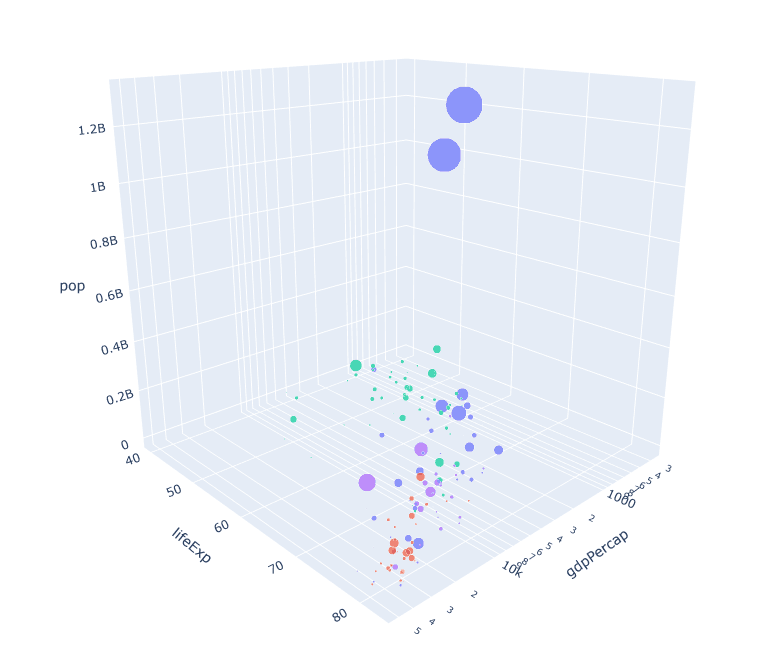
R Version:
library(plotly)
library(gapminder)

# Filter 2007 data
data_2007 <- gapminder %>% filter(year == 2007)

plot_ly(data_2007, x = ~gdpPercap, y = ~lifeExp, z = ~pop,
        color = ~continent, size = ~pop,
        text = ~country, hoverinfo = "text",
        type = "scatter3d", mode = "markers",
        marker = list(sizemode = "diameter", opacity = 0.7)) %>%
  layout(title = "Gapminder 3D Bubble Plot (2007)",
         scene = list(xaxis = list(title = "GDP per capita", type = "log"),
                      yaxis = list(title = "Life Expectancy"),
                      zaxis = list(title = "Population")))
These examples underscore the potential of using 3D scatter plots to represent complex datasets. By integrating visual and numerical data through software tools like R and Python, researchers can glean actionable insights, paving the way for more nuanced interpretations of multifaceted information. The power of visualization in the interpretation of data cannot be overstated, as it brings clarity and understanding to seemingly intricate relationships.
Interpreting 3D Scatter Plots
3D scatter plots are powerful visualization tools that provide insights into complex datasets by representing three dimensions of data simultaneously. Interpreting these plots effectively involves several key aspects, including the analysis of axis labels, data point distribution, the identification of outliers, and understanding the significance of the plot’s three-dimensionality.
First, axis labels are crucial as they define what each dimension represents in the context of the data. Proper labeling allows observers to quickly understand the variables being compared. For example, in a 3D scatter plot created using matplotlib 3D scatter functionality, the axes may represent different traits, such as height, weight, and age. Understanding these labels will help the viewer interpret the spatial relationships between the data points.
Next, the distribution of data points within the space can reveal patterns and trends. A dense cluster of data points might indicate a strong relationship between the variables represented on the axes, while scattered points might suggest weaker correlations. By examining the structure of these distributions, viewers can gauge how variables interact within the dataset.
Outliers also hold significant importance in the interpretation of 3D plots. Data points that lie far from the general distribution may indicate special cases, errors in data collection, or phenomena worthy of further investigation. Identifying these outliers can lead to deeper insights into the underlying dataset and assist in refining analyses.
Finally, the three-dimensional aspect of 3D plots in Python and R, such as those generated with plotly 3D scatter capabilities, allows for an enriched understanding of relationships. The use of 3D elements can help demonstrate interactions that might be overlooked in traditional two-dimensional representations. Thus, the dimensionality enhances the capability to unveil complex patterns within the data.
When analyzing 3D scatter or bubble plots:
- Look for clusters – Groups of points close together may indicate similar characteristics
- Check for outliers – Points far from the main distribution may be anomalies
- Examine relationships – See if points form patterns along axes (linear, exponential, etc.)
- Note bubble sizes – In bubble plots, larger sizes indicate higher values of the fourth dimension
- Rotate the view – Interact with the plot to see relationships from different angles
Tips for Effective 3D Visualization:
- Use meaningful axis labels and units
- Add a legend for color/size encoding
- Consider transparency (alpha) to handle overlapping points
- For static plots, choose an informative viewpoint
- Interactive plots are often more effective for 3D data
In conclusion, effectively interpreting 3D scatter plots requires careful consideration of axis labels, data distribution, outlier detection, and the benefits derived from the three-dimensional representation of data. Understanding these elements is essential for gleaning meaningful insights from complex datasets.
Common Challenges and Solutions
Creating and interpreting 3D scatter plots can present several challenges that may hinder the effectiveness of data visualization. One prevalent issue is overplotting, which arises when multiple data points occupy the same space in the 3D scatter plot. This can obscure important trends and lead to misinterpretation of the data. To mitigate this challenge, one can employ techniques such as jittering—introducing slight random noise to the coordinates of points—or utilizing transparency to allow overlapping points to remain visible. Additionally, using different shapes or colors for data points can help distinguish between groups, thus enhancing clarity.
Another common challenge is selecting the appropriate perspective view for the 3D plot in Python or R. The angles and rotations can significantly affect how the data is perceived. One solution to this problem is to experiment with various viewing angles using libraries like matplotlib 3D scatter and plotly 3D scatter. This experimentation allows for identifying the most informative vantage point, which can aid in better interpretation of the relationships present in the data.
Furthermore, ensuring clarity in visual representation is crucial when creating a 3D scatter plot. This may involve optimizing the scales on each axis to ensure proportionality and relevance to the data. In Python, functions from the matplotlib library allow for easy adjustments of axes, and similar adjustments can be made in R using ggplot2. Make use of appropriate labels and legends to enhance user understanding, as these tools are vital when conveying complex information. By recognizing these common challenges and employing targeted strategies, one can create effective 3D plots that convey insights accurately and clearly.
Conclusion and Further Readings
In this blog post, we have explored the concept of 3D scatter plots and their implementation in both Python and R. Such plots are invaluable tools for visualizing three-dimensional data, making them essential in various fields like data analysis, machine learning, and scientific research. We began by discussing the fundamental principles behind 3D scatter plots, highlighting their ability to convey information regarding relationships and distributions among multiple variables in a visually compelling manner.
We delved into practical implementations, specifically utilizing libraries such as Matplotlib for Python and Plotly for creating interactive visualizations. The process of crafting a 3D scatter plot in Python using Matplotlib not only reinforces the importance of understanding data attributes but also showcases the versatility of this powerful library. Similarly, employing Plotly to generate interactive 3D plots offers users enhanced engagement with their data, fostering a deeper comprehension of complex datasets and enabling actionable insights.
For those eager to deepen their mastery of 3D visualization techniques, there are numerous resources available. Books on data visualization often include sections dedicated to 3D plots, offering theoretical and practical insights. Online courses and tutorials focusing on Python and R programming can expand knowledge on using libraries such as Matplotlib and ggplot2 effectively. Furthermore, engaging with community forums like Stack Overflow or dedicated data visualization communities can provide invaluable real-time assistance and innovative ideas.
To foster continued learning, consider looking for articles and research papers that discuss advancements in data visualization methodologies, particularly those that focus on the practical applications of 3D scatter plots. Resources like official documentation for Matplotlib and Plotly can also serve as excellent references for mastering more complex features. Ultimately, leveraging these resources and understanding the principles covered can elevate your data visualization capabilities significantly.